
ubuntuone-control-panel does not adapt to length of translated messages
| Affects | Status | Importance | Assigned to | Milestone | |
|---|---|---|---|---|---|
| Ubuntu One Control Panel |
Invalid
|
High
|
Unassigned | ||
| ubuntuone-control-panel (Ubuntu) |
Won't Fix
|
Undecided
|
Unassigned | ||
Bug Description
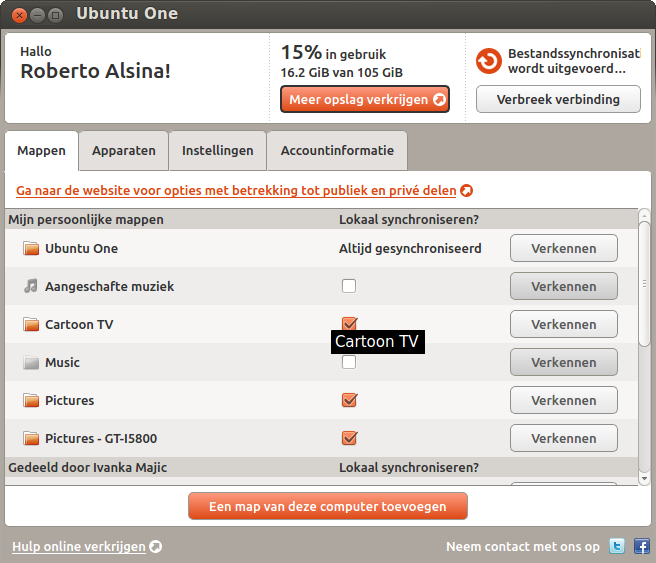
Backround:
English is one of the most compact written languages. As a result, translations are often longer than the original message.
This becomes a problem in ubuntuone-
Preferred solution:
Make buttons expand in size depending on the text on the label. As can be seen from the screenshot, there is plenty of room for the buttons to expand to the left, and this was taken on an 10.1' netbook.
Easiest solution:
Keep everything as it is, but add a translators comment to all relevant strings, specifying the length restrictions that apply to that particular string.
The relevant strings marked in the screenshot are:
"Bestandssynchr
"Verbinding verbreken"
And the English source text is:
"File Sync starting..."
"Disconnect"
ProblemType: Bug
DistroRelease: Ubuntu 12.04
Package: ubuntuone-
ProcVersionSign
Uname: Linux 3.2.0-17-generic x86_64
ApportVersion: 1.94-0ubuntu1
Architecture: amd64
Date: Sun Mar 4 21:11:12 2012
PackageArchitec
SourcePackage: ubuntuone-
UpgradeStatus: No upgrade log present (probably fresh install)

| Changed in ubuntuone-control-panel: | |
| assignee: | nobody → U1 Design UX Team (ubuntuone-design-ux) |
| tags: | added: u1-design-input-needed |
| Changed in ubuntuone-control-panel: | |
| status: | New → Triaged |
| Changed in ubuntuone-control-panel: | |
| assignee: | U1 Design UX Team (ubuntuone-design-ux) → Roberto Alsina (ralsina) |
| Changed in ubuntuone-control-panel: | |
| importance: | Undecided → High |
| Changed in ubuntuone-control-panel (Ubuntu): | |
| status: | Incomplete → Confirmed |
| Changed in ubuntu-translations: | |
| status: | New → Incomplete |
| no longer affects: | ubuntu-translations |
| Changed in ubuntuone-control-panel (Ubuntu): | |
| status: | Incomplete → Won't Fix |
| Changed in ubuntuone-control-panel: | |
| status: | In Progress → Invalid |
| assignee: | Roberto Alsina (ralsina) → nobody |
I'm happy that - as suggested - the buttons expand to the left and push the upsell button and storage to the left along with it.
I assume that this can be done in code and no further UI work is needed.