Too many icons in Gnome Shell Activities Overview require ellipses

Bug #968213 reported by Romano Giannetti
138
This bug affects 24 people
Affects Status Importance Assigned to Milestone
GNOME Shell
New
Unknown
One Hundred Papercuts
Triaged
Medium
Unassigned
gnome-shell (Ubuntu)
Triaged
Medium
Unassigned

Bug Description

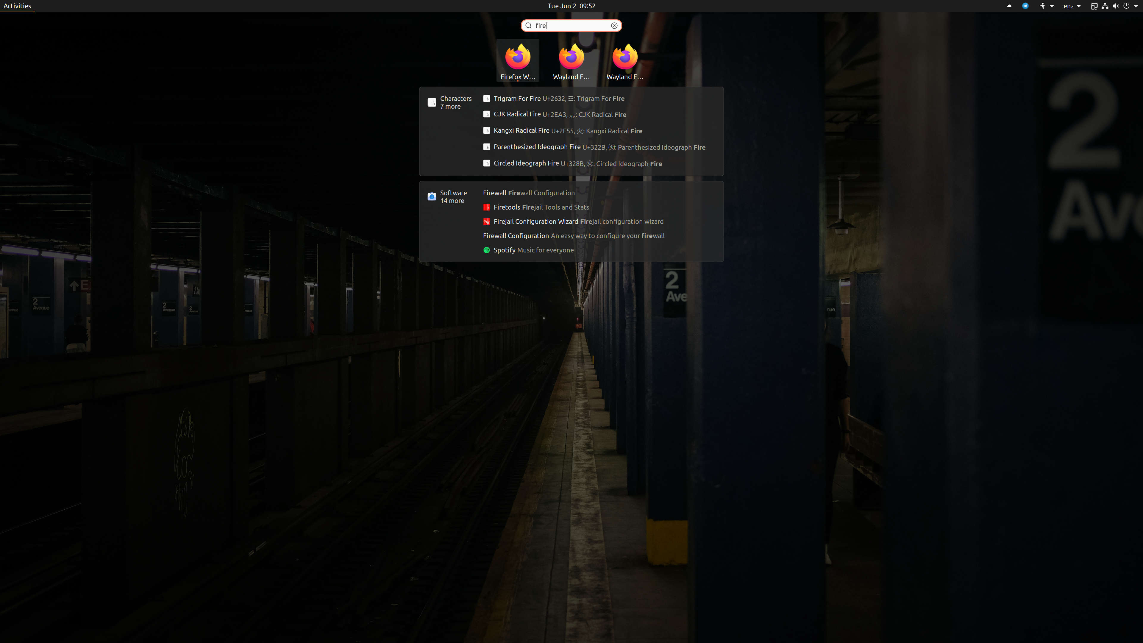
Several apps in the default Ubuntu 17.04 or 17.10 install have Ellipses when shown in GNOME Shell's Activities Overview.

This was made worse by switching GNOME Shell to use the Ubuntu font because the Ubuntu font is a bit wider than GNOME's default Cantarell font so some apps that didn't require ellipses in 17.04 require them now in 17.10 Alpha.

The upstream GNOME bug proposes that apps names be allowed to use 2 lines. This is similar to what the Settings app (gnome-control-center) does.

This is also really bad for languages that use more characters than English.

Original Bug Title
------------------
Gnome Shell Activities Overview should show full names on mouse hover

Original Bug Report
-------------------
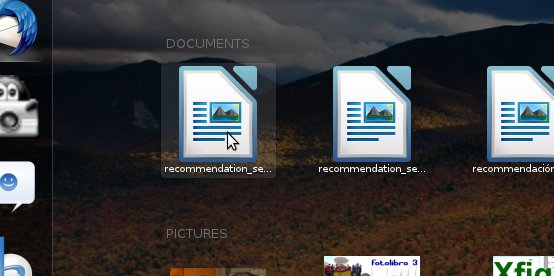
The title says it all --- especially when choosing recent documents, if they start with the same say 12 or 14 letters, it's impossible to differentiate them (see attached screenshot).

When mouse is hovering an icon, the full name of the application/document should be shown.

Revision history for this message
In , Pierre-bugzilla (pierre-bugzilla) wrote :

The default size of many things in activities is currently a bit too small and rather difficult to read. This affects things like window titles, and even worse for application icons. In general, I'd say text size should be kept >= 10pt.

Revision history for this message
In , Andre Klapper (a9016009) wrote :

It works totally fine for me. Probably highly depends on your screen size and resolution. Can you please provide more info?
Which distribution is this about?

Revision history for this message
In , Pierre-bugzilla (pierre-bugzilla) wrote :

Of course.

The distribution is Fedora 16.
My screen size is 15.4", with a resolution of 1680x1050.

I noticed that the problem is less severe on a screen with better contrast (on my colleagues laptop), so it might not be considered a problem with people with fancier machines.

Basically, the applications grid is barely readable when sitting normally in my chair with the laptop on the desk. I have to lean in so that my eyes are roughly above the edge of the laptop to get a comfortable reading distance.

Revision history for this message
In , Milan Bouchet-Valat (nalimilan) wrote :

It's true that icon name tooltips in the dash and window titles are smaller than most labels in the desktop. In particular, even if I can read them, I confirm that window titles are not very easy to read in a short glance (15" laptop screen).

Revision history for this message
In , Pierre-bugzilla (pierre-bugzilla) wrote :

Created attachment 201253
increase font sizes

Suggested change to increase font sizes. This uses 10.5pt as that seems to be a common size in the rest of the theme.

There are a still a few elements that are <10pt, but I didn't touch those as they weren't part of common components.

One problem this causes is that application labels will often not fit. Ideally, they should be able to be multi-line. Unfortunately I'm unable to figure out the Javascript/gnome-shell/Clutter layers to accomplish this.

Revision history for this message
In , Jasper St. Pierre (jstpierre) wrote :

*** Bug 649571 has been marked as a duplicate of this bug. ***

Revision history for this message
In , Pierre-bugzilla (pierre-bugzilla) wrote :

Some pointers on how to get multiline would be nice. I tried adding the following to iconGrid.js:

            this.label.line_wrap = true;
            this.label.line_wrap_mode = Pango.WrapMode.WORD_CHAR;
            this.label.ellipsize = Pango.EllipsizeMode.NONE;

No go though. It didn't even disable the ellipsing...

As plan B, I did this, which worked:

        this.tooltip = label;
        this.actor.has_tooltip = true;
        this.actor.tooltip_text = label;

Revision history for this message
In , Pierre-bugzilla (pierre-bugzilla) wrote :

Ok, I managed to figure it out. I forgot a ".clutter_text." in there:

            this.label.clutter_text.line_wrap = true;
            this.label.clutter_text.line_wrap_mode = Pango.WrapMode.WORD_CHAR;
            this.label.clutter_text.ellipsize = Pango.EllipsizeMode.NONE;

I also needed to get it properly restricted to the given width using:

            let [labelMinHeight, labelNatHeight] = this.label.get_preferred_height(availWidth);

Unfortunately, the bounding containers didn't resize dynamically as I would have hoped, so I had to change "-shell-grid-item-size" in the css. That got things mostly working for two line objects (although it got center aligned, instead of top aligned, which is probably preferred). It still looked funky for three line objects though.

So more work is needed to get thing more dynamic. Some help from the experts would be welcome. :)

Revision history for this message
In , Pierre-bugzilla (pierre-bugzilla) wrote :

Created attachment 201299
increased font size and multiline support

Managed to figure it out. I have to say I'm very impressed by how easy it is to hack gnome-shell. :)

This patch improves the BaseIcon class so that it supports multiple lines. It will use the available space to fit as many lines as possible. That also means it should be completely backwards compatible as long as you don't increase the space given to it. I've changed the CSS to allow two lines of text with the new font size.

The remaining issue I have is that the "running" marker is misplaced. It seems like it is using the minimum width instead of the actual one. There's the same issue with the width, if a square look is deemed desirable.

Revision history for this message
In , Milan Bouchet-Valat (nalimilan) wrote :

> Managed to figure it out. I have to say I'm very impressed by how easy it is to
> hack gnome-shell. :)
That's one of the reasons JavaScript was chosen. ;-)

Care to attach a screenshot? Designers need to agree on the change, and they probably won't apply the patch to check the result. (The running indicator bug can be dealt with once/if they agree.)(In reply to comment #8)

Revision history for this message
In , Drago01 (drago01) wrote :

I'd be in favor of this change ... the problem isn't really the font size though but the chosen font. Cantarel just looks bad at this small sizes. But as we are unlikely going to change the font increasing the size sound like a good way to solve it.

Revision history for this message
In , Pierre-bugzilla (pierre-bugzilla) wrote :

Created attachment 201323
increased font size and multiline support (improved)

Improved version of the last patch. Better alignment of the label and icon when there is extra space, and makes things square to make it easier to fix the "running" marker.

Revision history for this message
In , Pierre-bugzilla (pierre-bugzilla) wrote :

Created attachment 201324
Comparison screenshot

Revision history for this message
In , Pierre-bugzilla (pierre-bugzilla) wrote :

Created attachment 201325
Comparison screenshot

(fixed image. bad pixel alignment in the first one)

Revision history for this message
In , Milan Bouchet-Valat (nalimilan) wrote :

*** Bug 663835 has been marked as a duplicate of this bug. ***

Revision history for this message
In , Drago01 (drago01) wrote :

(In reply to comment #11)
> Created an attachment (id=201323) [details] [review]
> increased font size and multiline support (improved)
>
> Improved version of the last patch. Better alignment of the label and icon when
> there is extra space, and makes things square to make it easier to fix the
> "running" marker.

Can you reattach this as a proper git patch? i.e with commit message and subject (using git format-patch or git-bz).

Revision history for this message
In , Allan Day (allanday) wrote :

(In reply to comment #13)
> Created an attachment (id=201325) [details]
> Comparison screenshot
>
> (fixed image. bad pixel alignment in the first one)

Thanks for the patch and the screenshot! I've having trouble with my build today so I'm unable to test. Can you post a full screen shot for me to see?

Revision history for this message
In , Jasper St. Pierre (jstpierre) wrote :

The main thing that I can see is that items in the grid are misaligned. The way you would fix that is with the y_align property, so that the icons in the grid are always at the top of the item.

A full screenshot would help to see if it's noticable, though.

Revision history for this message
In , Pierre-bugzilla (pierre-bugzilla) wrote :

Created attachment 201387
Full screenshot

Revision history for this message
In , Pierre-bugzilla (pierre-bugzilla) wrote :

(In reply to comment #17)
> The main thing that I can see is that items in the grid are misaligned. The way
> you would fix that is with the y_align property, so that the icons in the grid
> are always at the top of the item.
>
> A full screenshot would help to see if it's noticable, though.

I'm afraid I'm still too new to this to understand what you mean. Could you elaborate a bit? Things should be aligned AFAICT :)

Revision history for this message
In , Jasper St. Pierre (jstpierre) wrote :

Look at the bottom of the ABRT icon compared to the icons to the left of it. The full label pushes the icon up. We want to not do that.

Revision history for this message
In , Pierre-bugzilla (pierre-bugzilla) wrote :

Created attachment 201388
0001-Improve-icon-grid-layout.patch

Revision history for this message
In , Pierre-bugzilla (pierre-bugzilla) wrote :

Created attachment 201389
0002-Avoid-small-font-sizes-in-common-ui-elements.patch

Revision history for this message
In , Pierre-bugzilla (pierre-bugzilla) wrote :

(In reply to comment #20)
> Look at the bottom of the ABRT icon compared to the icons to the left of it.
> The full label pushes the icon up. We want to not do that.

Ah. Suggestions on how the logic should be here? Just have BaseIcon top align everything?

Revision history for this message
In , Allan Day (allanday) wrote :

Jimmac (one of the designers) approves of the general approach here.

It's been suggested that we impose a two line limit on the size of the labels.

Revision history for this message
In , Pierre-bugzilla (pierre-bugzilla) wrote :

Created attachment 201472
Full screenshot, icons top aligned

Here's a screenshot with the icons aligned at the top instead. This puts them all at the same height, regardless of how big the label is.

I'm not so sure about this model though. As you can see, this results in uneven space around the application when it is selected. To me, this looks worse than the fact that the icons aren't on a perfectly straight line.

Revision history for this message
In , Jasper St. Pierre (jstpierre) wrote :

Hm, why does the running prelight go around the label, not around the full box? See if you can tweak the CSS so that it goes around the box instead.

38 comments hidden view all 115 comments
Revision history for this message
Romano Giannetti (romano-giannetti) wrote :
Revision history for this message
Jeremy Bícha (jbicha) wrote :

This bug is an upstream one and it would be quite helpful if somebody experiencing it could send the bug the to the people writing the software. You can learn more about how to do this at https://wiki.ubuntu.com/Bugs/Upstream/GNOME. Thanks in advance!

Changed in gnome-shell (Ubuntu):
importance: Undecided → Wishlist
status: New → Confirmed
Revision history for this message
Romano Giannetti (romano-giannetti) wrote :

Ok, reported upstream. Let's see ;-)

Changed in gnome-shell:
importance: Unknown → Medium
status: Unknown → New
72 comments hidden view all 115 comments
Revision history for this message
In , Florian-muellner (florian-muellner) wrote :

*** Bug 704348 has been marked as a duplicate of this bug. ***

Revision history for this message
In , Allan Day (allanday) wrote :

*** Bug 700388 has been marked as a duplicate of this bug. ***

Revision history for this message
In , Allan Day (allanday) wrote :

Reassigning to overview.

Revision history for this message
In , Florian-muellner (florian-muellner) wrote :

*** Bug 738651 has been marked as a duplicate of this bug. ***

Revision history for this message
In , Florian-muellner (florian-muellner) wrote :

*** Bug 674183 has been marked as a duplicate of this bug. ***

Changed in gnome-shell:
status: New → Invalid
Revision history for this message
In , Florian-muellner (florian-muellner) wrote :

*** Bug 687589 has been marked as a duplicate of this bug. ***

Revision history for this message
In , Florian-muellner (florian-muellner) wrote :

*** Bug 753217 has been marked as a duplicate of this bug. ***

Revision history for this message
In , Florian-muellner (florian-muellner) wrote :

*** Bug 761244 has been marked as a duplicate of this bug. ***

78 comments hidden view all 115 comments
Revision history for this message
Mantas Kriaučiūnas (mantas) wrote :
Changed in gnome-shell:
importance: Medium → Unknown
status: Invalid → Unknown
summary: - gnome shell activities overview should show full names on mouse hover
+ Gnome Shell Activities Overview should show full names on mouse hover
description: updated
Changed in gnome-shell:
importance: Unknown → Medium
status: Unknown → Confirmed
79 comments hidden view all 115 comments
Revision history for this message
In , Florian-muellner (florian-muellner) wrote :

*** Bug 765779 has been marked as a duplicate of this bug. ***

Revision history for this message
In , Gnome-org (gnome-org) wrote :

Created attachment 329534
Text wrapping

Today i want to try Google unstable, if something is wrong i want google beta ...

How to know what is what if those icons change positions as you use them?

Revision history for this message
In , Wise Melon (wise-melon-deactivatedaccount) wrote :

@kolorafa, Just as a temporary solution I would suggest that you edit the .desktop files for them to make the names shorter and fit properly.

Revision history for this message
In , X-bugs (x-bugs) wrote :
Revision history for this message
In , Florian-muellner (florian-muellner) wrote :

*** Bug 778186 has been marked as a duplicate of this bug. ***

Revision history for this message
In , Florian-muellner (florian-muellner) wrote :

*** Bug 782169 has been marked as a duplicate of this bug. ***

Jeremy Bícha (jbicha)
Changed in gnome-shell (Ubuntu):
importance: Wishlist → Medium
tags: added: gnome-17.10
removed: activities gnome-shell ui
description: updated
summary: - Gnome Shell Activities Overview should show full names on mouse hover
+ Too many apps in Gnome Shell Activities Overview require ellipses
Jeremy Bícha (jbicha)
description: updated
Changed in gnome-shell (Ubuntu):
status: Confirmed → Triaged
83 comments hidden view all 115 comments
Revision history for this message
Jeremy Bícha (jbicha) wrote : Re: Too many apps in Gnome Shell Activities Overview require ellipses

This screenshot was taken from today's Ubuntu GNOME image.

The previous "page" is just as bad:
LibreOffice Dr…
LibreOffice Im…
LibreOffice M…
LibreOffice W…

Aisleriot Solit… (that one fit on one line with Cantarell)
Firefox Web B…

And there are some in Utilities but you get the point.

84 comments hidden view all 115 comments
Revision history for this message
In , Marcus Sundman (sundman) wrote :

This is ridiculous! A bug which breaks the most central thing in the whole UI, and it goes unfixed for over half a decade. And even after patches have been provided years ago.
If there was no patches I'd have a look at it myself, but clearly nobody is interested in even reviewing patches so what's the point?

Revision history for this message
In , Allan Day (allanday) wrote :

(In reply to Marcus Sundman from comment #76)
> This is ridiculous! A bug which breaks the most central thing in the whole
> UI, and it goes unfixed for over half a decade. And even after patches have
> been provided years ago.
> If there was no patches I'd have a look at it myself, but clearly nobody is
> interested in even reviewing patches so what's the point?

Please cut out the emotional hyperbole. The fact that there are comments here from shell developers clearly shows that people are interested.

What I said in comment 61 still stands. If you have a suggested for how to resolve the issue we'd love to hear it.

Revision history for this message
In , Nicolás Bértolo (nicolasbertolo) wrote :

(In reply to Allan Day from comment #77)
> What I said in comment 61 still stands. If you have a suggested for how to
> resolve the issue we'd love to hear it.

I am not who you are talking to, but I am annoyed by this bug too.

In my opinion the ugliness caused by wrapped text is, by far, less annoying than not being able to read the application's name in the overview.

Taking into account the fact that this bug has been open for close to 6 years and that there are patches available that partially fix it, it seems like a good decision to commit those patches and schedule a design review of the overview's effects.

These are my honest thoughts on this matter.

Cheers.

Revision history for this message
In , Wise Melon (wise-melon-deactivatedaccount) wrote :

I agree, this really needs to be sorted out. What's the point in working on new features if the existing ones don't work well enough already?

86 comments hidden view all 115 comments
Revision history for this message
Wise Melon (wise-melon-deactivatedaccount) wrote :

The excuses they give upstream for not fixing this is ridiculous, what's the point in working on so many new features for each release if they can't even get the existing ones working to a satisfactory degree?

New features are important, but if I was in charge of development I would certainly make sure that focus was also on making sure that current features which are there to stay work properly. Otherwise I'm just building a wonky building with a fancy roof.

Changed in ubuntu-gnome:
status: New → Confirmed
Revision history for this message
Jeremy Bícha (jbicha) wrote :

Nikita, I understand you are frustrated, but your comments aren't really adding anything to this issue.

summary: - Too many apps in Gnome Shell Activities Overview require ellipses
+ Too many icons in Gnome Shell Activities Overview require ellipses
86 comments hidden view all 115 comments
Revision history for this message
In , Allan Day (allanday) wrote :

(In reply to Nicolás Bértolo from comment #78)
...
> I am not who you are talking to, but I am annoyed by this bug too.

My comment was marked as a reply to comment 76.

> In my opinion the ugliness caused by wrapped text is, by far, less annoying
> than not being able to read the application's name in the overview.

Nobody's talking about "ugliness" from wrapping. The issue is that multi-line names will interfere with the positioning of the running indicator below the application name - either making it appear too far below the name, or leaving it positioned at different heights.

One way to fix it would be to drop the running indicators from the application grid.

> Taking into account the fact that this bug has been open for close to 6
> years and that there are patches available that partially fix it, it seems
> like a good decision to commit those patches and schedule a design review of
> the overview's effects.

That's not how this works. We come up with a design first, then commit patches. Not the other way round.

85 comments hidden view all 115 comments
Revision history for this message
Wise Melon (wise-melon-deactivatedaccount) wrote :

@Jeremy, sorry, I have flu, maybe I shouldn't be interacting here until I get better. I tend to be a little too emotional etc with it.

86 comments hidden view all 115 comments
Revision history for this message
In , Jeremy Bícha (jbicha) wrote :

By the way, Ubuntu 17.10 Alpha currently defaults to GNOME Shell with the Ubuntu font which means there are even fewer characters there (about 13-14) before the labels start ellipsizing. I posted a screenshot at comment #5 of https://launchpad.net/bugs/968213

Revision history for this message
In , Sebastien Bacher (seb128) wrote :

Created attachment 355056
current Ubuntu example of confusing layout

One other example of very confusing user experience, that's on a stock current Ubuntu installation looking for libreoffice, you better know the icon to be able to start the right component...

Revision history for this message
In , Romano Giannetti (romano-giannetti) wrote :

Just showing the full name (even more important for files) on mouse-over would solve the problem, at least for non-touch interface.

Jeremy Bícha (jbicha)
tags: added: rls-bb-incoming
tags: added: visual-quality
Revision history for this message
In , joshas (joshas) wrote :

Ubuntu 17.10 was released with this issue. Please, find a way to add at least second line for long program names. Activity indicator could be moved to the left, like in Ubuntu dash.

88 comments hidden view all 115 comments
Revision history for this message
Will Cooke (willcooke) wrote :

This is an annoying issue, but we don't have time to fix it this cycle. Sorry.

tags: added: rls-bb-notfixing
removed: rls-bb-incoming
Changed in gnome-shell (Ubuntu):
assignee: nobody → Daniel van Vugt (vanvugt)
Changed in gnome-shell (Ubuntu):
status: Triaged → In Progress
89 comments hidden view all 115 comments
Revision history for this message
In , Daniel van Vugt (vanvugt) wrote :
88 comments hidden view all 115 comments
Revision history for this message
Daniel van Vugt (vanvugt) wrote :

A fix is pending:
https://gitlab.gnome.org/GNOME/gnome-shell/merge_requests/90

I was in the area, and noticed it was "simple" enough to fix.

tags: added: bionic
89 comments hidden view all 115 comments
Revision history for this message
In , Daniel van Vugt (vanvugt) wrote :
Revision history for this message
In , Andre Klapper (a9016009) wrote :

*** Bug 796404 has been marked as a duplicate of this bug. ***

Revision history for this message
In , Florian-muellner (florian-muellner) wrote :

*** Bug 687969 has been marked as a duplicate of this bug. ***

90 comments hidden view all 115 comments
Revision history for this message
Daniel van Vugt (vanvugt) wrote :

Work is now in progress in https://gitlab.gnome.org/GNOME/gnome-shell/merge_requests/109

Although I suggest my smaller proposal is safer for backporting: https://gitlab.gnome.org/GNOME/gnome-shell/merge_requests/90

Also more elegant. But I don't mind which fix lands. Just land something.

Changed in gnome-shell (Ubuntu):
assignee: Daniel van Vugt (vanvugt) → nobody
91 comments hidden view all 115 comments
Revision history for this message
In , Daniel van Vugt (vanvugt) wrote :
Revision history for this message
In , Piotr Drąg (piotrdrag) wrote :

*** Bug 796726 has been marked as a duplicate of this bug. ***

affects: ubuntu-gnome → hundredpapercuts
Changed in hundredpapercuts:
importance: Undecided → Medium
91 comments hidden view all 115 comments
Revision history for this message
Coeur Noir (coeur-noir) wrote :

Still ugly in Ubuntu 20.04.

Seems improvements are planned for gnome 3.38 ???

It's been years that names are truncated on the grid view…

Revision history for this message
Daniel van Vugt (vanvugt) wrote :

This really should be discussed upstream instead of here. I've just fixed the upstream bug link: https://bugzilla.gnome.org/show_bug.cgi?id=663725

Changed in gnome-shell:
importance: Medium → Unknown
status: Confirmed → Unknown
Changed in gnome-shell:
importance: Unknown → Medium
status: Unknown → Confirmed
tags: added: focal
Changed in gnome-shell (Ubuntu):
status: In Progress → Triaged
Rudra Saraswat (rs2009)
Changed in gnome-shell (Ubuntu):
status: Triaged → Confirmed
Changed in gnome-shell (Ubuntu):
status: Confirmed → Triaged
91 comments hidden view all 115 comments
Revision history for this message
Pierre Equoy (pieq) wrote :

If that can be of any help, I have the following use case:

In addition to the default Firefox launcher, I created two other .desktop files:

    - One called "Wayland Firefox #1" to run Firefox on Wayland with user profile #1
    - The other called "Wayland Firefox #2" to run Firefox on Wayland with user profile #2

I'm using a 4k screen (3840×2160), so I have *a lot* of space available on the screen.

And yet, GNOME uses ellipsis and this is what I get when I look for "Firefox" in the GNOME Overview screen (see attachment).

I hope this gets fixed soon. Something as simple as a tooltip when putting the cursor on top of the icon or text would be very helpful already.

Revision history for this message
Coeur Noir (coeur-noir) wrote :

There has been many proposals to upstream throughout years for fixing that stupid and ridiculous ellipsis.

Upstream seems not to want to merge those because these days they are working on a new app grid - where ellipsis is still a thing.

It's been years they don't care.

Maybe that should be fixed only downstream in Ubuntu 20.04 LTS and too bad for others ???

Revision history for this message
Marcus Aurelius (marcuscf) wrote :

So another LTS got released with this issue... :-(

If upstream Gnome is dragging its feet to solve this, would I be asking too much if I suggested Ubuntu to bundle the "Applications Overview Tooltip" in the distro? At least users won't have to mess with browser extensions. That looks like a pretty obvious solution to me.

Revision history for this message
In , Gnome-sysadmin (gnome-sysadmin) wrote :

GNOME is going to shut down bugzilla.gnome.org in favor of gitlab.gnome.org.
As part of that, we are mass-closing older open tickets in bugzilla.gnome.org
which have not seen updates for a longer time (resources are unfortunately
quite limited so not every ticket can get handled).

If you can still reproduce the situation described in this ticket in a recent
and supported software version, then please follow
  https://wiki.gnome.org/GettingInTouch/BugReportingGuidelines
and create a new ticket at
  https://gitlab.gnome.org/GNOME/gnome-shell/-/issues/

Thank you for your understanding and your help.

Changed in gnome-shell:
status: Confirmed → Expired
tags: added: jammy
removed: gnome-17.10
Changed in gnome-shell:
importance: Medium → Unknown
status: Expired → Unknown
tags: added: kinetic
Revision history for this message
Ubuntu QA Website (ubuntuqa) wrote :

This bug has been reported on the Ubuntu ISO testing tracker.

A list of all reports related to this bug can be found here:
https://iso.qa.ubuntu.com/qatracker/reports/bugs/968213

tags: added: iso-testing
Changed in gnome-shell:
status: Unknown → New
wontfix (wontfix)
tags: added: lunar mantic
Revision history for this message
Jeremy Bícha (jbicha) wrote :

This was fixed in GNOME Shell 40 and newer which is available in Ubuntu 22.04 LTS and newer.

Changed in gnome-shell (Ubuntu):
status: Triaged → Fix Released
Revision history for this message
Jeremy Bícha (jbicha) wrote :
Changed in hundredpapercuts:
status: Confirmed → Fix Released
1 comments hidden view all 115 comments
Revision history for this message
Jeremy Bícha (jbicha) wrote :

wontfix, please report a new Launchpad issue. This issue was about

"When mouse is hovering an icon, the full name of the application/document should be shown."

That change has been done.

Revision history for this message
Daniel van Vugt (vanvugt) wrote :

Definitely not fixed. In fact we discussed this bug in Prague with Tim.

Changed in gnome-shell (Ubuntu):
status: Fix Released → Triaged
affects: hundredpapercuts → ubuntu
Changed in ubuntu:
status: Fix Released → Triaged
affects: ubuntu → hundredpapercuts
tags: removed: bionic
Revision history for this message
Daniel van Vugt (vanvugt) wrote :

The current upstream discussion is at:
https://gitlab.gnome.org/GNOME/gnome-shell/-/issues/5455

Displaying first 40 and last 40 comments. View all 115 comments or add a comment.
This report contains Public information  
Everyone can see this information.

Other bug subscribers

Remote bug watches

Bug watches keep track of this bug in other bug trackers.