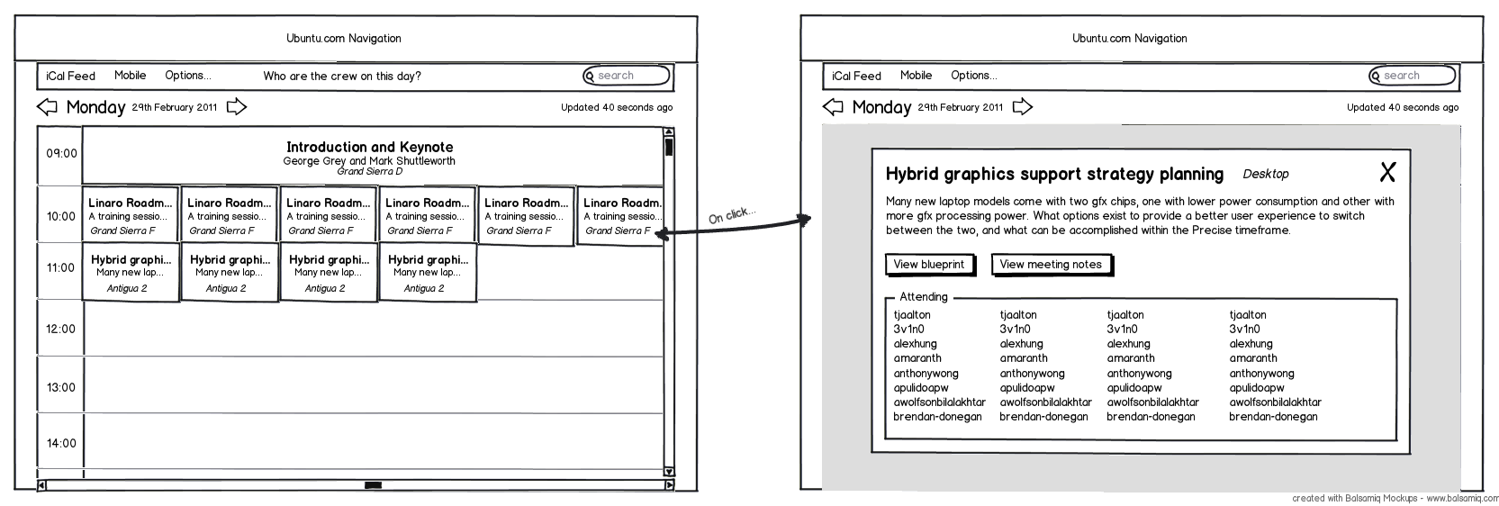
Schedule could use a re-design

Bug #888686 reported by Andrew
10
This bug affects 1 person
Affects Status Importance Assigned to Milestone
Summit
Triaged
High
Unassigned

Bug Description

The UDS Schedule Page could use some improvements.

Firstly the page is too wide and does not make great use of the space, with title and descriptions of sessions in many cases unreadable. Alignment of some content is off as well and the styling for 'meeting pods' does not fit with the Ubuntu theme.

It is also not clear how to access related content (i.e. the etherpad) and using Javascript we could condense all the schedules into one and allow a user to configure how it is displayed.

Relevant Bugs:
https://bugs.launchpad.net/summit/+bug/831674

Tags: design
Revision history for this message
Andrew (and471) wrote :

Here is my idea of what the schedule should be like

Changed in summit:
importance: Undecided → Critical
status: New → Confirmed
Revision history for this message
Nigel Babu (nigelbabu) wrote :

Hi Andy! Thanks for mock up, can you talk to johnoxton? He's helping us with a redesign of summit and you both working together would be so much win! On another note, I'm hijacking this bug for tracking our upcoming redesign.

Changed in summit:
importance: Critical → High
status: Confirmed → Triaged
Revision history for this message
Andrew (and471) wrote :

Hi guys, unfortunately I am a bit busy at the moment, however attached is an SVG of a more complete mockup which I made. Hopefully it may be of use to you :)

Revision history for this message
Chris Johnston (cjohnston) wrote :

What is your thought on the new agenda view:

http://summit.ubuntu.com/uds-p/2011-10-31/

The agenda view is designed for laptops/desktops/mobile devices. The monitors in the hallways will still display the old schedule.

Revision history for this message
Andrew (and471) wrote :

Cool! One thing I think it could use though is some better alignment above the list, and not have the list of attendees on hover, especially with large numbers of people, it becomes very awkward to use.

A popover that appears on click, when could then be closed would be a lot easier to use, IMHO. Also then you could make it larger, and avoid the problem of it not fitting on one screen.

tags: added: design
To post a comment you must log in.
This report contains Public information  
Everyone can see this information.

Other bug subscribers

Remote bug watches

Bug watches keep track of this bug in other bug trackers.