Suggestion to improve New dialog

Bug #1424547 reported by grofaty
6
This bug affects 1 person
Affects Status Importance Assigned to Milestone
Pinta
Fix Released
Medium
Miguel Fazenda

Bug Description

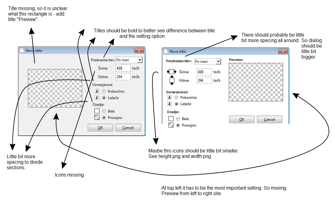
In Pinta 1.6 development New dialog (File | New) was added. But I think we can improve this design with little work.
Please see attachment for my suggestion.

P.S. Design change should also be checked on Linux (Ubuntu) beside Windows.

Revision history for this message
grofaty (grofaty) wrote :
Revision history for this message
grofaty (grofaty) wrote :
Revision history for this message
grofaty (grofaty) wrote :
Revision history for this message
grofaty (grofaty) wrote :

From above height.png and width.png I have created two little bit smaller icons and made them grey. Both changes to better fit the New dialog design.

Revision history for this message
grofaty (grofaty) wrote :
Revision history for this message
grofaty (grofaty) wrote :
Changed in pinta:
importance: Undecided → Medium
milestone: none → 1.7
status: New → Confirmed
Revision history for this message
Miguel Fazenda (migfaz-71) wrote :

I have made a pull request, making it close to your idea! https://github.com/PintaProject/Pinta/pull/99

Revision history for this message
grofaty (grofaty) wrote :

Miguel, thanks this looks better.

Room for improvement :)
- add spacing between settings (see my suggestion),
- add bold for titles (see my suggestion).

By the way what is the operating system for print-screens (in pull request)? Is it OS X? Font is so big. See my Windows print-screens where fonts are much smaller and much more pretty. Don't know if we can control this font size to be the same on all operating systems.

Revision history for this message
Miguel Fazenda (migfaz-71) wrote :

I added some spacing between options :D, it looks nice. http://i.imgur.com/knGKOsg.png

I'm not going to make the titles bold to maintain consistency throughout the program, the only dialog that I found that has text in bold is the print one that I think isn't implemented by the program but rather the OS. It isn't going to look good for the rest of the dialogs to be different, I think. I think it would be a main Pinta developer to decide that. Hope you understand.

About the font size, I am using Ubuntu Gnome 14.04. I don't think we can, or should, make the font look the same on all OSs, since that is chosen to look the same on all programs on the OS.

Sorry to have taken so long, I didn't see you replied. Do you have any other suggestions?

Changed in pinta:
assignee: nobody → Miguel Fazenda (migfaz-71)
status: Confirmed → In Progress
Revision history for this message
grofaty (grofaty) wrote :

Miguel, yes sure I understand final decisions are always by project maintainers - they decide this when they merge (or not merge) the code into official project. I don't have strong feelings about this new dialog design. I just made a suggestions and we should get the best compromise we can. Your work is appreciated, thanks for making product better.

I also agree we should make a look like it is suppose to be on operating system the program is running on. Despite this is going to be hard sometimes, for example there is File | Quit menu option, which is perfect on Linux, but on Windows there should be used File | Exit (but it is not). I am not saying we should be changing this menu option, just that developing for multiple platforms is not death simple. It may look good on one operating system and not so good on others.

Revision history for this message
Cameron White (cameronwhite91) wrote :
Changed in pinta:
status: In Progress → Fix Committed
grofaty (grofaty)
Changed in pinta:
status: Fix Committed → Fix Released
To post a comment you must log in.
This report contains Public information  
Everyone can see this information.

Other bug subscribers

Remote bug watches

Bug watches keep track of this bug in other bug trackers.