
Resume layout on mobile devices
| Affects | Status | Importance | Assigned to | Milestone | |
|---|---|---|---|---|---|
| Mahara |
Fix Released
|
Medium
|
Jono M | ||
Bug Description
Hi,
We are using a Mahara theme that adapts to screen resolutions / sizes, which especially targets mobile devices. The main content of the page is rendered within a narrow column.
The current layout of information in the resume page contains information that is rendered within a table. This table is too wide to fit in a narrow column when viewed on mobile devices. You can see this in the attached screenshot.
While the use of a table for the layout of information works on desktop and larger devices in a narrow column the rows are too long.
Is there any way to have a mobile specific template which could render the information in a narrow column friendly format? Perhaps as a series of lists rather than table rows?
If so where in the code would be a good place to start looking to implement such a template?
With thanks.
-Corey

| Changed in mahara: | |
| assignee: | nobody → Jono Mingard (mingard) |
| status: | New → Confirmed |
| status: | Confirmed → In Progress |
| Changed in mahara: | |
| milestone: | none → 1.9.0 |
| status: | In Progress → Fix Committed |
| tags: | added: usermanualupdate |
| Changed in mahara-manual: | |
| status: | New → Confirmed |
| importance: | Undecided → Medium |
| assignee: | nobody → Kristina Hoeppner (kris-hoeppner) |
| milestone: | none → 1.9.0 |
| Changed in mahara: | |
| status: | Fix Committed → Fix Released |
| tags: | removed: usermanualupdate |
| no longer affects: | mahara-manual |
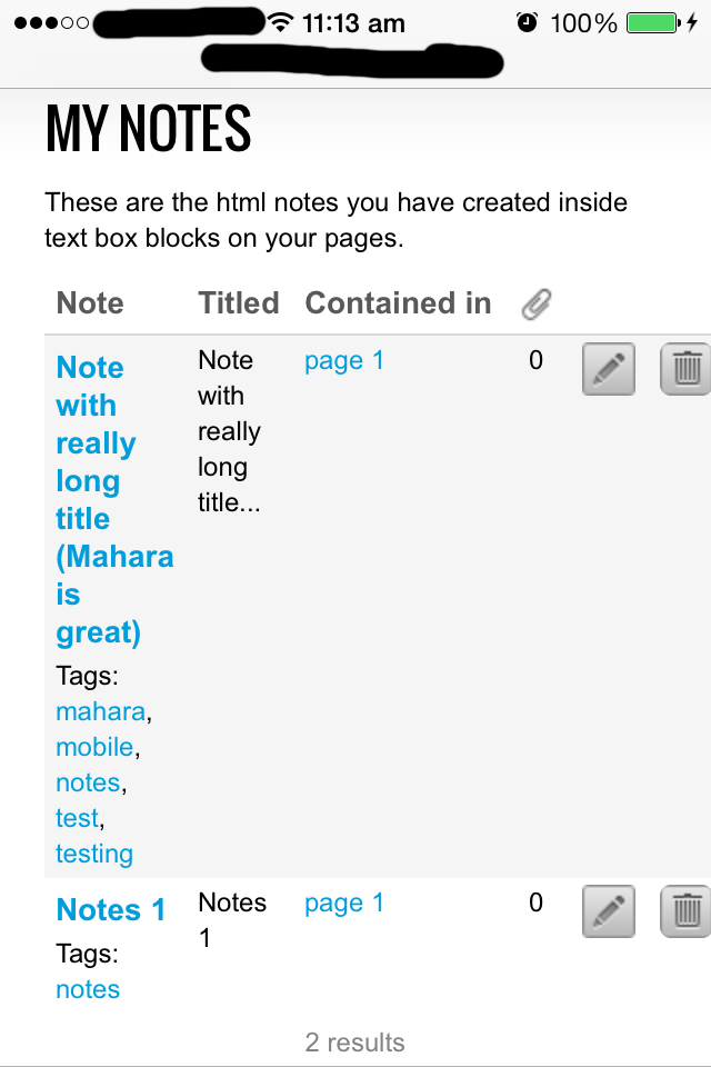
Please note that this issue also exists for the My Notes page. A screen shot is attached.
I believe this issue exists where any page uses a table to render content and that content is too big to fit in a narrow column theme that would be used for mobile devices.
Being able to change the template used for rendering such pages when displayed on a mobile theme would be very useful.