It would be nice to have an easier way to see a node's status (ready vs deployed vs whatever)
Bug #1386923 reported by
Jeff Lane
This bug affects 1 person
| Affects | Status | Importance | Assigned to | Milestone | |
|---|---|---|---|---|---|
| MAAS |
Fix Released
|
Medium
|
Unassigned | ||
Bug Description
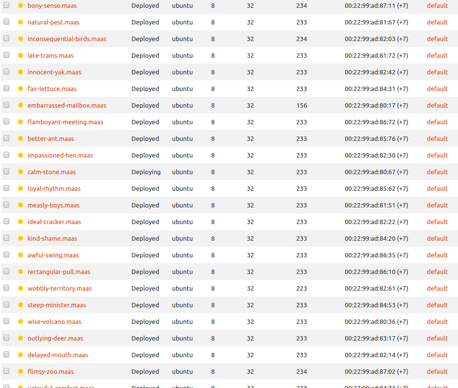
Specifically, when you're looking at nodes en masse on MAAS, looking through pages of 50 nodes each, the difference between "Deploying" and "Deployed" is difficult to see at a glance. The power status is easy, there are colored dots.
Check out the screen shot attached to this bug. Earlier I was skimming a list of 50 nodes for 1 single node in "deploying" state... it took me forever to figure out which one it was because it's so hard for me to see that one 'Deploying' amidst a field of 'Deployed's.
I don't know if colored balls are the answer, or mabye the status text color could change.. something tells me that a colored ball would look better.

To post a comment you must log in.
Heh, there are some awesome node names in there. innocent-yak made me think of Gavin :)
I have a few ideas for this:
1. Does it help if you sort the status column?
2. I am about to add a new search box that does proper searching. Would it help if it matched status text?
3. Ask Carla! :)