Error popup for the inline bugtask target edit widget looks horrible in Chromium
Bug #423151 reported by
Graham Binns
This bug affects 2 people
| Affects | Status | Importance | Assigned to | Milestone | |
|---|---|---|---|---|---|
| Launchpad itself |
Fix Released
|
High
|
Benji York | ||
Bug Description
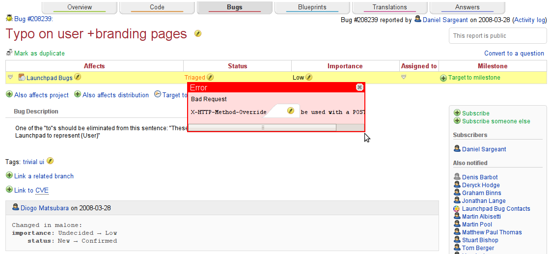
What happens:
When an error appears due to something going wrong with the inline bugtask target widget in Chromium, it appears in a red popup with a horizontal scrollbar. The popup appears *under* the edit icon for the bug description. Screenshot attached.
What should happen:
The error popup should be consistent with Launchpad's existing visual style and should be the topmost element on the page.
Related branches
lp:~benji/launchpad/bug-423151
- Benji York (community): Approve
-
Diff: 12 lines (+5/-0)1 file modifiedlib/canonical/launchpad/icing/style-3-0.css (+5/-0)

| affects: | launchpad → malone |
| tags: | added: ui-easy |
| tags: |
added: easy removed: ui-easy |
| Changed in launchpad: | |
| assignee: | nobody → Benji York (benji) |
| status: | Triaged → In Progress |
| tags: |
added: qa-ok removed: qa-needstesting |
| tags: | added: dublin |
| Changed in launchpad: | |
| status: | Fix Committed → Fix Released |
To post a comment you must log in.
This is part of the picker widget. I agree, it's not very pretty, but I don't think the priority is too High