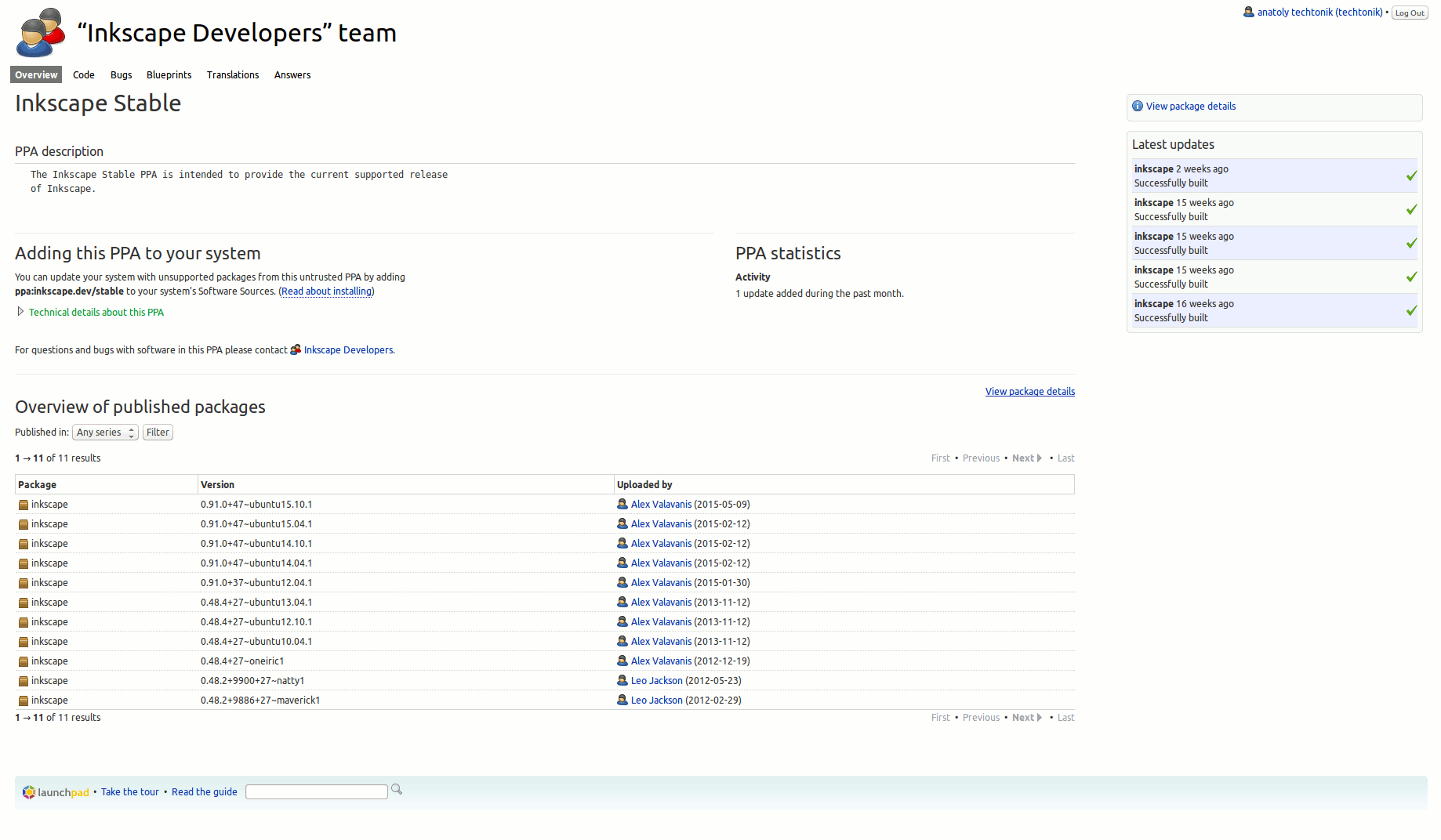
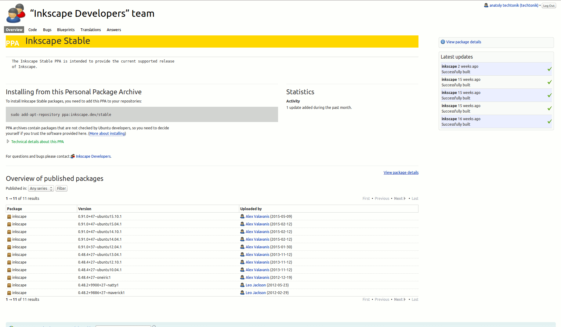
Better design for the PPA page
| Affects | Status | Importance | Assigned to | Milestone | |
|---|---|---|---|---|---|
| Launchpad itself |
New
|
Undecided
|
Unassigned | ||
Bug Description
For people who know that a PPA is and what is the process, current PPA
pages are far from meeting user expectations. Instead of just copy/paste
the commands to install stuff from this certain PPA I need to exercise
typing practice together with precision copy/paste jitsu.
So, I've made a few modification to make design more functional:
1. color code page to be PPA page
2. remove repeated and non-explained PPA word
(because now everything on that page is related to PPA)
3. moved the command that I, as advanced user need, to immediate visible page
Let me know what you think and if could be accepted as a patch.
More featurecreeping while I am at it (just need a place to record notes):
- add popup label to PPA header describing what a PPA is
- add link to copy/paste in one click
- and keyboard shortcut to focus and copy/paste
- show stats with barchart or timeline (or remove it at all)
- remove duplicate"View package details" navigation
- rename "Overview of published packages" --> "Personal archive contents"

| description: | updated |