Alternate fonts can look bad
| Affects | Status | Importance | Assigned to | Milestone | |
|---|---|---|---|---|---|
| Inkscape |
Invalid
|
Low
|
bbyak | ||
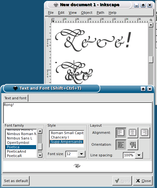
Bug Description
I have a "professional" PostScript font (Poetica) that has
alternate ampersands as well as other subtypes of fonts.
However, fontconfig lists them as having the same name, but
different "Styles." Now Inkscape is the only X application that
handles this even remotely right (I assume due to the work
against bug #904962), so the list of styles shows up correctly.
However, the width of the fonts is really messed up. I've
attached a screenshot so you can see the difference. I would
have added this report to #904962, but I couldn't figure out how
to attach a file to an old report.
The upper text is chosen as PoeticaAnd with style Supp
Ampersands (which I added to a fonts.cache-1 in my fonts
folder by hand, a trick I need for every other program). This
looks right.
The lower text is chosen as Poetica with Supp Ampersands.
You can see that it is suboptimally rendered. :)
Two other points:
The "Roman Small Capitals" style works as expected.
The "Chancery I" style is not displayed (so I added the
PoeticaR name), Instead the mangled "Supp Ampersands" is
displayed.
I'm not sure if the first one works because it's the first one, or
maybe because the name has "Roman" in it. I haven't tried
installing the Regular font.
Also, I get the same behavior when I disable my fonts-cache
hack, so it's not that.
Plus, I would like to say that I think that inkscape is an
incredible program. Once these font issues are sorted out, I'm
going to point to the way it's done here as "the" way to do it. It's
definately the closest!

| Changed in inkscape: | |
| assignee: | buliabyak-users → buliabyak |
| tags: | added: fonts |
I forgot to mention the version. I'm using 0.39.