Back button (most used) in Nautilus smaller than rest

Bug #390724 reported by Andy.hall06
16
This bug affects 1 person
Affects Status Importance Assigned to Milestone
One Hundred Papercuts
Fix Released
Low
Papercuts Ninjas
nautilus (Ubuntu)
Fix Released
Low
Ubuntu Desktop Bugs

Bug Description

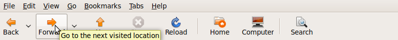
The back button in nautilus is much narrower than the forward button (and other buttons). It should arguably be bigger. It is used more often and is just good UI design to have it consistent with the size of the others at the very least.
See browsers as an example, when the buttons are not the same size, the back one is bigger.

Tags: nautilus
Revision history for this message
Pedro Villavicencio (pedro) wrote :

could you take an screenshot of the issue? IIRC that's a theme issue.

Changed in nautilus (Ubuntu):
assignee: nobody → Ubuntu Desktop Bugs (desktop-bugs)
importance: Undecided → Low
status: New → Incomplete
Revision history for this message
Andy.hall06 (andrew-hall06) wrote :

No not at all. Default theme, everything set to default. Do not disable text below icons (else you will not have the issue).
Keep everything default and you will see it.
A screenshot might not help much because you won't see the button borders/margins unless you hover over the buttons.

If you want, I could post 2 screenshots, one hovering over the back button and one hovering over any other button (like forward).
But you can check it out easily on your own install. It is 100% reproducible all the time.

Revision history for this message
Sebastien Bacher (seb128) wrote :

having screenshots would make the issue clearer

Revision history for this message
Andy.hall06 (andrew-hall06) wrote :
Revision history for this message
Andy.hall06 (andrew-hall06) wrote :
Revision history for this message
Andy.hall06 (andrew-hall06) wrote :
Revision history for this message
Andy.hall06 (andrew-hall06) wrote :

Sorry for multiple posts, could not figure out how to get multiple attachments in the same post. Anyway above I have posted the Up and forward buttons for comparison and this here is the back button. Default 'text below icons' and default themes (although I did not see it change in any of the 20+ themes I tried, the problem remains). Even redundant and useless buttons such as Home and Stop are bigger and the same size as the rest.

I mean seriously, a STOP button in a file manager? :D That too not combined with a reload button, is that some sort of easter egg or in-joke :D

Revision history for this message
Sebastien Bacher (seb128) wrote :

that's not really a bug but the buttons are adapted to the label, what else would you suggest?

Revision history for this message
Andy.hall06 (andrew-hall06) wrote :

No. Else the UP button should be even smaller. So it is not adapted to the label just like it isn't a theme issue, I tried a dozen themes, nothing fixed it and anyway, the default theme that matters has the issue as well.
If it is indeed adapted to the label, then it definately is a traditional bug since the adaptation is inconsistent (since the UP is so big)

Otherwise I agree its not a traditional bug but it is exactly the sort of issue the 100 bugs project is for.

Quoting From:
https://launchpad.net/hundredpapercuts

"- bugs that are system-wide (Nautilus, Gnome panel, etc), rather than app-specific (F-Spot, OOo, Terminal, etc.)
- bugs that impact standard workflows (like connecting to the network, copying files, browsing folders, etc.), rather than specialised or corner case workflows
- bugs that are easy to address, rather that ones that require significant design or development efforts
- issues with existing features, rather than requests for new features
- bugs that relate to usability and design (like size of the notification bubbles), rather than broken software (e.g. notifications flickering in fullscreen)"

Point by point:
-This is system wide and is to do with Nautilus as stated by first criteria
-It is to do with browsing folders as stated by second criteria
-It is easy to address as stated by third criteria, it won't take a re write or significant tweaking to fix, it's a very minor UI change
-It is to do with an existing feature as stated by fourth criteria
-It is precisely to do with usability AND design as stated by final criteria, besides, the example of the size of notification bubbles in amusingly analogous to this issue of size of the most used file browser button.

I would be hard pressed to find an issue that fits the stated criteria of the 100 bugs project better.

Revision history for this message
Andy.hall06 (andrew-hall06) wrote :

Look I am not on a personal crusade to get a bigger back button :D

It's just that when I saw this 100 bugs project, it made me think, this is EXACTLY what Ubuntu needed since its a little rough around the edges, these are the sort of things that affect the perception of people as to whether or not Ubuntu is a polished product.

Design consistency is a very basic design principle and one that everyone should be able to understand. The fact that right now it is inconsistent cannot be disputed for the reasons I have already outlined above.

But this issue is not only to do with design or UI, rather it is also a much bigger usability issue. See this to get all technical about the issue:

http://en.wikipedia.org/wiki/Fitts_law

To experienced UI designers, the current Nautilus window will immediately standout as wierd. It's not just that the back button is small, its more to do with the fact that it is smallER than the other buttons despite being one of the most important (if not the most important) on that toolbar. What further violates the law is that totally redundant or little used buttons such as STOP, RELOAD and HOME are much bigger than it. This is not just personal preference, the stop/reload buttons are fairly redundant in a file browser, they could become more important while browsing over the network (local or wide area) but even then they would never be used as often as BACK. Similarly HOME is made redundant by the side pane showing the file directory.

Hope that is sufficient detail to get this rectified in 9.10

Revision history for this message
Sebastien Bacher (seb128) wrote :

not sure why you think those buttons are not streched to fit the label but thet are, the up button is not the same widget since it doesn't have an arrow which opens a list next to it, the issue is not specific to nautilus other gkt applications using such button have the same behaviour, it would also look weird to have lot of spacing around the text there

Revision history for this message
Andy.hall06 (andrew-hall06) wrote :

If they indeed are, then that makes the issue worse, not better, because now it's bad design since it is by intention, not just an oversight. Like I explained above, this is not a matter of my personal preference but derived from basic principles of design. Why would it look weird to have similar sized buttons?? Design consistency will look weird?

That all GTK apps use such a system is not a defence, its not a good thing. Just for knowledge though, in which other app can I see the same behaviour? I haven't myself seen asymmetric back/forward buttons in other apps. EOG/Gthumb etc have equal sized ones but I guess that is because they do not have the drop down arrow next to them and no text to fit to either.

I don't use epiphany but looking at the screenshots, it follows the GNOME HIG closer than Firefox, and hence seems to suffer the same problem as Nautilus. I know a lot of people were pissed off about Firefox violating GNOME HIG but frankly, now I can see why they did that. Epiphany and the GNOME HIG seem to have never heard of Fitts law or of UI design in general, glad to know that Mozilla know its UI design and have violated the GNOME HIG for a very very good reason.

Revision history for this message
Andy.hall06 (andrew-hall06) wrote :

Because this seems to be going to and fro, let me just state a small fact and put this into perspective:

Right now the most important toolbar button (the one used most often) in Nautilus is also the smallest.
I mean not only is it not the same size as the rest, it is actually smaller!
For whatever reason that might be(GNOME HIG, consistency with other GTK apps etc)

Think about that for a second :D

Since you correctly point out that the scope of the problem is much bigger (GNOME HIG, GTK), I doubt it will be fixed now but lets not pretend it is ideal. It is quite simply and objectively, bad design.

Revision history for this message
Sebastien Bacher (seb128) wrote :

let's wait for the design team to comment, not sure if it's better to have consistant button look with extra spacing around the label or the button matching the label

Changed in nautilus (Ubuntu):
status: Incomplete → New
Revision history for this message
Vish (vish) wrote :

I'v added a edited version of the back button, it does, seem to have a better appearance...

And as Sebastien has said it seems the Back Button is smaller due to the stretch to fit...

Could a quick edit be ADDING 2 spaces in front of the word "Back" and 1 spaces behind... >
 like so " Back " ?
I'm not sure where to edit this, if someone could point me where the labels are set , i could try to check the hack...

Revision history for this message
Sebastien Bacher (seb128) wrote :

> Could a quick edit be ADDING 2 spaces

the workaround would work for english only, translations will have different labels

Revision history for this message
Andy.hall06 (andrew-hall06) wrote :

mac_v,

Your screenshot looks much much better than the default. The spacing too looks consistent.

I don't know how the actual code works and know nothing about programming, but from what I see at the UI level, the two drop down buttons are separate buttons (seem to be be even if they aren't) from the Back and Forward buttons. So why is BACK a separate widget from every other button like UP,HOME? It could be the same and the drop down arrow be separate.

Ideally a much better way of doing it would be to have only one single drop down arrow for both the BACK AND FORWARD. This is the method adopted in Firefox by Mozilla and numerous other File managers and Web browsers. It's merits are obvious, both the drop down currently show the same set cut into two pieces determined by where you currently are. In a single arrow implementation, it will show a full history with a radio button/dot to indicate where you currently are. '

Furthermore, the HOME button needs to go (the STOP and RELOAD are also fairly useless but can come into play when browsing files over the network, they could and should be combined however). All of this just increases productivity and more importantly space efficiency, which is very important for users with smaller screens which are now very popular due to this small little (pun intended) not-so-transient fad called........netbooks.

But since I can barely convince people of the current issue, I guess I better just leave all that alone :P

But wait! what is this:
https://bugs.launchpad.net/hundredpapercuts/+bug/386150

Wow, now THOSE are big changes, and it gets a CONFIRMED tag!
Does that mean it will be implemented in 9.10? :D
Lol and here I am pushing for a slightly larger back button.

Revision history for this message
Matthew Paul Thomas (mpt) wrote :

This is a valid bug. It is ugly for buttons to be nearly the same width but not quite: they should be either exactly the same width, or obviously and intentionally very different. This means that if you customize a toolbar (possible in other applications, but currently not in Nautilus) to add a button that has a label wider than any of those currently in the toolbar, the rest of the buttons should widen to match it.

I reported the equivalent bug in Mozilla in 2000 <https://bugzilla.mozilla.org/show_bug.cgi?id=60553>, and in Epiphany in 2005 <http://bugzilla.gnome.org/show_bug.cgi?id=169397>.

Changed in nautilus (Ubuntu):
status: New → Confirmed
Revision history for this message
Vish (vish) wrote :

Confirmed status: due to related Bug #386150

@Andy.hall06

Actually that is not my screenshot, it is an edit of Your screenshot ;p...

I'v seen the other Bug too, hopefully this will be in the same milestone as that...
 since papercuts team seems to be doing bugs related to same apps in a single milestone... :)

Changed in hundredpapercuts:
status: New → Confirmed
Revision history for this message
Andy.hall06 (andrew-hall06) wrote :

Lol, yeah I know. I meant your work modifying it is great.

I have another usability question. If GNOME has so designed Nautilus that the button wraps around the text, what the hell happens when in some non-English language, the back and forward words are so mismatched that one is very long and one is very short? Does one button then look twice as big as the other? Further evidence of bad design!
Ideally, the buttons would be identical and then you would adjust whatever is to be displayed accordingly. Ultimately the button and it's icon are the important things [universal to understand], the text is just there for new users and to improve usability.

Revision history for this message
Vish (vish) wrote :

Also i tried hacking
/usr/share/nautilus/ui/nautilus-navigation-window-ui.xml
[this file can be used to change the nautilus toolbar layout]

For some reason , changing the label here, doesnt seem to work... need to look deeper

Revision history for this message
Sebastien Bacher (seb128) wrote :

Andy you seem very interested in this small usability issue but you generated enough comment to clearly state your opinion by now so it would be time to stop there and let people do work next, stating the same things again and again will only spam people by email and annoy them

that said I'm not convinced that having lot of padding and empty space on each side of the label in locales where the wording is very different for previous and next would be better looking that having buttons fitting the label

Revision history for this message
Andy.hall06 (andrew-hall06) wrote :

Well I had too. You still don't seem to understand that this is not a subjective issue based on my perception. Its an objective design flaw.

I just tested some other GTK apps and this issue could not get funnier. In Eye of Gnome, you have a customisable toolbar. Try dragging a button with a long name (such as properties, slideshow, show last) and see what happens. ALL the buttons readjust their size in order to be the same size as the largest button. So the button wraps around the text of the largest button and all the others adjust to that largest size for consistency. Works much better than Nautilus. Earlier I thought maybe the GNOME HIG were flawed, but certainly the discrepancy between EoG and Nautilus means one of them isn't following the guidelines. So definitely a bug and not my "opinion". With you buttons to fit labels paradigm, you could potentially have all buttons of different sizes. That would certainly be a nightmare. I have nothing further to say. No more "spam" from this end.

Revision history for this message
Sebastien Bacher (seb128) wrote :

having all buttons identic means that you can easily have button not fitting on the toolbar if one label is a long word in your locale though

Vish (vish)
Changed in hundredpapercuts:
status: Confirmed → Triaged
importance: Undecided → Low
Revision history for this message
Vish (vish) wrote :

Marcus , could you take a shot at this?

Changed in hundredpapercuts:
assignee: nobody → Marcus Carlson (0-launchpad-mejlamej-nu)
Revision history for this message
Marcus Carlson (0-launchpad-mejlamej-nu) wrote :

I've tried setting both back and forward to homogeneous but it didn't help (not sure why, no warnings/error - nothing). And forcing the button to a specific width would create more problem (icons only, text besides icons, different theme/language/font etc) than it would solve. So at the moment I'm out of ideas.

Changed in hundredpapercuts:
assignee: Marcus Carlson (0-launchpad-mejlamej-nu) → nobody
Changed in nautilus (Ubuntu):
status: Confirmed → Triaged
Vish (vish)
tags: added: nautilus
Changed in hundredpapercuts:
assignee: nobody → Papercuts Ninja (papercuts-ninja)
Revision history for this message
Timothy Arceri (t-fridey) wrote :

In nautilus 3.1.4 this is no longer an issue as the back/forward buttons no longer have text and are the same size. Marking as fix released as is no longer an issue in Oneiric.

Changed in hundredpapercuts:
status: Triaged → Fix Released
Changed in nautilus (Ubuntu):
status: Triaged → Fix Released
To post a comment you must log in.
This report contains Public information  
Everyone can see this information.

Other bug subscribers

Remote bug watches

Bug watches keep track of this bug in other bug trackers.