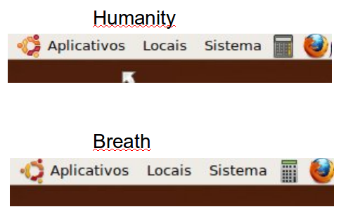
Ubuntu icon doesnt look good in humanity

Bug #437379 reported by Benjamim Gois
10
This bug affects 2 people
Affects Status Importance Assigned to Milestone
Humanity
Fix Released
Undecided
Unassigned

Bug Description

The ubuntu icon that appears on the top left corner of the screen doesn't look very good. The one used on Breath gives a much better and modern look.

Revision history for this message
Benjamim Gois (benjamim-gois) wrote :
Revision history for this message
SolidSteel144 (milesrdz) wrote :

That or the original icon used with Human. The current one used in this them seems thick in my opinion.

Revision history for this message
Benjamim Gois (benjamim-gois) wrote :

I guess that a image spoke more than 1000 words. Check the comparison.?field.comment=I guess that a image spoke more than 1000 words. Check the comparison.?field.comment=I guess that a image spoke more than 1000 words. Check the comparison.

Revision history for this message
Vish (vish) wrote :

Fixed in rev 347

Changed in humanity:
status: New → Fix Released
Revision history for this message
Vish (vish) wrote :

@Benjamim Gois Ildefonso da Silva ,
the images you attach are not clear , use png format to save images. Its not only in this bug , but in the other bugs too :)
It becomes difficult to understand when the image is so pixelated ;)

Revision history for this message
Mat Tomaszewski (mat.t.) wrote :

Please do not release the fix yet. It is not a trivial change and needs more consideration.

Revision history for this message
Benjamim Gois (benjamim-gois) wrote :

Sorry mac_v, my mistake. I'm uploading a new image.

Revision history for this message
scholli (scholli-tz) wrote :

The best is to take the pretty PNG-Ubuntu-Logo from the Human-Icon-Theme and insert it in a new SVG //or// rename simply the PNG-Ubuntu-Logo form the Human-Theme from "start-here.png" to "start-here.svg". This is a quick solution till a new and very good Ubuntu-Distribution-Logo is made in SVG.

But of course, till to the final of Karmic Koala we have still 3 weeks. Maybe enough time for improve the start-here.svg I made for Breathe since a time... Improve!, because I think still it isn't perfect.

Revision history for this message
scholli (scholli-tz) wrote :

Okay I draw a Ubuntu-Distribution-Logo in 24x24. It's smaller and near to the original in big. If you think that a light-grey and transparent outline around it would be better, so I can do it. Even in 22x22 adjusted version, too.

Please test it and tell me what you think about.

Revision history for this message
Benjamim Gois (benjamim-gois) wrote :

Hey scrolli, that's very nice. But i still think that a light-grey and transparent outline around, just like the original one on breath-icon-theme would be even better. Great job dude !

Revision history for this message
scholli (scholli-tz) wrote :

Think about that this one I made for Breathe since a time uses blurred shadows and thinks that don't fits really with this Set. The light-grey and transparent outline is for the missing place impossible. So this is now my finished propose I will submit now. I made them for 24 and 22. Hope that the elementary-art-team like it. Before discarding please make a test. Thanks.

To post a comment you must log in.
This report contains Public information  
Everyone can see this information.

Other bug subscribers

Remote bug watches

Bug watches keep track of this bug in other bug trackers.