
Wishlist: shadows for dropdowns and active tabs
Bug #2057432 reported by
Stephanie Leary
This bug affects 1 person
| Affects | Status | Importance | Assigned to | Milestone | |
|---|---|---|---|---|---|
| Evergreen |
Fix Committed
|
Wishlist
|
Unassigned | ||
Bug Description
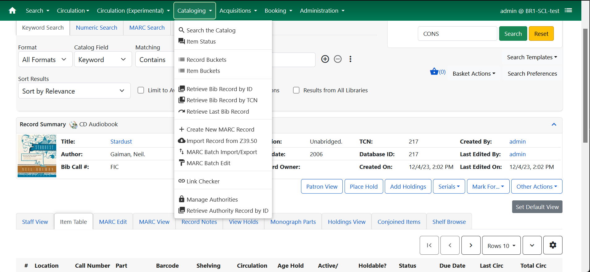
It can be hard to distinguish dropdown menus from the contents of the page behind them, especially over grids. It would help if the dropdowns had shadows, to make it clearer that they are layered on top of the page content.
Shadows and borders would also be nice on tabs, to help distinguish the active tab from the inactive ones.

To post a comment you must log in.
Branch adding shadows to both the dropdowns and tabs, and tightening up the tab spacing a little (since they're easier to tell apart when they have borders): https:/
Screenshot attached, showing how this looks in the nav menu and the catalog record tabs.