
Depth Drop Down Menu in Create Patron Note Doesn't Display Well In Some Cases
Bug #1980874 reported by
Jennifer Pringle
This bug affects 2 people
| Affects | Status | Importance | Assigned to | Milestone | |
|---|---|---|---|---|---|
| Evergreen |
Fix Released
|
Medium
|
Unassigned | ||
| 3.9 |
Fix Released
|
Medium
|
Unassigned | ||
Bug Description
Evergreen 3.9
Chrome
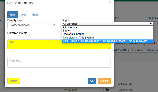
The drop down menu for Depth in the new Create Note in the Notes tab of the patron account does not handle multiple org unit types at that same depth.
In our consortium we have Branch, Bookmobile, Reading Room, and Sub-System all at the same level. The drop down menu handles this by sticking quite far out the side of the pop-up. (See screenshots)
Ideally the notes depth menu text would wrap to stay within the pop-up or if possible be able to tell which org unit type(s) was relevant to the workstation and only display those. (ie. if the org unit doesn't have a bookmobile don't include bookmobile in the list).

| Changed in evergreen: | |
| status: | New → Confirmed |
| tags: | added: usability |
| Changed in evergreen: | |
| importance: | Undecided → Medium |
| milestone: | none → 3.10.1 |
| tags: | added: signedoff |
| Changed in evergreen: | |
| status: | Fix Committed → Fix Released |
To post a comment you must log in.
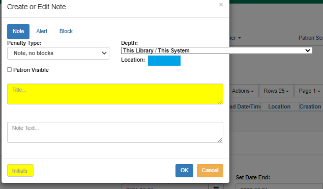
We can prevent the longer labels from overflowing the modal when the <select> is closed. Unfortunately, we can't prevent the individual options from overflowing when the dropdown is open. The <option> tag has almost no CSS support other than color and background-color, so all the properties that would be useful here do not work: width, max-width, overflow, word-wrap, and overflow-wrap are all unsupported.
Unless we want to turn this field into a combobox, this is as good as it gets.
Branch here:
https:/