Create more obvious (and stylish?) focus indicators

Bug #1828463 reported by Jane Sandberg
14
This bug affects 3 people
Affects Status Importance Assigned to Milestone
Evergreen
Fix Released
Medium
Unassigned
3.11
Fix Released
Medium
Unassigned

Bug Description

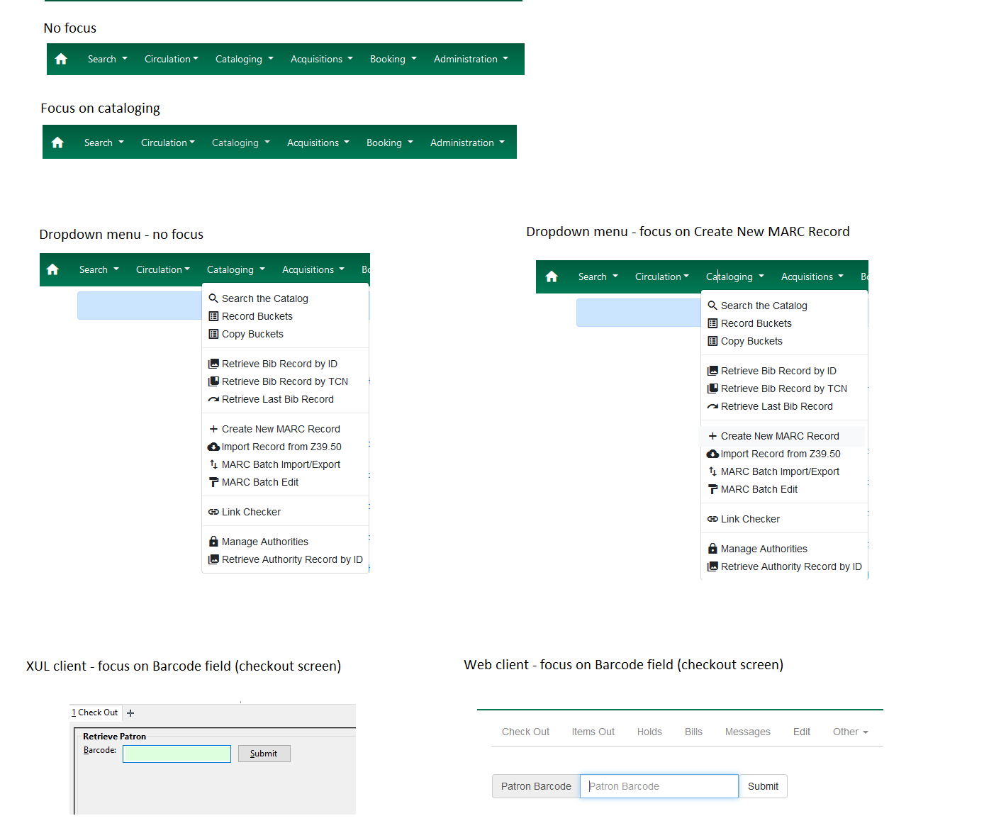
The web browser's default focus indicators are difficult to see in many parts of the Web client, such as the dark green navbar.

See also this article from Deque: https://www.deque.com/blog/give-site-focus-tips-designing-usable-focus-indicators/

Revision history for this message
Eva Cerninakova (ece) wrote :

This applies not only to the dark green menu, but also drop-down menus (see the attachment).

I also liked the light green focus that used to be applied the barcode fields, MARC subfields etc. in the XUL client. I know the light blue frame used for focus in the web client is standard, but the light green field background was much more noticeable.

Changed in evergreen:
status: New → Confirmed
Revision history for this message
Meg Stroup (mstroup) wrote :

I've also had some feedback that it is easy to lose your place when editing a MARC record

I am attaching a screenshot showing keyboard focus in MARC 100 $a. The pale blue/dark gray is visually challenging [screenshot attached].

Revision history for this message
Eva Cerninakova (ece) wrote :

I strongly agree that the contrast of the active field in the Marc editor should be much greater than it is now (the green background in XUL client used to be helpful).

Revision history for this message
Eva Cerninakova (ece) wrote :

I have another comment from our staff - not related exactly to focus but to the contrast of the interface:
Some staff pointed, that it is hard to see, which card in the MARC record is currently being used; they would like the active card to be more distinctly distinguished than just by the gray frame (see the attachment).

tags: added: usability
tags: removed: webstaffclient
Revision history for this message
Stephanie Leary (stephanieleary) wrote (last edit ):

Here's a branch that bumps up the opacity of the blue focus outlines to 75% (from Bootstrap's default 25%) and changes the nav bar's focus outline color to yellow for better contrast against the green.

https://git.evergreen-ils.org/?p=working/Evergreen.git;a=shortlog;h=refs/heads/user/sleary/LP1828463-bolder-focus-outlines

To test:

1. You'll need to have your browser set up for keyboard testing if you don't already: https://wiki.evergreen-ils.org/doku.php?id=accessibility:testing#testing_keyboard_navigation
2. Focus on your browser's address bar and then press tab until you get past your toolbar buttons. You should start to see the nav menu items outlined in yellow.
3. Keep tabbing until you reach something else that can be focused, like a form input. It should be outlined in bright blue.

Most outlines hug their contents, but I spaced out the checkbox outline a little. Let me know what you think of this, and if you spot anything else that needs its spacing or color tweaked.

tags: added: pullrequest
tags: added: ux-keyboard
Revision history for this message
Galen Charlton (gmc) wrote :

Signoff pushed to user/gmcharlt/lp1828463_signoff. This includes a follow-up to align the focus outline styling of buttons that happen to be dropdown items with dropdown items that are anchors.

tags: added: signedoff
Changed in evergreen:
status: Confirmed → Fix Committed
importance: Undecided → Medium
milestone: none → 3.12.3
Revision history for this message
Jane Sandberg (sandbergja) wrote :

Thanks, Stephanie and Galen! This is a big improvement. I've pushed the two commits to rel_3_11 and above.

Two notes for posterity's sake:
* Meg's comment #2 inspired me to try this patch out in the MARC editor. It's now a lot easier to see which field you're in, but the focus indicator is often partially covered up by other fields. I know that there's a new MARC editor coming soon, though, so I don't think it's urgent to look into that issue in the current one -- it's still a big improvement!
* This only improves the Angular screens, the focus indicator in Angularjs screens is still not obvious or stylish.

Revision history for this message
Stephanie Leary (stephanieleary) wrote :

Thanks, Jane! This will indeed be included in the revised MARC editor.

Changed in evergreen:
status: Fix Committed → Fix Released
To post a comment you must log in.
This report contains Public information  
Everyone can see this information.

Other bug subscribers

Remote bug watches

Bug watches keep track of this bug in other bug trackers.