
Consistent styles required for header text in web client
| Affects | Status | Importance | Assigned to | Milestone | |
|---|---|---|---|---|---|
| Evergreen |
Fix Released
|
Medium
|
Unassigned | ||
| 3.1 |
Won't Fix
|
Medium
|
Unassigned | ||
| 3.2 |
Won't Fix
|
Medium
|
Unassigned | ||
| 3.3 |
Won't Fix
|
Medium
|
Unassigned | ||
| 3.4 |
Fix Released
|
Medium
|
Unassigned | ||
Bug Description
In the web client interfaces, we're already seeing some inconsistencies in the way we display text that acts as a heading.
Several interfaces use a heading where the text is styled using the alert-info class. This class provides a light blue background with a font that is darker blue. You can see these headings in:
* Check In
* Pull List for Holds Request
* Renew Items
* Pending Patrons
* Holds Shelf
* Scan Items as Missing Pieces
We have one interface - Verify Credentials - which wraps its heading in <legend> tags.
Another interface - In-House Use - uses a class of eg-grid-
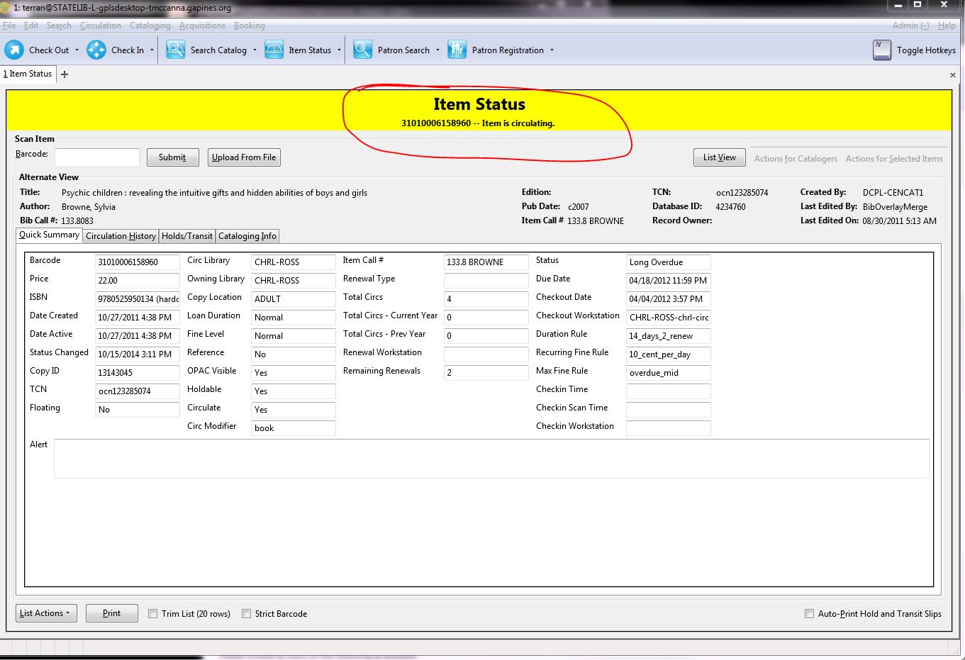
Two interfaces use the <h2> tag for its headings:
* Item Status
* Replace Barcode
Looking at webby, there are a few cataloging interfaces that don't have text that serve as a heading:
* Copy/Record buckets
* Retrieve Record by ID
* Retrieve Record by TCN
I'm not considering Dojo interfaces at this time since I would expect those interfaces to be inconsistent. I also am not considering the patron search/record at this time, but we may want to revisit it in the future.
I suggest that all of these interfaces should have headings and that the style should be consistent from one interface to another.
I can work on the code to do so, but I first want to make sure I'm heading in the right direction.
Can we all rally around the style with the light blue background / blue font as a starting point for the style?
Also, to provide some semantic structure to the page, no matter what the style, I would like to wrap all of these headings in <h2> tags. Any objections?
| Changed in evergreen: | |
| assignee: | nobody → Kathy Lussier (klussier) |

| tags: | added: ui |
| Changed in evergreen: | |
| status: | New → Confirmed |
| tags: | added: accessibility |
| Changed in evergreen: | |
| assignee: | Jane Sandberg (sandbej) → nobody |
| Changed in evergreen: | |
| milestone: | none → 3.3.4 |
| Changed in evergreen: | |
| milestone: | 3.3.4 → 3.3.5 |
| Changed in evergreen: | |
| milestone: | 3.3.5 → 3.4.2 |
| Changed in evergreen: | |
| milestone: | 3.4.2 → 3.4.3 |
| tags: | added: signedoff |
| Changed in evergreen: | |
| milestone: | 3.4.3 → 3.4.4 |
| Changed in evergreen: | |
| milestone: | 3.4.4 → 3.5.1 |
| Changed in evergreen: | |
| status: | Fix Committed → Fix Released |
I'd like to expand this to include more consistent page headers in general from screen to screen so that it's easier for staff to know where they are (and also to report problems when they run across them).
For instance, on the Item Status page in the web client, it does not display a page title and the "Scan Item" text is so large that it looks like a page title. The regular staff client clearly shows the "Item Status" title as well as the barcode number and current status (see screenshot).