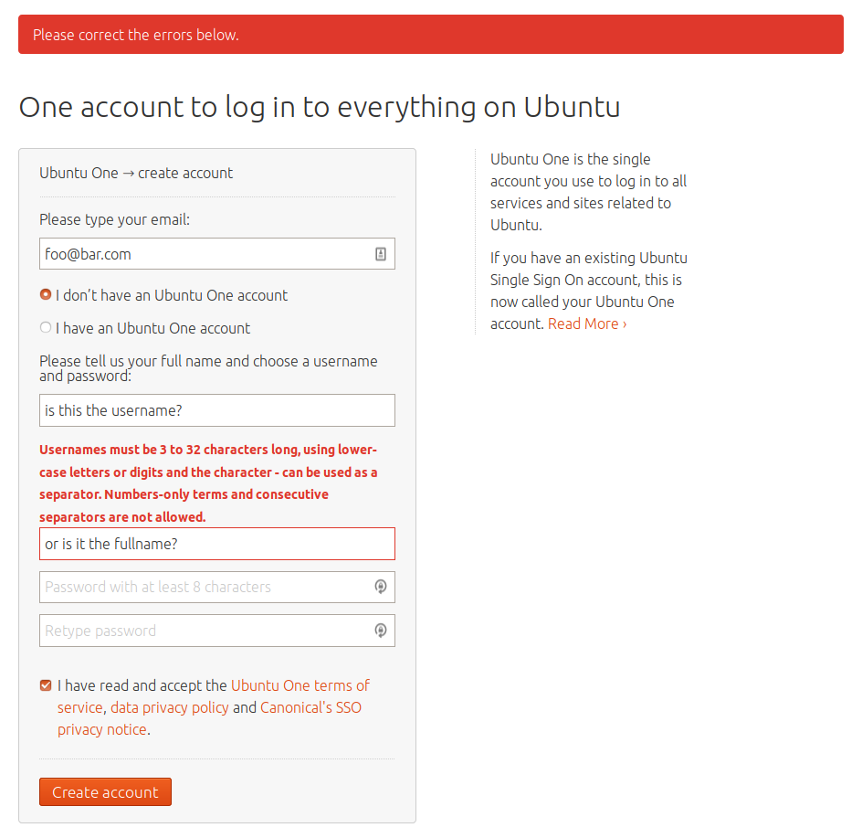
Username/Fullname field labels disappear when stuff is typed into the field, confuse people when they have errors
| Affects | Status | Importance | Assigned to | Milestone | |
|---|---|---|---|---|---|
| Canonical SSO provider |
Fix Released
|
Undecided
|
Matias Bordese | ||
Bug Description
In the registration form, the username and full name fields don't have proper labels; instead, the name of the field appears *inside* the field, greyed out, and disappears entirely when people type in it.
Often, people will input an invalid username (since username specs are pretty strict) and get an error describing the required format. Unfortunately, the error appears *between* the username and full name fields, and because at this point both fields have content, the labels are not visible; as a result, people correct the *wrong* field and get frustrated (read: come complaining in the SSO support e-mail address) about being unable to fix their usernames even after multiple attempts (because at this point they're changing the full name).
The provided screenshots show a pristine form, and a form with both fields filled out, and the error between them, to illustrate the problems.
What we could do:
- Add proper labels to each field.
- See if there's a way to more closely visually tie the error to the field it refers to.
- Something else? maybe js or "pattern" validation that could trigger at field blur time and alert right then/there with a nice arrow pointing to the field? (https:/
Related branches
- Daniel Manrique (community): Approve
- Maximiliano Bertacchini: Approve
-
Diff: 208 lines (+38/-22)6 files modifiedsrc/api/v20/tests/test_handlers.py (+8/-4)
src/api/v20/tests/test_registration.py (+10/-5)
src/identityprovider/forms.py (+7/-6)
src/identityprovider/tests/test_forms.py (+6/-3)
src/webui/tests/test_views_account.py (+4/-2)
src/webui/tests/test_views_registration.py (+3/-2)

| Changed in canonical-identity-provider: | |
| assignee: | nobody → Matias Bordese (matiasb) |
| status: | New → Fix Committed |
| Changed in canonical-identity-provider: | |
| status: | Fix Committed → Fix Released |
The merged change makes the error less ambiguous by repeating the input. Unfortunately that makes an already-wordy error message even longer. And it doesn’t help if someone, quite reasonably, enters the same text in the full-name and user-name fields.
Ambiguous error states are just one of the many problems with placing field labels inside fields. (Others include unfilled fields being less noticeable, looking disabled when you do notice them, and/or looking as if you need to delete the label before entering your own text.) So I’d support your first suggestion of giving proper labels to each field. Your second suggestion would help too, specifically placing every error message below the relevant field rather than above it.