Fill Stroke : Minor visual enhancements

Bug #950508 reported by John Smith
6
This bug affects 1 person
Affects Status Importance Assigned to Milestone
Inkscape
Fix Released
Wishlist
John Smith

Bug Description

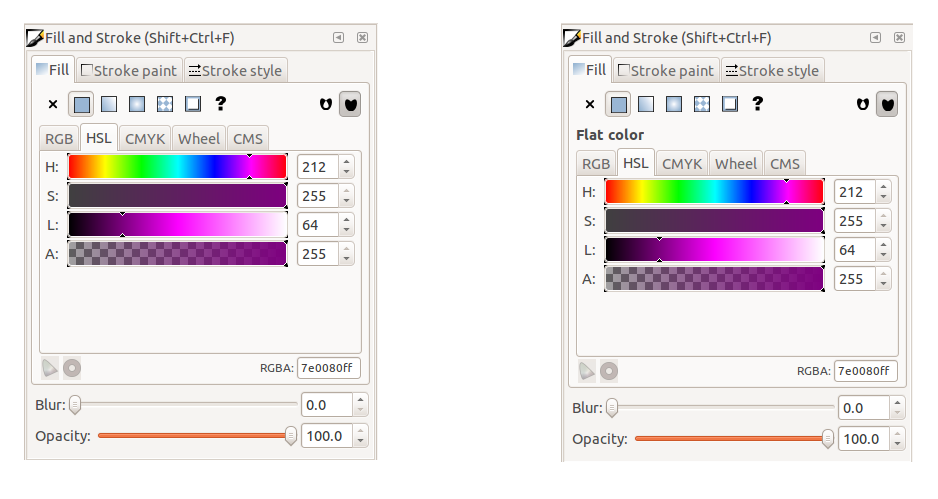
Small changes to Fill and Stroke:
* Replace "Flat Color" frame with a label
* Align the labels for Blur and Opacity with the controls. Match spin controls size.

Tags: ui
Revision history for this message
John Smith (john-smithi) wrote :
Changed in inkscape:
assignee: nobody → John Smith (john-smithi)
su_v (suv-lp)
Changed in inkscape:
importance: Undecided → Wishlist
status: New → Confirmed
Revision history for this message
su_v (suv-lp) wrote :

Just a minor detail/question about the alignment of the label: AFAICT Inkscape does not make use of center-aligned labels / sub-headers elsewhere in dialogs. Doesn't the proposed centered alignment of the label introduce new inconsistencies between this and other dialog layouts?

Revision history for this message
Kris (kris-degussem) wrote :

Everything for consistency in the dialogs I would say. Moving the "Flat color" label renders the UI indeed inconsistent and center aligned labels are also not frequently used in other programs as well.
So, I would keep the "Flat color" label as it is and move the opacity widgets as proposed.

Other option, we could also drop the label. From the buttons we know the fill type and if no object is selected, als child widgets should be disabled/grayed out anyway for consistency (which is currently not the case for the opacity label).

Revision history for this message
John Smith (john-smithi) wrote :

>centered alignment of the label introduce new inconsistencies
Yes you are absolutely right ~suv!

Attached is a comparison with left aligned label and without label.
Only small concern without a label is that "Radial gradient" may be slightly confusing since the drop-down list of gradients are usually called "linerGradient123".

Which do you prefer ?

Revision history for this message
su_v (suv-lp) wrote :

> Which do you prefer ?

Personally, I have no real need for the (redundant) label, but I'm a bit concerned about new and casual Inkscape users (more than slight confusion with regard to linear|radial gradient and custom swatches (which can be a gradient as well)). I'd vote to keep some kind of label for now (but drop the frame in favour of minimal padding instead).

Revision history for this message
ScislaC (scislac) wrote :

I just want to throw out there that it is odd to me to see the spinboxes match in size, but not the sliders...

Revision history for this message
ScislaC (scislac) wrote :

I forgot to also bring up... John, have you played with GIMP 2.7.x series and checked out their revamped sliders (or darktable for that matter)? It might be worth exploring them instead (or at some point at least). You can make them jump to specific positions, slide them, click in to for numeric input, etc.

Revision history for this message
John Smith (john-smithi) wrote :

@suv - I suggest we leave the labels there for now, to avoid any confusion for users.

@ScislaC - Cant get the sliders to line up perfectly since blur/opacity are in different widgets, so cant align them in a table. But we can get pretty close with some padding.

Revision history for this message
Kris (kris-degussem) wrote :

Just discovered this unused file on the wiki:
http://wiki.inkscape.org/wiki/index.php/File:Mockup.svgz
File is not shown in firefox directly, I richtclicked on the Mockup.svgz‎ link to save the file to disk. This svg describes a UI proposal for gradient library in the fill and stroke dialog.

Revision history for this message
su_v (suv-lp) wrote :

> Just discovered this unused file on the wiki:

AFAICT this is not an "unused" file, but was uploaded there in the context of this discussion from 2007 on the mailing list:
<http://thread.gmane.org/gmane.comp.graphics.inkscape.devel/21191>

Revision history for this message
John Smith (john-smithi) wrote :

Good find Kris.
Perhaps this should be added to the discussion on Gradient window improvements.

Bug #722017 - UI - Better Gradient Window
https://blueprints.launchpad.net/inkscape/+spec/ui-gradient-window

Revision history for this message
John Smith (john-smithi) wrote :

I have committed this as r11090 to the trunk.
Please let me know if you see any alignment issues on your platform.

Changed in inkscape:
status: Confirmed → Fix Committed
Revision history for this message
Kris (kris-degussem) wrote :

Unfortunately there are: see attach (vista 64 bit, in Dutch).
The lower label in Dutch is wider and is not shown completely in both undocked and docked state.

Revision history for this message
John Smith (john-smithi) wrote :

@Kris, sorry about that, r11093 should fix this.
The labels now expand when needed.

Revision history for this message
su_v (suv-lp) wrote :

>>> Please let me know if you see any alignment issues on your platform.
>> The lower label in Dutch is wider and is not shown completely
> The labels now expand when needed.

Now the labels / widgets no longer align vertically.

Naive question: Couldn't a 'GtkSizeGroup' be used to vertically align the labels and widgets even if they are not packed inside a table?

(from the example 'Size Groups' in the gtk-demo app:
«GtkSizeGroup provides a mechanism for grouping a number of widgets together so they all request the same amount of space. This is typically useful when you want a column of widgets to have the same size, but you can't use a GtkTable widget.»)

Revision history for this message
John Smith (john-smithi) wrote :

@suv, thanks for the tip, i didnt know about the GtkSizeGroup.

r11104 should finally have the blur and opacity labels aligned.
Tested on Ubuntu 11.10 and WIndows 7.

su_v (suv-lp)
Changed in inkscape:
milestone: none → 0.49
Bryce Harrington (bryce)
Changed in inkscape:
status: Fix Committed → Fix Released
To post a comment you must log in.
This report contains Public information  
Everyone can see this information.

Other bug subscribers

Remote bug watches

Bug watches keep track of this bug in other bug trackers.