
libreoffice icons looks so oldish in the unity launcher
Bug #935650 reported by
Marco Trevisan (Treviño)
This bug affects 1 person
| Affects | Status | Importance | Assigned to | Milestone | |
|---|---|---|---|---|---|
| Ayatana Design |
New
|
Undecided
|
Unassigned | ||
| libreoffice (Ubuntu) |
Opinion
|
Undecided
|
Unassigned | ||
Bug Description
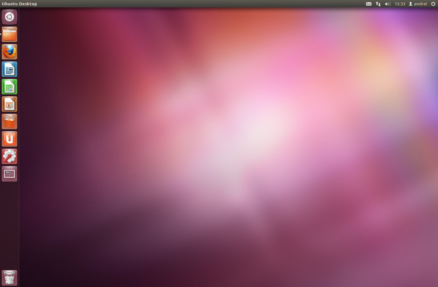
We ship the libreoffice icons by default in the unity launcher, but they look really so oldish and inconsistent with the rest of the system. They totally need to be replaced with something better.

| Changed in libreoffice (Ubuntu): | |
| status: | Incomplete → Opinion |
To post a comment you must log in.
Could you please attach a screenshot to confirm the icons you mean and what is wrong with them.
What better options could you suggest?