
HUD options displayed is difficult to read if background is white
| Affects | Status | Importance | Assigned to | Milestone | |
|---|---|---|---|---|---|
| unity (Ubuntu) |
Incomplete
|
Undecided
|
Unassigned | ||
Bug Description
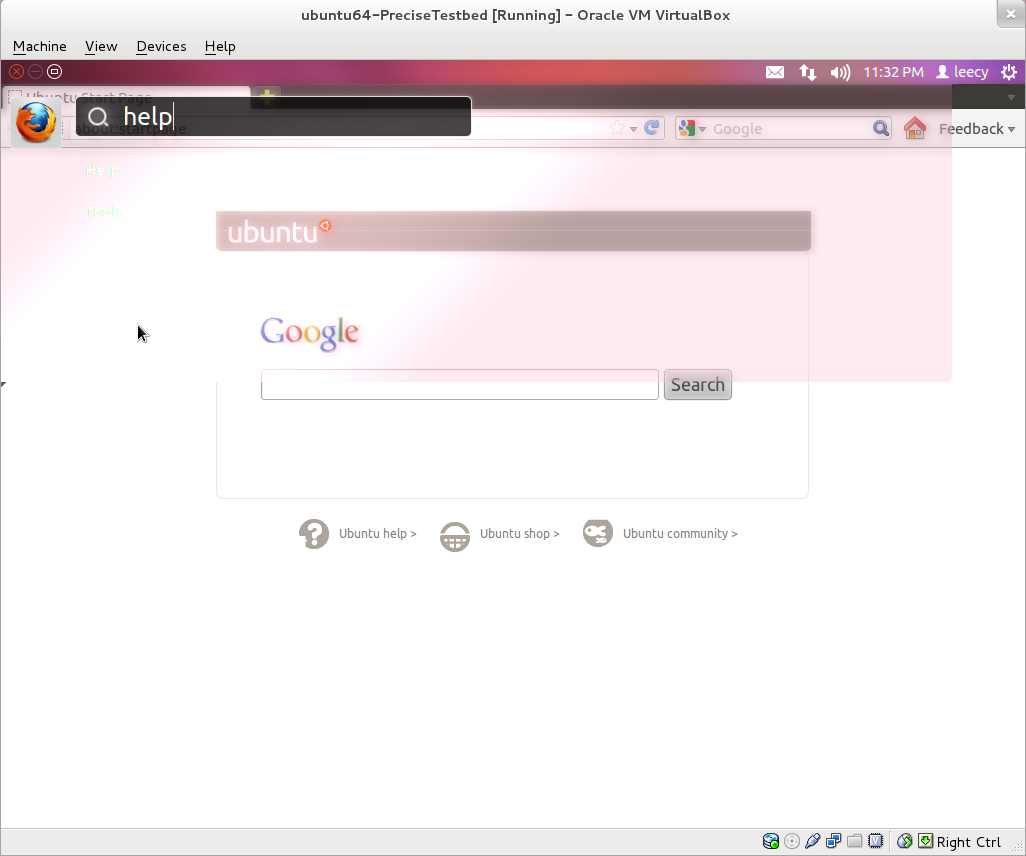
The HUD options text is in white with a lightly blurred brown background.
This is not really acceptable if the application running in background is showing a white patch area and the HUD options happen to overlap with that area (see attached screenshot for example).
I propose the background of the HUD be made less transparent and in a darker shade of brown. Either that or the options displayed is outlined with a black border, and the typeface be made a little bigger. These options can also be combined to improve readability.
lsb_release:
Description: Ubuntu precise (development branch)
Release : 12.04
apt-cache:
unity:
Installed: 5.1.0-hud2
Candidate: 5.1.0-hud2
Version table:
*** 5.1.0-hud2 0
500 http://
100 /var/lib/
5.0.0-ubuntu3 0
500 http://

Thank you for taking time in filing the bug to make ubuntu better.
here i am not be able to reproduce it.see the screenshot.