Dialog appearance is inconsistent with GNOME conventions
Bug #892329 reported by
Jack Gandy
This bug affects 1 person
| Affects | Status | Importance | Assigned to | Milestone | |
|---|---|---|---|---|---|
| Eina |
Fix Released
|
Medium
|
L.Lopez | ||
Bug Description
Eina seems to have the opposite behavior of most GNOME applications when it comes to dialogs. The Preferences and Plugins are modal, while the About dialog is not. Take a quick look at Empathy, Totem, Rhythmbox, Nautilus, and most GTK 3 applications; most have modal About dialogs and free Preferences dialogs.
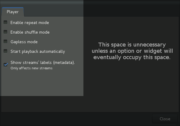
Also, the Preferences dialog has tabs, even though there is only one area for settings, 'Player'. A 'Player' heading would be more consistent with the GNOME HIGs. Consolidating the Plugins dialog as a tab alongside Player is another option.
The Preferences dialog also takes up more than twice the options' width in space, and there is a lot more space along the bottom than is necessary.

| Changed in eina: | |
| status: | New → In Progress |
| assignee: | nobody → L.Lopez (ldotlopez) |
| Changed in eina: | |
| status: | Fix Committed → Fix Released |
To post a comment you must log in.
I just commit to master branch a fix. Dialogs are now consistent with the rest of GNOME environment.