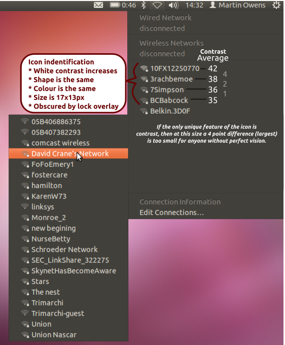
UI Issue: WiFi network stength hard to see with many networks.

Bug #874579 reported by Martin Owens
10
This bug affects 2 people
Affects Status Importance Assigned to Milestone
network-manager-applet (Ubuntu)
Confirmed
Low
Unassigned

Bug Description

When looking at the 'More Networks' drop down for the network manager indicator, we see that a large collection of networks can make trying to see the strength of a network quite hard. The Icons don't lend themselves to being stacked one on top of another as in the list.

See the screenshot for an example.

Revision history for this message
Martin Owens (doctormo) wrote :
Revision history for this message
Bilal Akhtar (bilalakhtar) wrote :

So, you mean to say, there should be more padding between items, and the icon should be larger?

Changed in indicator-network:
status: New → Incomplete
Revision history for this message
Martin Owens (doctormo) wrote :

No. Because to say such a thing would be to pretend to suggest a fix to a problem that I could well be inventing. What I did here is the reporting of the problem and it's unfair of you to ask me to come up with the solution to the problem in order to make the problem valid.

Changed in indicator-network:
status: Incomplete → New
Revision history for this message
Bilal Akhtar (bilalakhtar) wrote :

Hi Martin,

Sorry, I wasn't able to understand the issue fully. That's why I was asking it in a way to ensure if I was right.

Moreover, its not a bug in indicator-network, its a bug in the indicator-applet implementation of network-manager-gnome. Indicator-network is a completely new indicator which is not pre-installed on Ubuntu.

affects: indicator-network → network-manager-applet (Ubuntu)
Changed in network-manager-applet (Ubuntu):
status: New → Confirmed
importance: Undecided → Low
Revision history for this message
Martin Owens (doctormo) wrote :

Thanks cbds! Awesome response and thanks for reassigning, there are so many packages with similar names :-)

I've attached a design break down of what I mean to help the designers and developers understand what I'm seeing. The basic problem is that the icons are not different enough at small scales and rely on keen eyesight to spot a very slight different in contrast.

Revision history for this message
IlarioGelmetti (ilariogelmetti) wrote :

In my opinion moving the lock icon in a position where it doesn't overlap with the indicator should solve.

To post a comment you must log in.
This report contains Public information  
Everyone can see this information.

Other bug subscribers

Remote bug watches

Bug watches keep track of this bug in other bug trackers.