
Non-composited mode's borders are too small/misaligned
Bug #860979 reported by
Brandon Wright
This bug affects 3 people
| Affects | Status | Importance | Assigned to | Milestone | |
|---|---|---|---|---|---|
| Synapse |
Triaged
|
Low
|
Alberto Aldegheri | ||
Bug Description
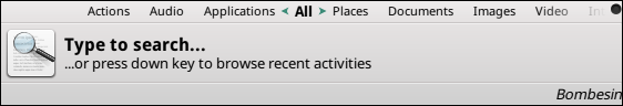
It seems with the recent theme changes that little care was given to make sure synapse looks good in a non-composited environment. Each theme seems to have varying levels of issues:
Default/Essential: Edge padding is too small. The black border on the outside edge is misaligned vertically by a half-pixel, resulting in a fuzzy bottom edge, and the top coordinate is wrong, leaving the top edge black.
Doish/Side Doish: Edge padding is too small. Once again, the black border is missing at the top, and there is a white line towards the bottom because the contents don't draw far enough downward.
Virgilio: Edge padding is too small, and looks good otherwise.

| Changed in synapse-project: | |
| milestone: | 0.2.99.1 → 0.2.99.2 |
| Changed in synapse-project: | |
| milestone: | 0.2.99.2 → 0.3.0 |
To post a comment you must log in.
Sorry, mistype. The top edge line is _blank_ in the default theme, not black.