Make the wares priority buttons in production sites more intuitive

Bug #726699 reported by Astuur
8
This bug affects 1 person
Affects Status Importance Assigned to Milestone
widelands
Fix Released
Low
Shevonar

Bug Description

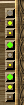
This is a suggestion for the UI
The priorisation buttons in production sites and construction sites are a little counter-intuitive.
The green dot should be visible when "High priority" is selected, not greyed out.
Also there could be a yellow button for "normal" and a red button for "low" priority.
Each of those colors should be visible when the option is in effect.
It would make things easier when controlling the state of the building.

Tags: ui
Revision history for this message
Hans Joachim Desserud (hjd) wrote :

Agreed. This have been confusing me as well. In my opinion it makes more sense to highlight the current selected priority, than the alternatives which I think is what is done today.

Hope someone can take a look at this for build17. Could perhaps look closer into bug 672098 at the same time

Changed in widelands:
importance: Undecided → Wishlist
milestone: none → build17-rc1
status: New → Confirmed
summary: - Make the wares priorisation buttons in production sites more intuituve
+ Make the wares priority buttons in production sites more intuitive
Changed in widelands:
importance: Wishlist → Low
Revision history for this message
Astuur (wolfsteinmetz) wrote :

I want to add that there is another point, where these buttons behave a bit strange:
They are triple-state buttons.
One state is for "option is on"
One state is for "option is off"
and the 3rd stat is for "button is pressed, but not yet released"

I do not know, if this is by design.
This 3rd state is graphically "button is retracted below the surface".
If this third state was made the permanent state for "option enabled",
the readout would be much clearer and easier to identify.

Revision history for this message
Hans Joachim Desserud (hjd) wrote :

I don't know for sure, but I assume this is by design. This is consistent with how other buttons work, both in Widelands as well as other programs (just try and see). Buttons use the metaphor of a physical button, so it needs all tree states to represent button on/off, but also if you hold it down. Therefore, showing the same state when a button is held down and on would be misleading as it is two different states and it would not necessarily remain on when the player release the mouse button.

I am not sure if I see your problem with the tree states. Could you please clarify if your problem is with the third state in general, or how it is currently represented?

Though as I thought about it, I wonder if radio buttons (http://en.wikipedia.org/wiki/Radiobutton) would be a better choice than buttons since we only want to allow one option selected at any time. The question then is, does the engine already support radio buttons? (I remember a discussion about drop down lists, which would need to be added at least)

Revision history for this message
Astuur (wolfsteinmetz) wrote :

Okay, this is complicated.
Forget the 3 states for a moment, and the fact that those buttons won't react anymore after some switching.
Also forget that it seems better to show the color of the currently active option instead of the non-active ones.
And let's also ignore that each button gets "highlighted" when a "mouse over occurs".

I'll be using the "low priority" set as an example, but
the problem really pertaines for "normal" and "high" priority just as well.

There is a "D:\Games\Widelands\pics\low_priority_button.png", which gets shown, while the button is inactive (or available for choice in the current button logic)
And a there is the "D:\Games\Widelands\pics\low_priority_on.png", which shows while this option is enabled (or
not available for choice)
I had expected these pictures to be shown when the corresponding stage of the button is active.
But it is not so easy. Instead the programm processes these pictures, before they are shown.
I have therefore made 2 identical pictures with the above name and 100% transparency throughout.
The button facette seems hard coded and blends a 50% white upper and left border onto the background.
So the upper and left button border appear as whitish wood, in case the button itself is transparent in this place,
or as the 50% whitened button color, in case it is not.
It also has a hard coded lower and right 100% black border, so these button borders appear in solid black.
This is not blended and so these parts are black unconditionally.
The center part of the "on-button" is also not shown "as is", but instead non-transparent colored areas are
replaced by white of the same transparency and again 50% blended over the underlying wood texture.
This way all colors are lost for the "pressed" state of the button.
This mechanism prohibits, that the "show what is active" logic can be enforced by changing the graphic alone.

Now for the "inactive" state of the button, which currently shows the color.
The facetted borders are exactly the same as mentioned above for the button's "active" state.
The middle section, however, seems unprocessed and shows whatever the "low_priority_button.png"
is.

The "on" picture strangely shows the "above level" facette (should be "pressed", so "below level" imho)
The "off" picture has the exact same facette, so the buttons do not even try to simulate a change in position.

I have also been able to observe the 3rd state after the modifications (pressed, not released)
and I still think it would help to have this graphic representation for "downpressed" = enabled).
The bug that causes these buttons to become unresponsive remains.

Summary: I have been able to slightly improve the readability of these buttons, but could not overcome
the strange logic of hilighting the alternatives instead of hilighting what is enabled.
I do not understand why the program does not simply show the unaltered graphics just
as they are. It would help us to implement the "enabled=pressed down=LED(color)on" logic.

Shevonar (shevonar)
Changed in widelands:
assignee: nobody → Shevonar (shevonar)
Revision history for this message
Shevonar (shevonar) wrote :

I didn't understand everything of your analysis Astuur but I did a fix, that hopefully makes the priority buttons work as you wish (and I agree that they didn't behave intuitive).
Fixed in revision 5996.

Changed in widelands:
status: Confirmed → Fix Committed
Revision history for this message
Astuur (wolfsteinmetz) wrote :

Looking forward to see it, Shevonar!
and thanks, for fixing this....

Revision history for this message
Victor Pelt (victor-pelt) wrote :

it takes to getting used to these new buttons. one small detail is that the difference between the middle and bottom buttom is still rather small. maybe make the lower one red? what do people think?

Revision history for this message
Hans Joachim Desserud (hjd) wrote :

I agree with Victor, the colors seem too similar. There is also an optical illusion which makes the selected boxes look smaller than the unselected ones. Not sure how easy this can be tweaked though. I am not sure if this is due to graphics or if it is drawn in the code. Other than that it looks fine.

Oh, and I am not 100% sure what Astuur meant in comment #4 either.

Revision history for this message
SirVer (sirver) wrote :

Thanks for the work shevonar, however I feel it hasn't improved the situation much. I just played a game with kristin and I felt the new design were counter intuitive. I always thought the buttons were greyed out (not pressable)...

I think we need another approach with this. I suggest trying a flat button like it is is used in the player statistics menu (screenshot attached). It conveyes the message of "this is selected" while keeping the message "you can also select the other things here". maybe the priority buttons are too small to be useful, but I would like to try it out. Are you interesting in doing that?

Revision history for this message
Shevonar (shevonar) wrote :

I think greyed out buttons are not a good idea at all, cause both variants have there pros and cons. On the one hand a greyed out button for the current selected option is not intuitive on the other hand greyed out but clickable buttons are not intuitive too.
Okay I'll see what I can do :) I will try with flat buttons and a red one for low priority. I will show some screenshots here soon.

Changed in widelands:
status: Fix Committed → In Progress
Revision history for this message
Shevonar (shevonar) wrote :

Not greyed out, flat and red ;) I think they look much better. Still any suggestions?

Revision history for this message
Victor Pelt (victor-pelt) wrote :

i like it

Revision history for this message
SirVer (sirver) wrote :

I think they are better. But they are not flat, are they? The still have a "button" look to them. Could you post a version with really 2D flat buttons like in the general statistics menu?

Revision history for this message
Shevonar (shevonar) wrote :

They are flat. The button like look comes from the pictures. Before there was a double button look and that made them look really strange. I'll see what I can do.

Revision history for this message
Shevonar (shevonar) wrote :

What I tried up to now doesn't look good. In the general statistics menu the buttons are Radiobuttons and belong to a Radiogroup. This would make sense for the priority buttons as well, but will take a bit longer to change.

Revision history for this message
Astuur (wolfsteinmetz) wrote :

Sorry to be late.
My idea was to have inactive LEDs dimmed (darker) on an elevated button, but still recognizable with their color.
and the active one bright (LED on) on a pressed button.
The rest was probably due to that double button look.

Revision history for this message
Shevonar (shevonar) wrote :

Two examples with reduced luminosity buttons.
I will now try out radio buttons (that is a major difference in code). If we stay with normal buttons, they will need some fixing, too. In spectator mode you can see the priorities of all players, but not change/click them. There is no visible difference to clickable buttons at the moment.

Revision history for this message
SirVer (sirver) wrote :

I like the right one best from an optical point of view.

I do not mind that there is no difference in spectator mode. It is clear from context that you can't change anything in the UI.

I am looking forward to the radio button solution... after all, those buttons are radiobuttons after all. :)

Revision history for this message
Shevonar (shevonar) wrote :

The priority radiobuttons are finished (at least optically).
From the coders point of view they are the much cleaner and nicer solution. However a design change like dimming inaktive options will become much more difficult, but I think I will keep the radiobuttons and change their design if necessary.
Feel free to comment and criticise.

Revision history for this message
Victor Pelt (victor-pelt) wrote :

in #17 i really can't tell which one is the enabled one

Revision history for this message
Venatrix (elisabeth) wrote :

I have to agree to Victor, it’s hard to tell, which button is active, especially in the second version.

In the radio buttons solution I think it isn’t necessary to have the lights in different sizes. It was good with the old version but now it can be confusing. I just would make them all the same size.

Revision history for this message
Astuur (wolfsteinmetz) wrote :

The radio button model is unambiguous due to the orange square, and it's fairly easy to recognize.
So if this was the end of the line, it would already be quite some progress.
Personally, I like a physical representation of a "button" better, and would still gladly see
a change in the "LEDs" between active and inactiv. But that is just my personal taste and probably not
even shared by all.

Revision history for this message
Shevonar (shevonar) wrote :

Here are equally sized radiobuttons.

@Victor & Venatrix: In a picture they might be hard to distinguish, but when you click them there is a relatively good difference (might need some time to get used to it and recognise it at a glance).

Revision history for this message
Shevonar (shevonar) wrote :

The radiobuttons do work now not only optically. The orange border is sometimes hard to see in front of the background image, but this should get fixed with bug #787365 .

Revision history for this message
Victor Pelt (victor-pelt) wrote :

the radio button version is nice.

Revision history for this message
SirVer (sirver) wrote :

Fantastic! I am all for merging the version in #23. Very throughout followthrough with this bug, Shevonar. Your dedication to details is a fantastic asset!

Revision history for this message
Shevonar (shevonar) wrote :

Pushed in revision 6008

Changed in widelands:
status: In Progress → Fix Committed
Revision history for this message
SirVer (sirver) wrote :

Released in build17-rc1.

Changed in widelands:
status: Fix Committed → Fix Released
To post a comment you must log in.
This report contains Public information  
Everyone can see this information.

Other bug subscribers

Remote bug watches

Bug watches keep track of this bug in other bug trackers.