Scan dropdown menu is confusing

Bug #670794 reported by Noam Yorav-Raphael
38
This bug affects 4 people
Affects Status Importance Assigned to Milestone
Simple Scan
Triaged
Low
Unassigned

Bug Description

First, congratulations on this great tool!

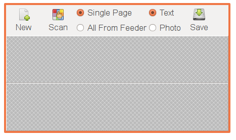
I would like to suggest a usability improvement to the toolbar. I now used simple-scan for the first time. I opened the program, and first clicked on the "scan" button. It worked fine, but scanned a photo and I wanted to scan text. So I opened the drop-down menu near the scan button, and was a bit confused: it wasn't clear at all that the first two items ("single page" and "scan all from feeder") start a scan and the next two items ("photo", "text") are scanning options (the only things that differs them is a small black dot next to one of the two options.) I see this menu, and think: "Ok, I want to scan multiple pages, and have a text scan. What should I press next?"

I think that if both were options, and both were in the toolbar, it would be easier to understand. I attach a glade screenshot with my suggestion.

Again, thanks a lot for this great tool!

Noam

Revision history for this message
Noam Yorav-Raphael (noamraph) wrote :
Revision history for this message
Noam Yorav-Raphael (noamraph) wrote :

I just thought of another advantage of my proposal: It's quite common for one user to switch between those options. This means that if I'm such a user, in the current UI, before each scan I have to click the (relatively small) down arrow to see which option is selected, perhaps change an option, click the arrow again and then click "All Pages From Feeder". In my proposal, I can see right away if the scan mode is what I would like so many times one click on "scan" would be enough. Changing an option would be just one another click.

Revision history for this message
Noam Yorav-Raphael (noamraph) wrote :

If I think about it, having two buttons and two radio buttons may be even better, as four radio buttons may be a bit confusing - see the picture.

By the way, I can write a patch if the suggestion is approved.

Revision history for this message
Robert Ancell (robert-ancell) wrote :

Hi Noam,

Thanks for the suggestion. The original design for simple-scan had these options always visible but I decided to hide them in the drop down. The reason for this was the display looks overly complex with them always visible. Note that there may be more options than photo/text in the future so putting them in the toolbar could cause future problems. Also, in your screenshot you show the toolbar in the tall format, there is not enough space when the toolbar is in the short form (see attached screenshot).

I agree with your point that the radio buttons are not as clear as they should be. It would be nice to have a heading "Scan options" or similar but I'm not sure if this is possible with GTK.

Changed in simple-scan:
status: New → Triaged
importance: Undecided → Low
Revision history for this message
Noam Yorav-Raphael (noamraph) wrote : Re: [Bug 670794] Re: Scan dropdown menu is confusing

Thanks for your answer!

It's very important to have the interface as simple as it could be (that was
why I liked simple-scan in the first place.) However, I think that perhaps
hiding options that shouldn't be hidden isn't really making the interface
simple, as the interaction becomes more complex. I think that when other
options are available, they should be set in the preferences dialog, as they
are not going to change a lot.

Regarding the short toolbar format: I think that perhaps it would be best to
have the radio buttons side by side if the toolbar is in the short format.
Another idea: you can use a drop-down selection box, so that the user can
see that currently "photo" is selected without clicking anything, and if he
wants to change this he can click it and select "text".

Noam

Revision history for this message
Robert Ancell (robert-ancell) wrote :

You say "options that shouldn't be hidden", but you haven't shown that the photo/text scan option is or should be hidden. In your bug report you say you went to the correct location to choose the text mode (the dropdown) but the confusion was it wasn't clear it was a radio button. For this reason it appears it is not too hidden, i.e. there was no trouble finding it.

The downside of putting this option in the toolbar you prompt the user to decide each time they scan what mode to do. A first time user is then confronted with an additional option and an experienced user is always shown the scan mode, even though they infrequently change it. For this reason it shouldn't be always visible.

So, I think the correct solution is to make it clearer that this is a radio button and it affects the next scan. An example of how radio buttons/toggles can be clearer is how they are done in modern toolkits like those used in the iPhone.

Revision history for this message
Noam Yorav-Raphael (noamraph) wrote :

I think that when I said "hidden" I didn't meant "hard to find" but simply
"not visible".

It's up to you of course, but I think that every user which happens to use
both modes from time to time will have to open the drop-down menu before
scanning just to make sure that his last scan wasn't done in the other mode.
Another idea: you can write this information in the status bar.

Noam

Revision history for this message
Bryce Nesbitt (bryce2) wrote :

I find the current setup to be not simple. When something I need is 4-5 mouse clicks away that presents a barrier to use.

Revision history for this message
Bryce Nesbitt (bryce2) wrote :

In my regular use of Simple Scan I change either resolution or scan type almost every scan.

After a bunch of bad experiences where I just pressed to start a scan, but ended up with the wrong scan, I've changed how I use SimpleScan. I now check the resolution and the scan type manually before starting a scan.

That's a lot of extra clicks. I never quite remember how SimpleScan was left last time, so each time I must check.

See also https://bugs.launchpad.net/simple-scan/+bug/1061267

Revision history for this message
Bryce Nesbitt (bryce2) wrote :

I used SimpleScan again, and hit this usability issue again.

Resolution and scan type are fundamental to scanning... those items can't be simplified without causing other non-simple problems.
See a proposed rendering for a solution at:
https://bugs.launchpad.net/bugs/1115963/+attachment/3515337/+files/ss.png

Revision history for this message
Bryce Nesbitt (bryce2) wrote :

Really clear menu items would be

[Text scan @300 dpi]
[Photo scan @150 dpi]

Then you'd know right away what the buttons will do.
Since it's a scanner, the dpi is an inherent complexity, better to put that up front so the user knows they have to think (a little) about dpi.

Revision history for this message
lucmars (lucmars) wrote :

Hi everybody

I agree with this confusing UI.

If one has to choose between photo or text then the UI should show a selector. for that

Same logic for all kind of setting at choice.

When Simple scan allows to choose the dpi resolution that implies a selector in the UI, and so on.

Finally, the scan button should be alone.

Beside that, I'm happy whith SC.

To post a comment you must log in.
This report contains Public information  
Everyone can see this information.

Other bug subscribers

Remote bug watches

Bug watches keep track of this bug in other bug trackers.