Ubuntu button edge should be grooved not shadowed
Bug #609787 reported by
Mark Shuttleworth
This bug affects 2 people
| Affects | Status | Importance | Assigned to | Milestone | |
|---|---|---|---|---|---|
| Unity |
Fix Released
|
Medium
|
Mirco Müller | ||
| unity (Ubuntu) |
Fix Released
|
Undecided
|
Unassigned | ||
Bug Description
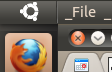
The current look of hte Ubuntu button on the panel has a drop shadow to the right (on the panel). That makes it look like the button is somehow raised above the rest of the panel. Instead, the button should be part of the panel. I would suggest moving to a groove edge, rather than a drop shadow edge.

| Changed in unity: | |
| assignee: | nobody → Mirco Müller (macslow) |
| importance: | Undecided → Medium |
| milestone: | none → 2010-08-26 |
| status: | New → Triaged |
| Changed in unity (Ubuntu): | |
| status: | New → Fix Released |
To post a comment you must log in.
I've attached a mockup of how I think it should look. Otto would be the best person to refine that to exact pixel positioning and colours. Otto, I've just used two one-pixel lines, a dark and a light one, to create the groove. Please could you refine and specify for Mirco? But a groove is the desired edging.
Also, for the avoidance of doubt, specify the horizontal position of the groove relative to the edge of the launcher. I suspect we will need a precise pixel-perfect spec of the launcher edge effect and the panel Ubuntu button groove.