Icon spacing on volume panel is messy
Bug #568819 reported by
Con Sistency
This bug affects 2 people
| Affects | Status | Importance | Assigned to | Milestone | |
|---|---|---|---|---|---|
| Indicator Display Objects |
Invalid
|
Undecided
|
Unassigned | ||
| humanity-icon-theme (Ubuntu) |
Fix Released
|
Low
|
Unassigned | ||
| Lucid |
Fix Released
|
Undecided
|
Vish | ||
| ubuntu-themes (Ubuntu) |
Fix Released
|
Low
|
Danielle Foré | ||
| Lucid |
Invalid
|
Low
|
Unassigned | ||
Bug Description
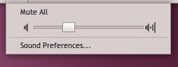
The spacing between the slider and the icons on the volume panel (when left clicking the applet) is quite different for each of them. it's trivial, but it looks bad and it's a panel that will get a fair lot of use. Screenshot attached.
Related branches

| affects: | indicator-applet → ido |
| Changed in ubuntu-mono (Ubuntu): | |
| assignee: | nobody → Daniel Fore (daniel-p-fore) |
| status: | Triaged → In Progress |
| Changed in humanity-icon-theme (Ubuntu): | |
| importance: | Undecided → Low |
| status: | New → Triaged |
| Changed in ubuntu-mono (Ubuntu): | |
| status: | In Progress → Fix Committed |
| Changed in humanity-icon-theme (Ubuntu): | |
| status: | Triaged → Fix Committed |
| Changed in ido: | |
| status: | New → Invalid |
| Changed in ubuntu-mono (Ubuntu Lucid): | |
| importance: | Undecided → Low |
| status: | New → Invalid |
| Changed in humanity-icon-theme (Ubuntu Lucid): | |
| importance: | Undecided → Low |
| status: | New → Fix Committed |
| assignee: | nobody → Vishal (vish) |
| importance: | Low → Undecided |
| status: | Fix Committed → New |
| assignee: | Vishal (vish) → Vish (vish...) |
| tags: |
added: verification-done removed: verification-needed |
| affects: | ubuntu-mono (Ubuntu) → ubuntu-themes (Ubuntu) |
| Changed in ubuntu-themes (Ubuntu): | |
| status: | Fix Committed → Fix Released |
To post a comment you must log in.
This doesn't look like a bug in the code so much as kind of an optical illusion that's a result of the icons themselves. The spacing between the slider and the icons on the left and right is the same, but the icon on the left has more empty pixels so it looks further from the slider.