Accounts creation window is unnaturally shaped
| Affects | Status | Importance | Assigned to | Milestone | |
|---|---|---|---|---|---|
| Gwibber |
Confirmed
|
Low
|
Unassigned | ||
| The Me Menu |
Invalid
|
Undecided
|
Unassigned | ||
Bug Description
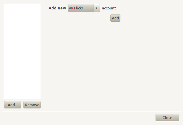
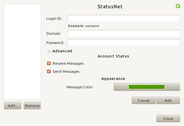
See attached screenshot of the Social Account window (as invoked from the Me Menu). When first invoked the size seems unnatural and awkward.
The size seems to be driven by the size of the fields that appear once you select a social network, but if you look at each of the options (Flickr, etc) none seem to actually require that width. The longest fields are login IDs and passwords (see second screenshot), but that's an awfully wide field for that sort of data. Many networks have a right-aligned "message colour" that may be driving things to the right, but it's unclear why that one field is right-aligned when all the others are left-aligned (nor is it clear why it needs such a long bar of colour).
Overall it seems the layout of this window could be improved, resulting in a window that is more visually balanced (and probably smaller).

| summary: |
- Social Accounts window is unnaturally shaped (Lucid beta) + Accounts creation window is unnaturally shaped |
| Changed in gwibber: | |
| importance: | Undecided → Low |
| Changed in gwibber: | |
| status: | New → Confirmed |
| Changed in gwibber: | |
| milestone: | 3.0 → 3.2 |
Not an issue of the memenu. Its gwibber where memenu directs you when clicked on 'broadcast accounts'