
Poor metaphor for a "wired network" icon (two arrows pointing up and down)
| Affects | Status | Importance | Assigned to | Milestone | |
|---|---|---|---|---|---|
| Ayatana Design |
New
|
Undecided
|
Unassigned | ||
| ubuntu-themes (Ubuntu) |
Fix Released
|
Medium
|
Unassigned | ||
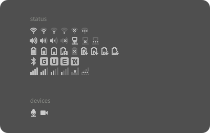
Bug Description
The icon used to show a wired (ethernet) network in network-
In user testing of Ubuntu on 2010-12-15, participants identified the icon as "flipping between sessions" or "scroll up scroll down."
Similarly in March 2012, Joe Pirillo: "The up and down is probably related to the volume, coz it's right next to the volume." <http://
A more appropriate icon could be something like the ones suggested at recent GNOME UX Hackfest, see this blog post http://
See also bug 461427, about the icon showing even when it isn't useful.

| Changed in ubuntu-mono (Ubuntu): | |
| status: | New → Confirmed |
| description: | updated |
| description: | updated |
| Changed in ubuntu-mono (Ubuntu): | |
| importance: | Wishlist → Medium |
| affects: | ubuntu-mono (Ubuntu) → ubuntu-themes (Ubuntu) |
| summary: |
- Poor metaphor for a "wired network" icon + Poor metaphor for a "wired network" icon (two arrows pointing up and + down) |
| tags: | added: artful xenial |
| tags: |
added: zesty removed: xenial |
| tags: |
added: xenial removed: artful |
| description: | updated |
I have to agree the icon is not perfect to represent "wired connection" . But the current icon is how it was designed.
Since this bug is about a request to redesign the default icon , setting it to wishlist.