notify-osd should have a close button

Bug #381416 reported by Nelson Álvarez Sáez
130
This bug affects 26 people
Affects Status Importance Assigned to Milestone
notify-osd (Ubuntu)
Won't Fix
Wishlist
Unassigned

Bug Description

Binary package hint: notify-osd

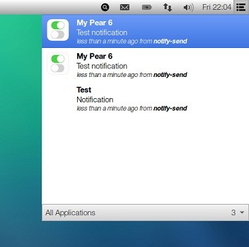
As simple as that. The new notification system works fine, but it really bugs me that I'm forced to wait for those little messages to fade away by themselves. Should I suggest this somewhere else?
Thanks

Andreas Moog (ampelbein)
Changed in notify-osd (Ubuntu):
importance: Undecided → Wishlist
Revision history for this message
qq274980 (qq274980) wrote :

Bugs me too. :-(

summary: - Jaunty's notify-osd should have a close button
+ notify-osd should have a close button
Revision history for this message
Mirco Müller (macslow) wrote :

It is a deliberate design-feature of notify-osd to not have close-buttons. See https://wiki.ubuntu.com/NotifyOSD#Bubble%20behavior

Changed in notify-osd (Ubuntu):
status: New → Won't Fix
Revision history for this message
Nelson Álvarez Sáez (alvareznelson) wrote : Re: [Bug 381416] Re: notify-osd should have a close button

Ah, OK. Thanks. Uninstalling and going back to the old system.

On Thu, Aug 13, 2009 at 10:01 AM, Mirco
Müller<email address hidden> wrote:
> It is a deliberate design-feature of notify-osd to not have close-
> buttons. See https://wiki.ubuntu.com/NotifyOSD#Bubble%20behavior
>
> ** Changed in: notify-osd (Ubuntu)
>       Status: New => Won't Fix
>
> --
> notify-osd should have a close button
> https://bugs.launchpad.net/bugs/381416
> You received this bug notification because you are a direct subscriber
> of the bug.
>

--
Nelson Álvarez
56 - 63 - 241 346 Home
56 - 9 - 412 16 00 Mobile
56 - 63 - 210 002 School
Home address: Corvi 7, 4041, Valdivia, Chile

Revision history for this message
Kaustubh P (thetuxracer) wrote :

yes, i also feel the same, that there should be a close button on the notification. I dont want my colleagues to see who is online, or what song I listen to, when they are over on my PC. Even if there is a design/behavior philosophy, I should atleast be able to be select whether I can see and use the close button.

Revision history for this message
Marco Ceppi (marcoceppi) wrote :

I believe you should be able to dismiss osd-notify windows by clicking on it - that way the design of "no close" button is satisfied while still providing the functionality of dismissing notifications

Revision history for this message
Gary Watts (gazbook) wrote :

Feels a little ridiculous to me there is no close button. Don't get me wrong, I really like the fact it fades to just visible so it's not in the way, but I feel it'd be more logical to be able to close the notification in some way or another, as once I know whatever information it is trying to convey it's use as ended.

Revision history for this message
falsetru (falsetru) wrote :

Bugs me too.

Revision history for this message
ike (ikeahloe) wrote :

even when it fades it still makes using the top right unbearable. In blender the top right is the outliner and the text is very small so i can't see anything with a notification is in the way and mousing over doesn't make it readable. I shouldn't have to change the way i use every program because the functionality and design is so poorly broken,

How hard would it be to have a little soft translulcent (unity style) x in the top left corner of a notification that is only visible on hover.

another possibility would be to allow swiping them to the right to make them go away. this would be good for tablet devices and also i think people forgot that track-pads and mice are great devices to swipe with as well (click-hold and swipe)

Revision history for this message
hans2504 (hanson4288) wrote :

I agree with Marco Ceppi. Click the notification to acknowledge and dismiss. A close button is not necessary, but I should be able to tell the notification to go away.

Revision history for this message
Siddhartha Narayan Pal (snpmath) wrote :

I think there should be a close button on each notification card. also it will be better if there exists some notification settings through which user can enable or disable notification card and customize the display time. unread notifications should be stored in notification center.

Revision history for this message
Jerry Quinn (jlquinn) wrote :

I would like a way to dismiss the notification as well. When one appears, the setting is too dark to comfortably see my work beneath it. The only way to deal with it is hover the mouse over the notification until it times out.

  The transparency when the mouse is hovering is adequate for working. The transparency when the mouse is elsewhere is distracting once I'm done reading it.

Revision history for this message
Rael Gugelmin Cunha (rael-gc) wrote :

You guys can use the patched NotifyOSD: it's close to the default one, but with very usefull features, like "click to close", time/font/color/position configurations.

This article:

http://www.webupd8.org/2012/11/patched-notifyosd-with-close-on-click.html

Cites only until 13.10, but it works fine on 14.04, I use it.

Revision history for this message
Jerico Serilico (jericoserilico-forum) wrote :

I sometimes have to work with many terminal windows outputting alarms, the notification bublle is too dark to allow reading through without hovering with the mouse on it, it is very annoying. Should have a dismiss feature.
Sometimes too notifications happen at the same time and there and completely hides the terminal window.
I'll try the patched notifyOSD

Revision history for this message
matt (ninethirty) wrote :

I agree. I know this bug is already closed as "Won't Fix" because it's working as designed, but I think it's a faulty design. Making the notifications "light-weight" by giving the user no way to interact with them, even to dismiss them, isn't really "light-weight" at all. It's more intrusive and difficult to work with. I have no way of getting the notifications out of my way once I've seen them, so they stay there taking up
I don't think it helps things at all to simply hold notifications of different priorities or lengths for different lengths of time. A notification should stay visible until a user has had a chance to see it. How long it takes the user to see it depends on else they're doing, and there's no way for either the system nor the application to know what else the user is doing -- are they currently reading something and waiting until they get to the end of a paragraph to glance at the notification, or did they look at it right away? You don't know, and you can't, so err on the side of longer notifications and give them a "dismiss" button.

To point: when I first installed Ubuntu 14.04, one of the first pieces of advice I got was to install a patched version of NotifyOSD that would let you customize notifications (including dismissing them). When that's the advice that people are giving to new users, I think you have a design problem....

Revision history for this message
Patrick Valencia (pvalencia357) wrote :

This is really obnoxious. I thought I'd get used to it once gnome3 and unity came out, but it's only made me more frustrated as time goes on. I miss the old gconf way of doing things, where a user could change anything they disagreed with. This seems more like locking the end users into the lowest common denominator of UI/UX in an attempt to fit in with The Big Two. The whole idea seems counter to the linux philosophy. I don't want to beat a dead horse, but I do want to restart a discussion. I think this needs a control panel with user customizable items like time to display, opacity, size, sound, position, and possibly the ability to dismiss simply by moving the cursor over it. However, I'd settle for just an X to dismiss.

To post a comment you must log in.
This report contains Public information  
Everyone can see this information.

Duplicates of this bug

Other bug subscribers

Remote bug watches

Bug watches keep track of this bug in other bug trackers.