Update-Manager barely usable on small screens

Bug #379469 reported by ullix
22
This bug affects 4 people
Affects Status Importance Assigned to Milestone
update-manager (Ubuntu)
Fix Released
Medium
Unassigned

Bug Description

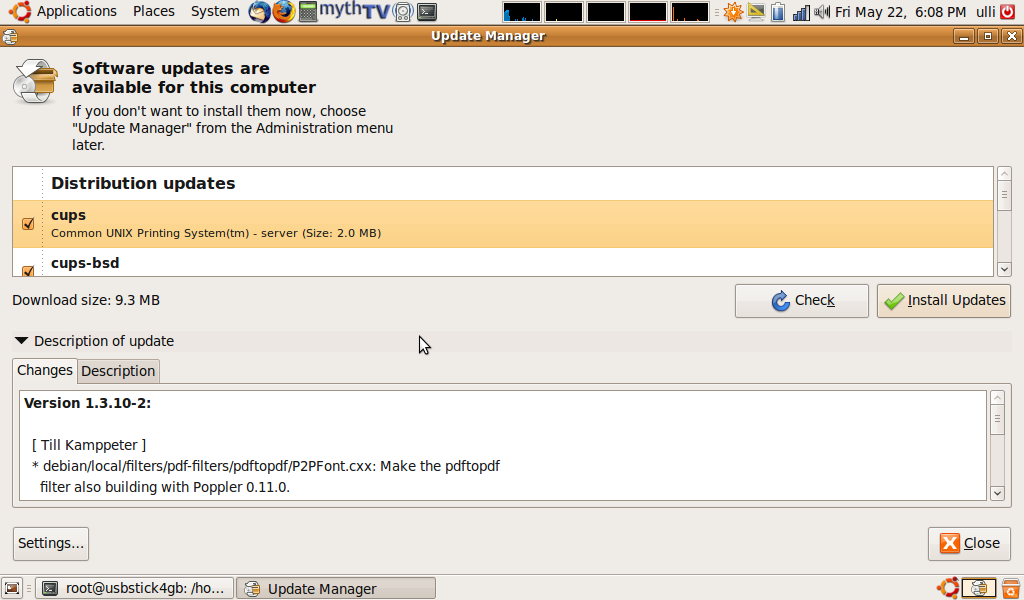
Binary package hint: update-manager

running ubuntu karmic on an Acer Aspire One netbook with screen 1024x600.

The update manager is wasting almost half the screen on empty space, while showing relevant info only in two small slits. Screenshot attached.

Revision history for this message
ullix (ullix) wrote :
Revision history for this message
Rolf Leggewie (r0lf) wrote :

confirming based on the screenshot.

Have you tried the netbook remix?

Changed in update-manager (Ubuntu):
importance: Undecided → Medium
status: New → Confirmed
Revision history for this message
ullix (ullix) wrote :

attaching another screenshot, showing that not much has changed since first reporting.

I had the remix on the computer and was able to switch, but the switcher was removed by some updates long ago, and I don't know how to get it back. If you can help here, I will try. For now I have only the gnome desktop

shankao (shankao)
summary: - [karmic]Update-Manager barely usable on netbooks
+ Update-Manager barely usable on small screens
tags: added: karmic lucid natty usability
Revision history for this message
Constantine (theaspect) wrote :

Ubdate manager in Debian looks normal, I think this problem is ubuntu-specific

Revision history for this message
Matthew Paul Thomas (mpt) wrote :
Revision history for this message
Matthew Paul Thomas (mpt) wrote :

As shown in that screenshot, this is largely fixed in Ubuntu 12.10. Specifically:
a. the weird wrapping of the primary text in Ubuntu 9.10 has been fixed.
b. The secondary text, "If you don't want to install them now...", has been removed. But there's a new "Details of updates" line, which takes up almost the same amount of vertical space.
c. There's only one row of buttons at the bottom, rather than one in the middle and one at the bottom.
d. The buttons no longer use icons, returning them to about the slimness they had in 9.04.

In future the interface will become even more space-efficient:
e. The update categories will no longer use large text. <https://wiki.ubuntu.com/SoftwareUpdates#expanded>
f. Each update in the list will take up one line of text, rather than two.
g. The "Changes" and "Description" tabs will be combined, saving the space used by the tab controls.

But for now, I think we can call this fixed.

Changed in update-manager (Ubuntu):
status: Confirmed → Fix Released
To post a comment you must log in.
This report contains Public information  
Everyone can see this information.

Duplicates of this bug

Other bug subscribers

Remote bug watches

Bug watches keep track of this bug in other bug trackers.