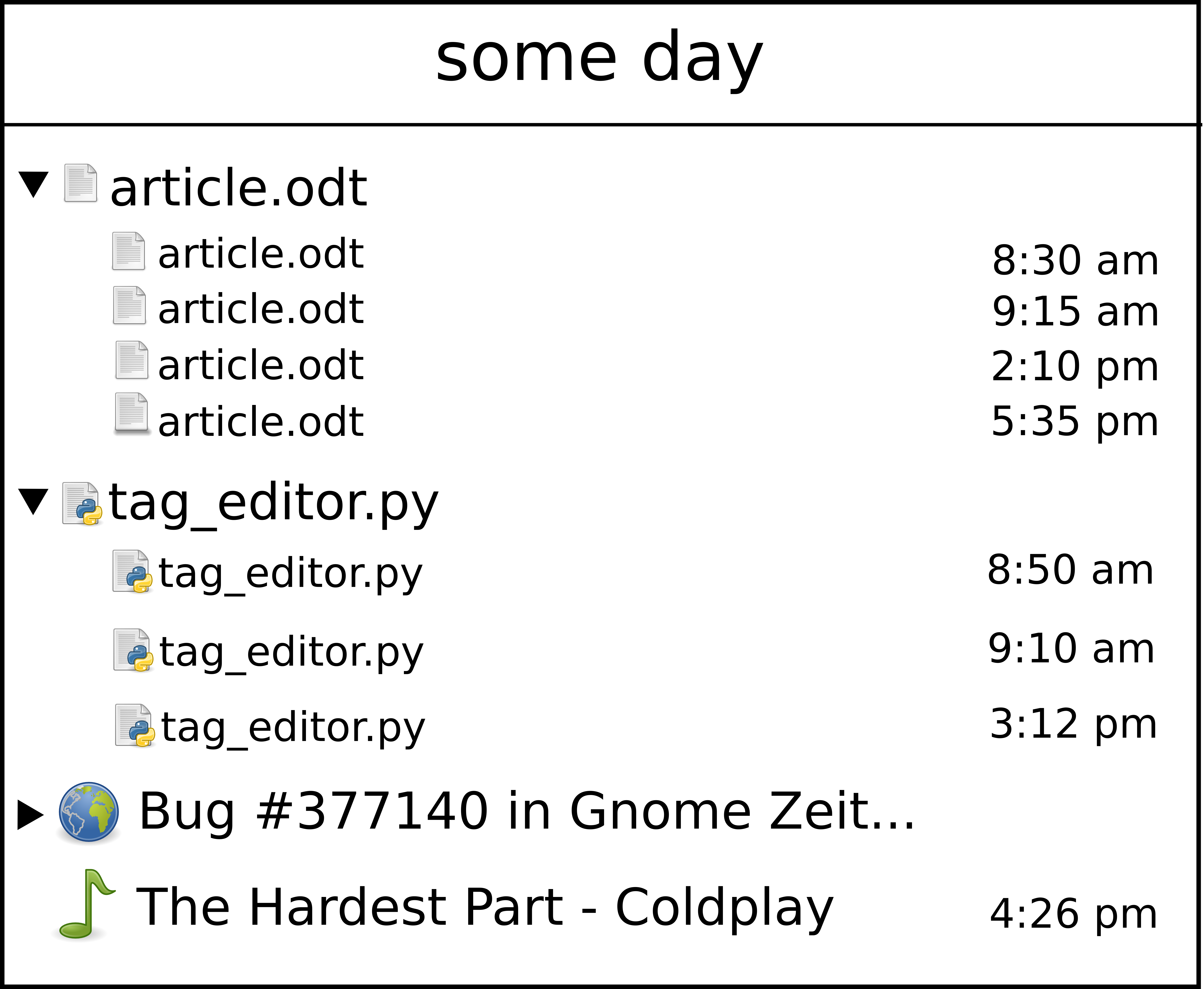
Prettify the journal view
Bug #377140 reported by
Federico Mena Quintero
This bug affects 1 person
| Affects | Status | Importance | Assigned to | Milestone | |
|---|---|---|---|---|---|
| [Legacy] GNOME Activity Journal |
Invalid
|
High
|
Federico Mena Quintero | ||
Bug Description
If grouping is enabled, then "you don't see anything" as the groups start closed by default. But when you open them, the view is quite cluttered. Here are some comments about that:
* You can remove the treelines and just let GtkTreeView indent as appropriate.
* You can display "Firefox History (42 items)" instead of "Firefox History" to make it obvious that there is data in there.
* You can color-code each group (red for all Firefox items, green for all documents, etc.). Then it's obvious which items belong together.
* In each item, the icons and text need to be vertically aligned at the top. Just set the cell renderer's yalign property to 0.0, I think.

| Changed in gnome-zeitgeist: | |
| assignee: | nobody → Federico Mena Quintero (federico-gnome) |
| Changed in gnome-zeitgeist: | |
| importance: | Undecided → High |
| milestone: | none → 0.1 |
To post a comment you must log in.
OK, I pushed the "no treelines" and "vertically align" parts in revisions 591 and 592, respectively.