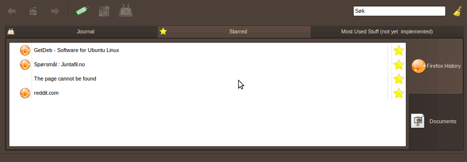
The starred tab has huge buttons, also not clear that you have to toggle between categories
Bug #374478 reported by
Ketil Wendelbo Aanensen
This bug affects 1 person
| Affects | Status | Importance | Assigned to | Milestone | |
|---|---|---|---|---|---|
| [Legacy] GNOME Activity Journal |
Fix Released
|
Undecided
|
Unassigned | ||
Bug Description
See screenshot. The buttons on the right are huge, and should be the same size as buttons elsewhere in the app.
Also, I don't see the need for a toggle here. If the use case is that lots of items are starred, then use a list and checkboxes instead. As a user, I'd like to be able to see them all simultaneously, or just some of them.

To post a comment you must log in.
That makes it more touchscreen friendly :D