
Liberation Serif 'Q' symbol looks bold
| Affects | Status | Importance | Assigned to | Milestone | |
|---|---|---|---|---|---|
| ttf-liberation (Debian) |
New
|
Undecided
|
Unassigned | ||
| ttf-liberation (Ubuntu) |
Confirmed
|
Undecided
|
Unassigned | ||
Bug Description
Binary package hint: ttf-liberation
I am using Ubuntu 9.04.
ttf-liberation:
Installed: 1.04.93-1
Candidate: 1.04.93-1
Version table:
*** 1.04.93-1 0
500 http://
100 /var/lib/
libfreetype6:
Installed: 2.3.9-4ubuntu0.1
Candidate: 2.3.9-4ubuntu0.1
libxft2:
Installed: 2.1.13-3ubuntu1
Candidate: 2.1.13-3ubuntu1
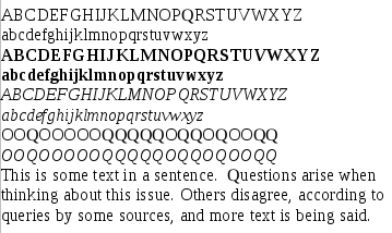
The capital letter 'Q' looks bold/antialiased for all sizes in regular Liberation Serif font below 14pt in openOffice (Display Size 18 in fontforge).
In addition to looking more bold, it is sometimes bigger than the letter O. However, at some sizes it is smaller. It could be a bug in the TTF file if the points are not at integer pixel coordinates.
I will attach a screenshot showing the difference, size 12 in OpenOffice.
You can open "LiberationSeri
All of the letters in italics and in bold look correct--the unformatted Q is the only one with a problem. In fact, if fixing this is too complicated, I would prefer an italic Q to replace the regular Q. Also, any ideas why the font in general looks so different below size 18?

| Changed in ttf-liberation (Ubuntu): | |
| status: | New → Confirmed |
I am having this bug in Debian Lenny, ttf-liberation version 1.04.93-1.