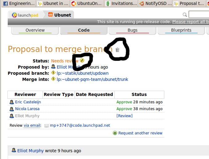
delete icon for a merge proposal is in a confusing spot oh the horror
Bug #331574 reported by
Elliot Murphy
| Affects | Status | Importance | Assigned to | Milestone | |
|---|---|---|---|---|---|
| Launchpad itself |
Fix Released
|
High
|
Tim Penhey | ||
Bug Description
Hello! When I go to a merge proposal and want to mark it as approved, I often click the delete icon instead of the edit icon. Several times a day, oh how horrible. I've considered that I'm not a very smart user. However, I think I would make this mistake much less if the trashcan and the pencil were right next to each other, instead of being on different lines. I think they used to be next to each other, and maybe they got accidentally moved apart during some of the excellent improvements that have been made to the merge proposal pages lately.
Screenshot attached.
Related branches
lp:~thumper/launchpad/branch-breadcrumbs
- Paul Hummer (community): Approve
- Diff: None lines

| Changed in launchpad-code: | |
| assignee: | nobody → Tim Penhey (thumper) |
| status: | Triaged → In Progress |
| Changed in launchpad-code: | |
| status: | In Progress → Fix Committed |
| Changed in launchpad-code: | |
| status: | Fix Committed → Fix Released |
To post a comment you must log in.
Egads, you're right!
I bet it's easy to fix too.