New version needs extra testing

Bug #2011994 reported by Sebastien Bacher
62
This bug affects 10 people
Affects Status Importance Assigned to Milestone
fonts-ubuntu (Ubuntu)
Confirmed
Undecided
Unassigned

Bug Description

A new version of the font got uploaded but there is one issue that needs to be investigated before we decide to migrate it

> the font on 12px or similar has different height (taller) than the old one

we need to verify the impact on the desktop interfaces

Revision history for this message
Paride Legovini (paride) wrote :

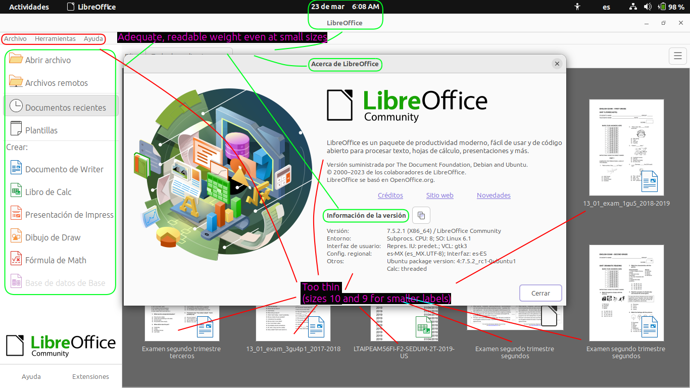
Hi, I happened to test fonts-ubuntu from lunar-proposed (currently 0.862-0ubuntu2) and with the default settings it looks very bad on my fairly high resolution 1080p 14inch laptop screen (wayland, no scaling), so bad that I was pondering to file a block-proposed bug, I'm happy to see is already present.

One thing that looks especially bad is the lowercase 'i', where the dot is connected to the "body" of the letter by a blurry blob. Moreover the font is overall thinner (harder on the eyes).

I tried tweaking the hinting settings via gnome-tweaks. Using full hinting makes the font sharper, but overall the font have worse shapes. In general I think we should keep the "slight" hinting setting.

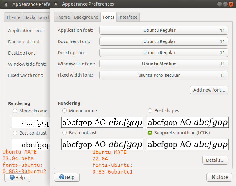
Could it be that the new version lost the manual hints prepared by the foundry, and what we get with 0.862-0ubuntu2 is fontconfig autohinting?

I now reverted to 0.83-6ubuntu1 and the UI is looking good again.

Revision history for this message
Launchpad Janitor (janitor) wrote :

Status changed to 'Confirmed' because the bug affects multiple users.

Changed in fonts-ubuntu (Ubuntu):
status: New → Confirmed
Revision history for this message
Sebastien Bacher (seb128) wrote :

Thanks Paride, could you perhaps attach a screenshot showing the issue? It would help to send the feedback to the designers

Revision history for this message
Paride Legovini (paride) wrote :

Attachment: letter 'i' with fonts-ubuntu from lunar.

Revision history for this message
Paride Legovini (paride) wrote :

Attachment: letter 'i' with fonts-ubuntu from lunar-proposed.

Hopefully the difference is clear, and hopefully finding the root cause for the 'i' looking bad will also fix the other differences (the font generally looking thinner and "different").

Revision history for this message
Alexander Browne (elcste) wrote :

I agree regarding the new `i`. I also see a similar issue with the middle of the number `8`.

I just tried it back and forth a few times, and I honestly prefer darker weight of the older version as feeling more readable. But this is admittedly subjective and the new version looks a little less unusual and more "contemporary".

Revision history for this message
Paride Legovini (paride) wrote :

I have the impression the different weight is caused by different (wrong?) hinting in the -proposed package. See for example the image in this article:

  https://en.wikipedia.org/wiki/Font_hinting

The apparent weight of the hinted/non-hinted versions is quite different.

Revision history for this message
Gre0 (gre0) wrote :

What I noticed right away is that the new version is thinner and less readable for me. (3840x2160) Changing Hinting has no effect.
All in all the font size is good, especially the mono font now fits proportionally better in the terminal.

Revision history for this message
arty (me-arty) wrote :

The Cyrillic letter Ge[1] has a funny shape, like the bottom half is serif

[1]: https://en.wikipedia.org/wiki/Ge_(Cyrillic)

Revision history for this message
arty (me-arty) wrote :

I didn’t see this particular issue before, so I presume this is caused by the new font with different dimensions: the checkboxes in the update dialog are cut off and cannot be scrolled to become fully visible.

Revision history for this message
Adolfo Jayme Barrientos (fitojb) wrote (last edit ):

Unfortunately, GTK has a long-standing bug that makes it so that, if you select a weight different than the default Regular, it ignores it. I wanted to select Medium to get the previous appearance, but GTK simply skips it and renders the UI in Regular, which is now too thin at size 10.

Revision history for this message
Adolfo Jayme Barrientos (fitojb) wrote :
Revision history for this message
Adolfo Jayme Barrientos (fitojb) wrote :
Revision history for this message
Adolfo Jayme Barrientos (fitojb) wrote :
Revision history for this message
Sebastien Bacher (seb128) wrote :

Thanks for the feedback. We decided to give it extra testing by including the update in the incoming beta build so I'm removing the blocker tag. We will decide on the path toward release according the beta feedback

tags: removed: block-proposed
Revision history for this message
Peter de Kraker (peterdekraker) wrote :

I just updated to Lunar beta, and on a 4K screen with 200% resolution, the font is way too thin... It's unreadable, takes much more effort. Is this by design? Or is it something else?

Revision history for this message
ironfoot (ironfoot) wrote (last edit ):

Hi! Tested fonts-ubuntu 0.863-0ubuntu2 in Ubuntu MATE 23.04 beta. Resolution is 1366x768. Default application font size in Ubuntu MATE is 11. Interface font is noticeably thinner and less readable compared to 0.83-6ubuntu1. I have problems with superscript dots in lowercase Latin 'i' and 'j' (by coincidence, the worst situation is with default font size 11). I attach some screenshots demonstrating font changes in applications after update.
I tested an aforementioned in comment #9 bug #784549 [https://bugs.launchpad.net/ubuntu/+source/fonts-ubuntu/+bug/784549] as well. I can confirm capital Cyrillic Ge still has initial design.

Revision history for this message
ironfoot (ironfoot) wrote :
Revision history for this message
ironfoot (ironfoot) wrote :
Revision history for this message
Jalon Funk (francescohickle15) wrote :

"Thanks for the feedback. We decided to give it extra testing by including the update in the incoming beta build so I'm removing the blocker tag. We will decide on the path toward release according the beta feedback"

So the feedback shown here was overly negative yet nothing has changed and there are few days left till final release. Nothing in the changelog even states why the font started looking different.

If nobody can find what caused the regression then the whole change should be reverted to last working version which was 0.83-6ubuntu1. Removing the blocker tag without resolving underlying issue and ignoring all feedback is unacceptable IMO.

To post a comment you must log in.