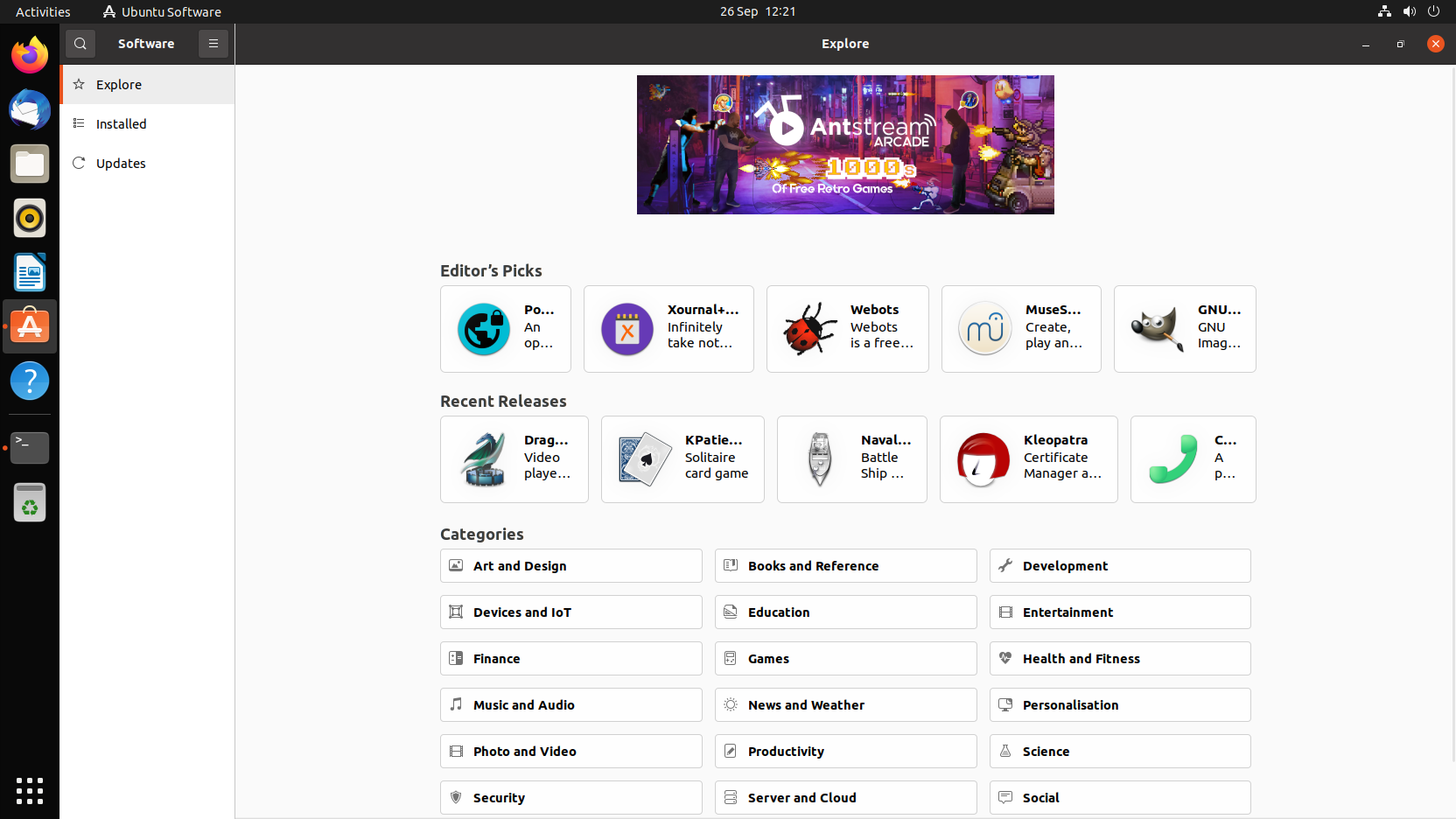
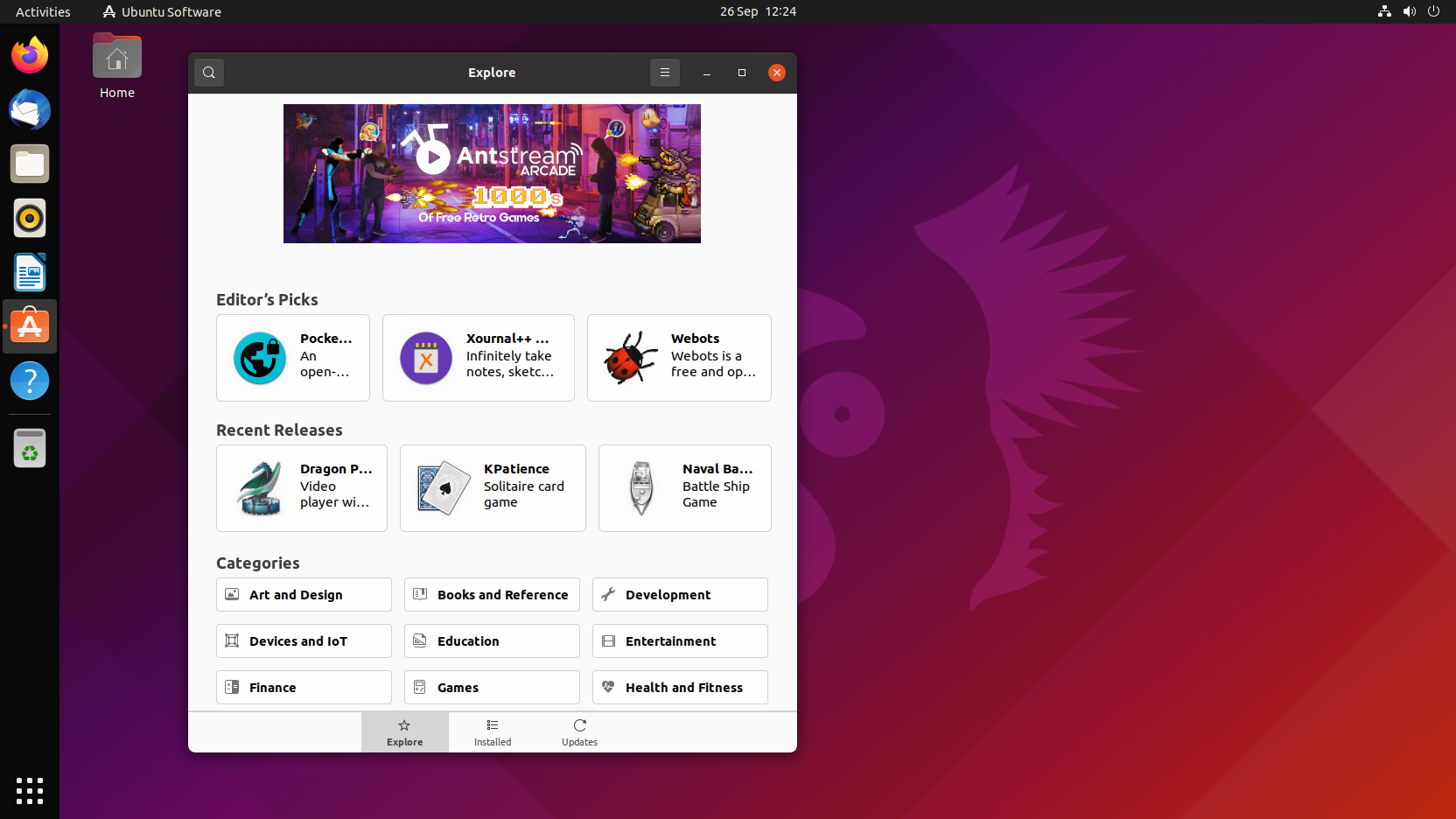
Application names are poorly truncated
| Affects | Status | Importance | Assigned to | Milestone | |
|---|---|---|---|---|---|
| snap-store-desktop |
Confirmed
|
Undecided
|
Unassigned | ||
Bug Description
On a clean install of Ubuntu 21.10 beta, the "Editor's Picks" include a few recommended applications.
Unfortunately the storefront truncates them to be unreadable.
Further, the truncate is different depending on the window size.
For example:
"Pocket Browser
An open-source browser made for privacy and going towards security"
Can be truncated (when maximised as):
"Po...
An
op"
or (when scaled to the smallest size)
"Pocket Bro...
An open-
source brow..."
or (when slightly larger than the smallest size)
"...
An
..."
or (when slightly larger still)
"Pocke...
An
open-..."
or (when slightly larger, and the side-bar pops up)
"P...
An
o..."
Most of which are completely useless as descriptions. Some applications have better, some worse, but they're all pretty useless until you click on them. A user shouldn't have to click on an application just to find out what the name of it is. The name at the absolute least, should be visible.
Screenshots attached.

| Changed in snap-store-desktop: | |
| status: | New → Confirmed |