
wish: red text in budget report for negative results
| Affects | Status | Importance | Assigned to | Milestone | |
|---|---|---|---|---|---|
| HomeBank |
Fix Released
|
Wishlist
|
Maxime DOYEN | ||
Bug Description
WISH: improvement for stack bars budget report view
-------
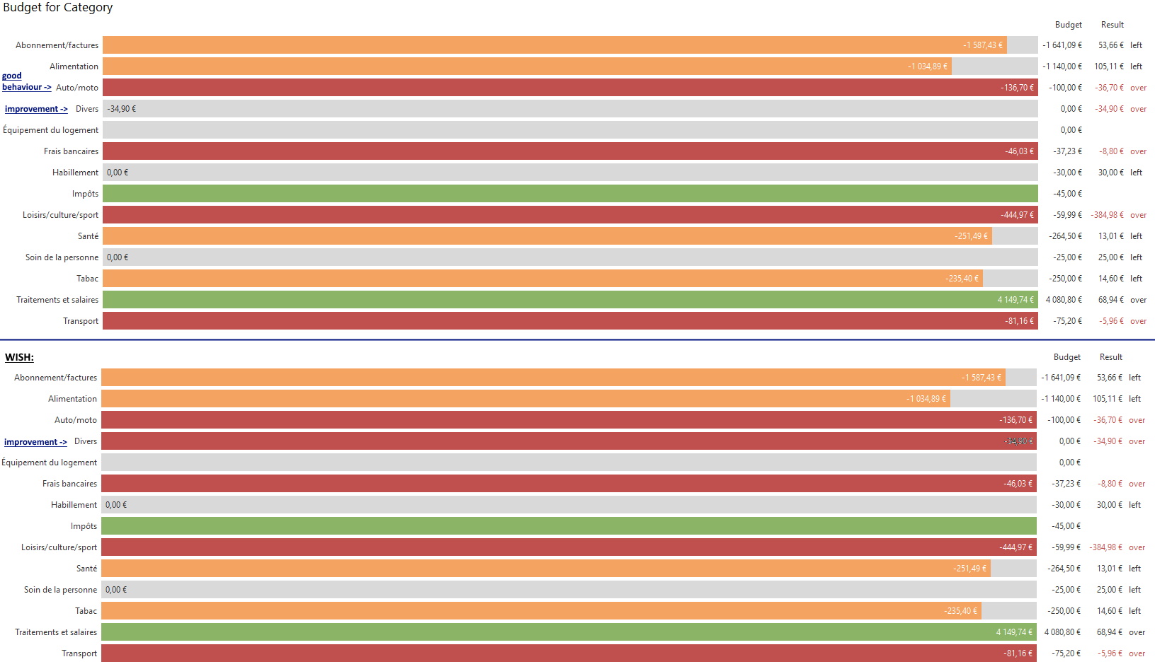
* SUMMARY
When a category is set to 0 and the budget result is over, the stack bar is still grey.
It would be more readable if the stack bar was red.
* DETAILS
+ INFO :: version 5.4.3 (GTK+ 3.24.18)
+ WHERE :: budget report -> stack bars view
+ WHAT :: In budget management, a category budget is set to 0 (exemple in the screenshot : "Divers")
+ HOW :: For this category, there are some expenses, so the budget is over (>0).
In the budget report :
1) In the list view, the result is over and the text is red => OK
2) In the stack bar view, the bar is grey, so it's harder to see that the budget is over. => improvement whished : the stack could be red, as the other categories when a budget is set and over
+ VISUAL: screenshot joined

| Changed in homebank: | |
| status: | Incomplete → Confirmed |
| assignee: | nobody → Maxime DOYEN (mdoyen) |
| Changed in homebank: | |
| milestone: | none → 5.4.4 |
| summary: |
- wish: red bar in budget report for negative results + wish: red text in budget report for negative results |
| Changed in homebank: | |
| status: | Confirmed → In Progress |
| Changed in homebank: | |
| status: | In Progress → Fix Committed |
| Changed in homebank: | |
| milestone: | 5.4.4 → 5.5 |
| Changed in homebank: | |
| status: | Fix Committed → Fix Released |
the full width grey represent the total budget gauge, here on your screenshot the 34.90 is so small amount that the gauge has no red rectangle part.
so filling the gauge with red make no sense, as you will loose the fill progression.
I would suggest maybe a) and/or b):
a)to move the 3 text column from the right to the left, so before the gauge
b) maybe to print 34.90 in red as well
what do you think ?