Nautilus sidebar theming is confusing

Bug #1762465 reported by Will Cooke
34
This bug affects 7 people
Affects Status Importance Assigned to Milestone
Ubuntu theme
Confirmed
Medium
Marco Trevisan (Treviño)
ubuntu-themes (Ubuntu)
Confirmed
Medium
Marco Trevisan (Treviño)

Bug Description

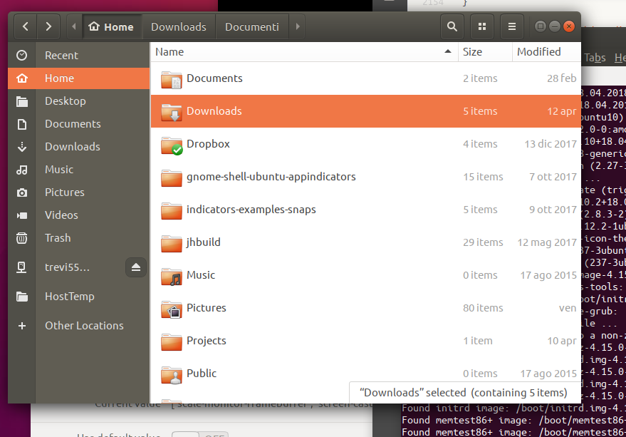
The new theming of the Nautilus sidebar is confusing to users. The icons and the icon labels have a different background colour, and when a specific location is selected the background colour of the selected icon changes to be the same as the background colour of the labels, while the other icons have a darker background colour.
This is giving the impression that the text labels are a hierarchy of the icon, rather than simply being labels associated with each icon.

Revision history for this message
Launchpad Janitor (janitor) wrote :

Status changed to 'Confirmed' because the bug affects multiple users.

Changed in ubuntu-themes (Ubuntu):
status: New → Confirmed
tags: added: bionic visual-quality
Changed in ubuntu-themes:
status: New → Confirmed
importance: Undecided → Medium
Changed in ubuntu-themes (Ubuntu):
importance: Undecided → Medium
Revision history for this message
Amr Ibrahim (amribrahim1987) wrote :

I agree to this bug. I think the sidebar should have the same background, labels and icons.

Revision history for this message
Daniel van Vugt (vanvugt) wrote :

As far as I can tell, you need to look for "placessidebar" in:
/usr/share/themes/Ambiance/gtk-3.20/gtk-widgets.css

But there's a lot of complexity there. I can't tell what does what.

Changed in ubuntu-themes:
assignee: nobody → Marco Trevisan (Treviño) (3v1n0)
Changed in ubuntu-themes (Ubuntu):
assignee: nobody → Marco Trevisan (Treviño) (3v1n0)
Revision history for this message
Marco Trevisan (Treviño) (3v1n0) wrote :

Not sure how this can be solved... Something like https://i.imgur.com/ZVXQ1ku.png ?

Revision history for this message
Marco Trevisan (Treviño) (3v1n0) wrote :

Not sure how this can be solved... Something like https://i.imgur.com/RA9esFK.png would be better?

Revision history for this message
Daniel van Vugt (vanvugt) wrote :

I think there are just too many columns. The icons and labels should have the same background colour. So one column instead of two.

Revision history for this message
Daniel van Vugt (vanvugt) wrote :

Same as the design of the side bar in http://news.google.com - one background for icons and labels.

Revision history for this message
Marco Trevisan (Treviño) (3v1n0) wrote :

I think that's a too big change, and Ambiance-RW that was ack'ed by design had this two color situation.

One thing we could do however, which won't involve much change nor break visual, could be just leaving the item selected with orange background, so although there are two colors, it should be pretty visible what they refer to.

Revision history for this message
Marco Trevisan (Treviño) (3v1n0) wrote :

Something like this, to be more clear: https://usercontent.irccloud-cdn.com/file/DwPJt7na/image.png

(maybe with a darker bg in the icon area to keep some consistency)

Revision history for this message
Daniel van Vugt (vanvugt) wrote :

I think that would be OK as a solution, but not ideal.

I don't know anything about Ambiance-RW's motivations but it seems like poor UI design to have two separate background colours. Each row is a single object made up of an icon and a label. It's visually confusing that each object is split across two columns.

Revision history for this message
florin (florin-arjocu) wrote :

That is true, it should be the same color for icon and label as they are one item.

Revision history for this message
Gustav Ekner (gustav-ekner) wrote :

Two more solutions:

* Make the background the same but keep a line between: https://i.imgur.com/ilhA6Zr.png
* Make the background the same and remove the line: https://i.imgur.com/qS0ODeq.png

(I based the images of Marco Trevisan's, hope that's OK :-) )

Revision history for this message
Ads20000 (ads20000) wrote :

I think the latter solution - keep the dark background but remove the line - makes the most sense. Can this be SRU'd to 18.04 when done? I think this is a significant enough design bug that an SRU should be done? Regression potential would be, perhaps, that updates (the change from the buggy UI to the new UI) don't produce the intended result (though updates can easily be tested for).

Revision history for this message
Ads20000 (ads20000) wrote :

Oh, except for a less dramatic deviation from the current design the sidebar should have orange text and an undivided dark background, I think, rather than an orange line, as in the most recent imgur. Probably the lighter shade of gray should be used.

Revision history for this message
Daniel van Vugt (vanvugt) wrote :

I also agree that https://imgur.com/qS0ODeq would be best.

To post a comment you must log in.
This report contains Public information  
Everyone can see this information.

Other bug subscribers

Remote bug watches

Bug watches keep track of this bug in other bug trackers.