
wish: configurable layout for home/summary page
| Affects | Status | Importance | Assigned to | Milestone | |
|---|---|---|---|---|---|
| HomeBank |
New
|
Undecided
|
Unassigned | ||
Bug Description
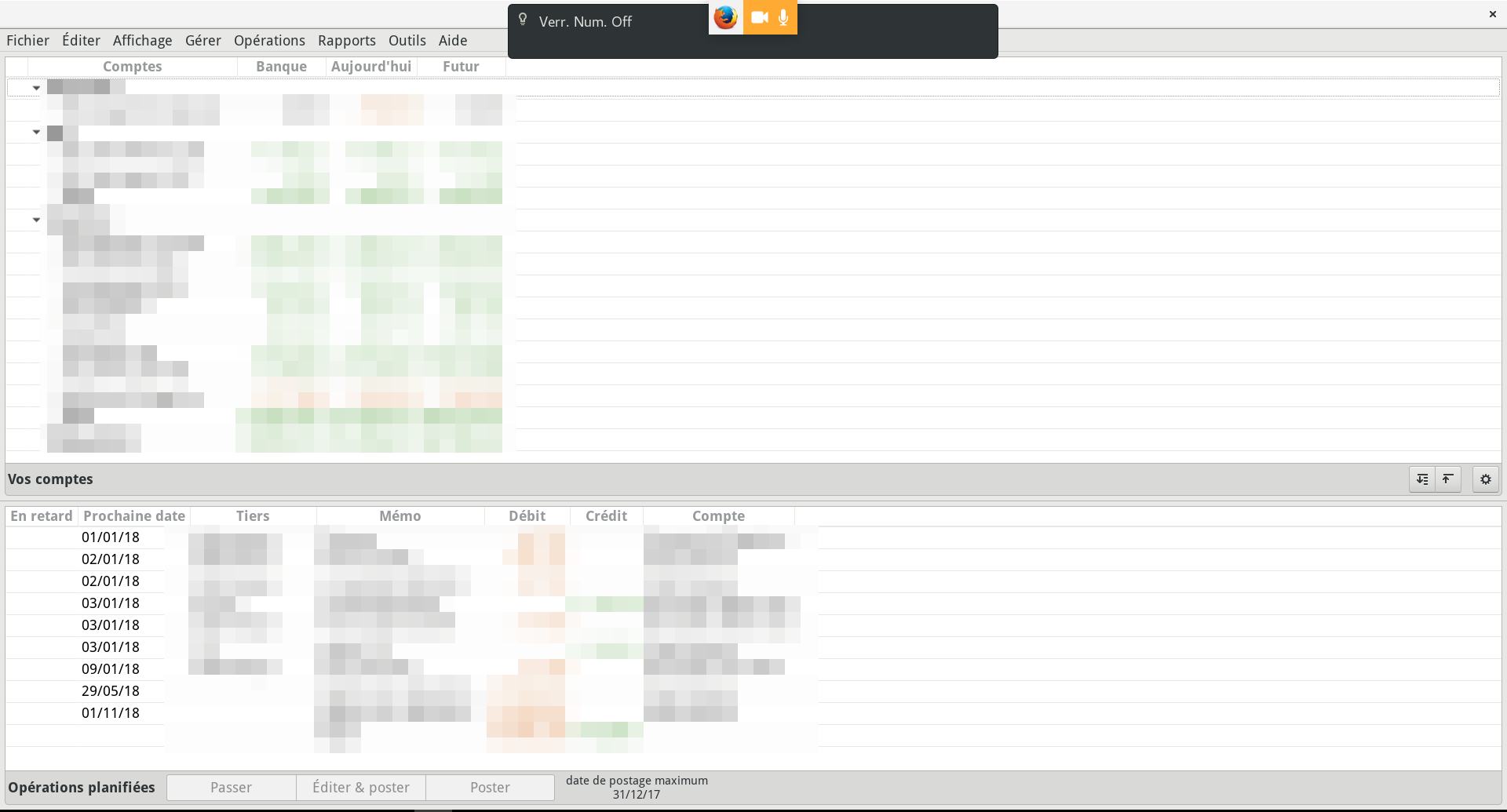
All my screens are widescreen (16:9, 16:10, or 21:9) but Homebank unfortunately doesn't leverage this aspect ratio. This is particularly noticeable with the main window, the "Accounts summary" that shows up when you start the application: I have a lot of accounts and a lot of recurrent transactions, and Homebank is making the two views scroll vertically while there is also a ton of available, "wasted" space on the sides. See attached screenshot.
See also: http://
Proposed approach:
1. When Homebank detects* the screen has a much bigger width than height,
2. If the "top spending" pane is disabled by the user,
3. Have the accounts list and the recurring transactions list widgets in two vertically scrollable areas side-by-side instead of two horizontally scrollable areas.
*: the blog post above also has a link to some example code/commit that will tell you know how to measure this easily with GTK.
Thanks!

| summary: |
- Wish: On widescreen monitors, when "top spending" pane is hidden, show - accounts summary and upcoming/recurrent transactions side-by-side + wish: 2 column layout for widescreen |
| Changed in homebank: | |
| importance: | Undecided → Wishlist |
| tags: | added: home |
| summary: |
- wish: 2 column layout for widescreen + wish: home 2 columns layout for widescreen |
| tags: | added: user-interface |
| summary: |
- wish: home 2 columns layout for widescreen + wish: configurable layout for summary page |
| Changed in homebank: | |
| assignee: | nobody → Maxime DOYEN (mdoyen) |
| status: | New → Confirmed |
| Changed in homebank: | |
| status: | Confirmed → New |
| summary: |
- wish: configurable layout for summary page + wish: configurable layout for home/summary page |
| Changed in homebank: | |
| assignee: | Maxime DOYEN (mdoyen) → nobody |
| importance: | Wishlist → Undecided |