change icons for workers in the menus

Bug #1512077 reported by kaputtnik
6
This bug affects 1 person
Affects Status Importance Assigned to Milestone
Widelands media development
Fix Released
Undecided
Unassigned
widelands
Fix Released
Medium
Unassigned

Bug Description

As mentioned in the topic "some icons need an update" (https://wl.widelands.org/forum/topic/1835/) i open this bug for uploading images and linking a branch if the icons are ready.

Short summary:
- The Barbarian Innkeeper still uses the old ration/meal icons
- All Carriers use the Atlantean Buckets icon. Create something off the idle animations?
- The Barbarian Weaver has wool in his icon instead of thatch reed.
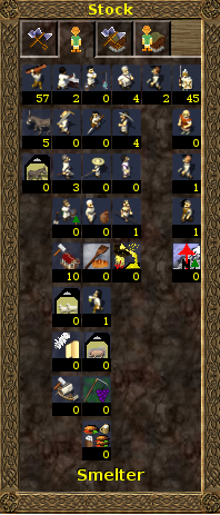
- The icons for workers in stock-menus should display human beings (widelands residents) instead images of wares/tools

Tags: images

Related branches

Revision history for this message
kaputtnik (franku) wrote :
Revision history for this message
GunChleoc (gunchleoc) wrote :

I think we're moving in the right direction here :)

Revision history for this message
kaputtnik (franku) wrote :

I've been through all atlantean workers. Because some of the materials are very dark, i've made a circular gradient on each icon which turns from transparent into white. The center of the gradient is always the middle of the worker.

I've made a comparison for the overall filesize in tribes/workers/atlantean and the new icons do not increase the sizes in a great manner. Its just 1 byte more.

Attached a screenshot.

Revision history for this message
kaputtnik (franku) wrote :

There are some inaccuracies between the old worker icons and the tools a worker uses. F.e. the barbarian gardener:

- old Icon shows a scythe
- Helptext in game says he uses a shovel and no scythe

I don't know and couldn't find anywhere the right answer. Could someone please tell me where to find which tool a worker needs to do his job? Thanks :-)

For the atlantean workers i always used the tool which is shown in the helptext in game. But it needs quite a lot of time to start a game only to retrieve the correct tool for a worker...

Revision history for this message
wl-zocker (wl-zocker) wrote :

Have a look at the worker's init.lua at the buildcost section. The gardener needs a shovel.

Revision history for this message
GunChleoc (gunchleoc) wrote :

You can also use the "workers" tab in the in-game help (Tribal Encyclopedia). The "Worker uses" section is automatically generated from what's in the init.lua files.

Revision history for this message
kaputtnik (franku) wrote :

@ #3

Thanks, i have overlooked this section.

Revision history for this message
kaputtnik (franku) wrote :

Barbarians... These do not have the white gradient. i think it looks better this way. And i believe that this inconsistence with atlantean workers do not really matter: One player could only play one tribe, so he/she could see only one such worker list.

Revision history for this message
GunChleoc (gunchleoc) wrote :

No, the inconsistency doesn't matter.

I love them, they look really good :)

Just one thing: I find the carrier carrying blackwood rather than a simple log a bit confusing - I was wondering if this was the wood hardener when I first saw him.

Revision history for this message
kaputtnik (franku) wrote :

Thanks :-)

Changing blackwood with log is no problem. I thought he should carry a tribe specific thing.

I played also around with the menu_tab_workers icons. If i find a better solution i will implement them into this branch.

The economy network graphs on the website needs also an update if we are ready with this. I believe these must be updated by hand, but i don't know if this is possible for now because creating the encyclopedia on the website is currently broken.

Not related to this: A thing i stumbled over: If a building is under construction, the in game help shows information only about "construction side", not about the building which is going to be constructed. We should rethink this. I would prefer to have information related to the building which is under construction.

Revision history for this message
kaputtnik (franku) wrote :

Empire workers are ready. I've changed also the icons for the tabs, also the icon for workers which is displayed in the buildings window. Because some buildings have only one worker, i tried to make this visible in the icon: The second carrier has some transparent, so the icon is maybe recognized as "one or more workers".

The barbarian carrier carry's now a log.

A questions about the difference between "workers in warehouse" and "workers in dock". Currently we have different icons. I think we should not make a graphical difference between "workers in warehouse" and "workers in dock" . The only difference is the type of building: Warehouse <-> Port, but both have the same function. Does a port need a new icon for the same thing? In my opinion we should use only one worker icon for both: a warehouse and a port.

kaputtnik (franku)
Changed in widelands-media:
assignee: nobody → kaputtnik (franku)
Revision history for this message
GunChleoc (gunchleoc) wrote :

They look great :)

The port has 4 tabs, which should all have a distinct icon. So yes, we do need 2 different icons for "workers in warehouse" and "workers in dock". The "workers in warehouse" image is what's being used in the warehouses as well.

One more thing: We don't have an animation for the Imperial Vintner yet. Can you hack the icon so he carries an amphora instead of the beer barrel? It doesn't match the animation, but I think it would look better in the warehouse window.

kaputtnik (franku)
Changed in widelands-media:
status: New → In Progress
Revision history for this message
kaputtnik (franku) wrote :

> The port has 4 tabs, which should all have a distinct icon. So yes, we do need 2 different icons for "workers in warehouse" and "workers in dock".

I don't understand that :-S The icons do already distinct. Attached screenshot for a comparison of all involved windows. Currently there are different icons, but i believe having the same icon for port and stock (which both have 4 tabs) would not make a difference.

Changed icon for the vintner.

Revision history for this message
wl-zocker (wl-zocker) wrote :

The stock menu shows all wares you have (in this economy?) in the first tab, and all stored (unused) wares in the third tab.

If you sum up all wares from warehouses, headquarters and ports (not sure about the dock, but it should not be, because the are not unused), this should give the number of stored wares. Consequently, all these four icons should look the same (e.g. having a warehouse in the background).

Wares and workers in a dock are waiting for a ship transport. So they are different from the wares normally stored because they are not unused, but awaited somewhere else. I prefer the anchor icon to the ship because they are not yet on a ship.

To the icons: In general, they look very good. Some things I don't like:
- Imperial carpenter: The left part of the saw is hard to see in the warehouse windows. And it is not immediately clear what he does - show some planks?
- Barbarians + Empire lumberjack: What is to the left of the worker? A felled tree?
- Atlanteans: It is not immediately clear who is the woodcutter and who is the sawyer.
- Atlanteans: The tree of the forester is hard to recognize.
- Barbarians: The carrier carries the blackwood at a strange angle.
- Empire: The stonemasons works both in the quarry and the stonemason's house, producing marble columns. This doesn't become clear from the icon.
- Barbarians + Empire: The miners have gold. At first, one might think that they are special gold-miners. I have no idea how to do it better.
- Atlanteans: The tridents and the tool are hard to see.
- Barbarians: The master blacksmith can produce tools, too. Give him both an ax and a tool?

About reordering the icons:
- Can carriers ever be in a portdock? The new port should create them automatically.
- Why is the scout in the last column (military) and not in the first (general)?
- Barbarian smithes: The master blacksmith seems wrong in the second-last column because he can make weapons, but on the other hand, he is a more experienced blacksmith.
- Empire: I think it would make more sense to have the carpenter under the lumberjack (maybe even under the forester).

Revision history for this message
GunChleoc (gunchleoc) wrote :

> I don't understand that :-S The icons do already distinct.

I misunderstood you then. I thought that you wanted to make them the same when you said:

> I think we should not make a graphical difference between "workers in warehouse" and "workers in dock" .

Can you update the "wares in portdock" icon too to show a ship instead of an anchor?

> Barbarians + Empire: The miners have gold. At first, one might think that they are special gold-miners. I have no idea how to do it better.

Maybe a pick, or a pile of mixed resources, maybe taken from the the building animations?

> Can carriers ever be in a portdock? The new port should create them automatically.

The order and whether they are displayed is controlled by the engine. They should only show up if they have a buildcost (e.g. when somebody mods Widelands)

About the display order: This is controlled in tribes/<tribename>.lua

Revision history for this message
kaputtnik (franku) wrote :

> About reordering the icons:

I never touched this :-)

And the other things i will regard . To be honest i didn't had a real plan for doing this. The only thing i thought of is to have always the worker on the right and "something" on the left. But often i was unsure what to show on the left... so sometimes i used images that a worker produce, and sometimes what he needs to do his job or needs to make him such a worker. In general i used images which are better distinguishable independent of "produce" or "needs". Maybe we should have a rule for that.

On the other side most of the old icons i didn't understand... and i believe that some the new icons a player didn't understand at all. In the end a space of 24x24 pixel isn't much space to show everything in a clear way. So from my point of view, the reason for the new icons is that they should show workers in the workers tab, instead of some signs. And that the icons fits graphically with the other graphics.

Thanks for looking into my work :-) As said, i will regard your comments.

> Can you update the "wares in portdock" icon too to show a ship instead of an anchor?

? It was an anchor showing *lol* ? Sorry, but this is one thing what i meant: I saw something but never an anchor :-D . Yes will try to do so.

Revision history for this message
GunChleoc (gunchleoc) wrote :

Yep - I had to take a close look too.

I am find with sometimes having the tool and sometimes the ware - e.g. for the toolsmith, there are so many wares to choose from...

I'd say just leave the icon order as it is, we can change that in a different branch if we want to. This is unrelated to this change.

Revision history for this message
kaputtnik (franku) wrote :

> Wares and workers in a dock are waiting for a ship transport. So they are different from the wares normally stored because they are not unused, but awaited somewhere else.

Ah, something i didn't know. Wouldn't it be better to clarify this in the tooltip? Instead "Workers in dock" "Workers awaiting for delivery"? Respectively for the wares in dock?

> I prefer the anchor icon to the ship because they are not yet on a ship.

We should use either an anchor or a ship for both icons: Wares and workers in dock ("awaiting for delivery") I would prefer a ship (not sailing) because we have no anchor in the whole game. I thought also to make something like "Wares arrow ship" but there is not enough space to do so.

Revision history for this message
GunChleoc (gunchleoc) wrote :

I like the ship too, good idea :)

How about "Wares/Workers waiting to embark"? You are right that the player doesn't really care that we have a Portdock object in the code here. On a selfish note, it would be quite convenient for my translation too, since I had trouble finding 2 distinct terms for "shipyard" and "dock".

Revision history for this message
wl-zocker (wl-zocker) wrote :

Reordering the icons is reported as bug 1518704.

We had anchors in the build help, but I think they all have been replaced. I agree that the portdock is somewhat mysterios, so better avoid that term.
A non-sailing ship would be fine for this icon, if a tooltip explains (understandably) what this tab means.

Revision history for this message
GunChleoc (gunchleoc) wrote :

How about "Wares/Workers waiting to embark on a ship"?

Revision history for this message
wl-zocker (wl-zocker) wrote :

I did not say that "Wares waiting to embark" is not understandable. You can leave it like this if English-speaking people understand what embark means.

Revision history for this message
kaputtnik (franku) wrote :

"Wares/worker [waiting] to be shipped"?

Revision history for this message
GunChleoc (gunchleoc) wrote :

I think the most natural would actually be:

Workers waiting to embark
Wares waiting to be shipped

Revision history for this message
kaputtnik (franku) wrote :

The reworked icons. I tried to follow the general rule " Worker on right side; additional graphic on the left should show the item the worker produce".

Atlantean do not have the white gradient anymore.... the only thing that is difficult to show is the blackroot. I've put a liitle "aura" to this ware to make it distinguishable to the background (carrier, blackroot farmer).

The menu_tabs are also reworked. The ship may need to stick out some more.

First attachment: Workers.

Revision history for this message
kaputtnik (franku) wrote :

The new tab images.

Revision history for this message
GunChleoc (gunchleoc) wrote :

Maybe diffuse the halo around the blackroot a bit? It looks too much like a line right now. You could also cheat a bit and try to make the blackroot itself lighter.

I would also like to see some more cross-tribe consistency:

- Atlantean carrier is carrying a blackroot, the other carriers are carrying a log.
- Basic miner should show the same resource indicator for all 3 tribes.

For the tabs, I think the ware/workers should be in front of the ship . The ware icon looks weird cropped like this.

Everything else looks great :)

Revision history for this message
kaputtnik (franku) wrote :

> - Atlantean carrier is carrying a blackroot, the other carriers are carrying a log.
done

> - Basic miner should show the same resource indicator for all 3 tribes.
done

The blackroot is now more redish and the halo is removed. I think it is ok. You have good ideas :-)

> For the tabs, I think the ware/workers should be in front of the ship . The ware icon looks weird cropped like this.
Yes, i thought doing so will become the ship clearer. But my eyes got tired... today it looks also ok if the ship is in background ;)

The attachment shows also a thing related to bug 1519361 : The background icon of the list shows a port, but the transparent areas get filled with other images/texts.

I will propose for merging the workers_branch then.

Revision history for this message
GunChleoc (gunchleoc) wrote :

Thanks!

I have added the screenshot to the other bug - it contains important information :)

GunChleoc (gunchleoc)
Changed in widelands:
status: In Progress → Fix Committed
kaputtnik (franku)
Changed in widelands-media:
status: In Progress → Fix Committed
Changed in widelands:
assignee: kaputtnik (franku) → nobody
Changed in widelands-media:
assignee: kaputtnik (franku) → nobody
Changed in widelands:
milestone: none → build19-rc1
GunChleoc (gunchleoc)
tags: added: graphics
removed: graphic
GunChleoc (gunchleoc)
tags: added: images
removed: graphics ui
GunChleoc (gunchleoc)
Changed in widelands:
status: Fix Committed → Fix Released
Changed in widelands-media:
status: Fix Committed → Fix Released
Revision history for this message
GunChleoc (gunchleoc) wrote :

Fixed in build19-rc1.

To post a comment you must log in.
This report contains Public information  
Everyone can see this information.

Other bug subscribers

Remote bug watches

Bug watches keep track of this bug in other bug trackers.