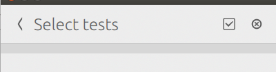
Select All/None should be a single icon
Bug #1490522 reported by
Ara Pulido
This bug affects 1 person
| Affects | Status | Importance | Assigned to | Milestone | |
|---|---|---|---|---|---|
| Checkbox Converged |
Fix Released
|
Medium
|
Maciej Kisielewski | ||
Bug Description
Having two icons in the Header, one for select all, one for select none is awkward and different from the rest of applications.
We should only have 1 icon (the one with the checkbox) and toggle its function between select all/none
Related branches
lp:~kissiel/checkbox/fix-1490522-select-deselect
- Zygmunt Krynicki (community): Approve
-
Diff: 92 lines (+27/-25)2 files modifiedcheckbox-touch/components/SelectionPage.qml (+25/-23)
checkbox-touch/tests/autopilot/checkbox_touch/__init__.py (+2/-2)

| Changed in checkbox-converged: | |
| status: | New → In Progress |
| assignee: | nobody → Maciej Kisielewski (kissiel) |
| importance: | Undecided → Medium |
| milestone: | none → 1.2.2 |
| Changed in checkbox-converged: | |
| status: | In Progress → Fix Committed |
| Changed in checkbox-converged: | |
| status: | New → Fix Committed |
| Changed in checkbox-converged: | |
| status: | Fix Committed → New |
| Changed in checkbox-converged: | |
| milestone: | 1.2.2 → 1.2.3 |
| Changed in checkbox-converged: | |
| status: | New → Fix Committed |
| Changed in checkbox-converged: | |
| status: | Fix Committed → Fix Released |
To post a comment you must log in.
If we want to have one button for those two actions, we should defined what this button should do when there is something (but not all) selected.
I think if the user starts to do custom selection, then they rather have everything deselected quickly, and start over.