
Improve event bubble margins
Bug #1308001 reported by
David Planella
This bug affects 1 person
| Affects | Status | Importance | Assigned to | Milestone | |
|---|---|---|---|---|---|
| Ubuntu Calendar App |
Fix Released
|
Medium
|
Mihir Soni | ||
Bug Description
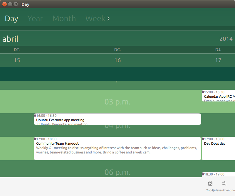
Right now, when looking at events in e.g. day view, there are a couple of design issues that could be solved to make them a bit tidier and more readable:
- The top margin is too small: the event hour nearly sticks to the bubble's top edge
- The coloured circle to the left of the event time is too close to the left, it should probably be moved to the right, or replaced by colouring the whole bubble
- Often if the vertical length (duration) of an event is short, we cut the description halfway through withouth bottom margin. Rather than doing that, if the description does not fit completely in the bubble, we should probably not display it.
In short, we'd need an event bubble mockup with sizes and margin specifications.
Related branches
lp:~mihirsoni/ubuntu-calendar-app/1308001
- Kunal Parmar: Approve
- Ubuntu Phone Apps Jenkins Bot: Approve (continuous-integration)
- Alan Pope 🍺🐧🐱 🦄 (community): Approve
- David Planella: Needs Fixing
-
Diff: 79 lines (+19/-14)1 file modifiedEventBubble.qml (+19/-14)

| Changed in ubuntu-calendar-app: | |
| assignee: | nobody → Mihir Soni (mihirsoni) |
| Changed in ubuntu-calendar-app: | |
| status: | Triaged → In Progress |
| Changed in ubuntu-calendar-app: | |
| status: | Fix Committed → Fix Released |
To post a comment you must log in.
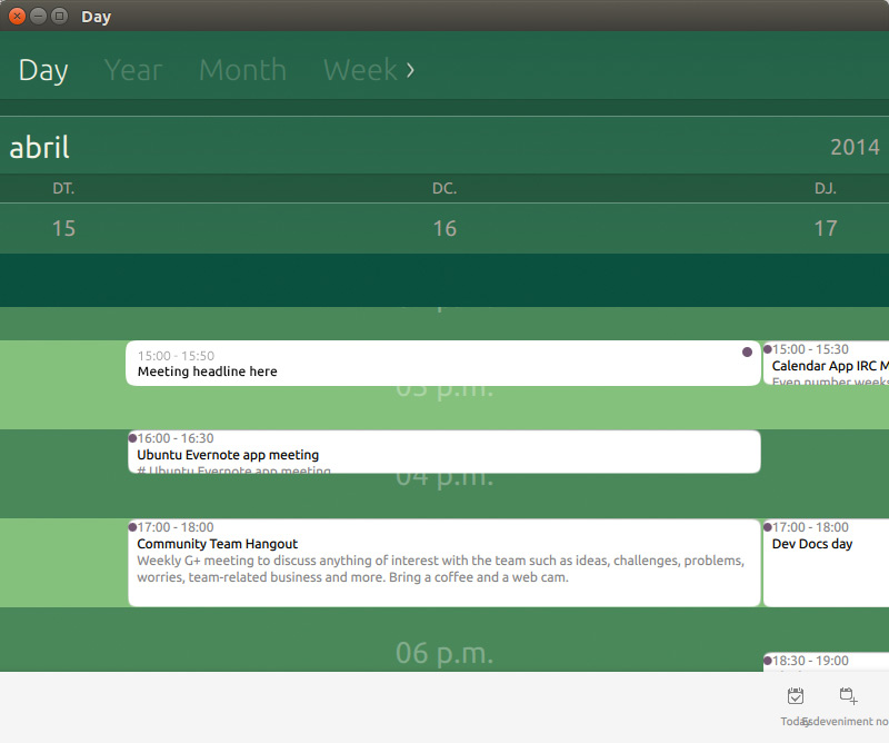
Here are the guidelines from the design team (see the "Meeting headline here" event). In short:
- Calendar indicator (coloured circle) to the right
- 1 GU margins
- Do not show the second line if it's cut off