
Artists view on desktop wastes space
Bug #1297177 reported by
Alan Pope 🍺🐧🐱 🦄
This bug affects 1 person
| Affects | Status | Importance | Assigned to | Milestone | |
|---|---|---|---|---|---|
| Ubuntu Music App |
Won't Fix
|
Low
|
Unassigned | ||
Bug Description
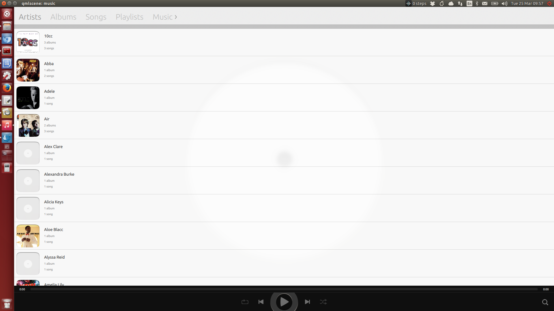
See screenshot.
On a high resolution desktop (or tablet) the artist view has a lot of wasted space to the right.
Perhaps we should have a multi-column view?

| tags: | added: bacon-dogfood |
| tags: | added: needs-design |
| Changed in music-app: | |
| milestone: | none → hackdays-1403 |
| Changed in music-app: | |
| status: | Confirmed → Triaged |
| importance: | Undecided → High |
| Changed in music-app: | |
| assignee: | nobody → Andrew Hayzen (andrew-hayzen) |
| Changed in music-app: | |
| importance: | High → Low |
To post a comment you must log in.
IMO each ListView (Songs, Albums, Artists, Playlists) wastes space currently in a wide mode. I think once we get a proper sidebar via the tablet/desktop convergence work this should be tolerable.