
font rendering problems in Gutsy w/ compiz
| Affects | Status | Importance | Assigned to | Milestone | |
|---|---|---|---|---|---|
| compiz (Ubuntu) |
Invalid
|
Undecided
|
Unassigned | ||
Bug Description
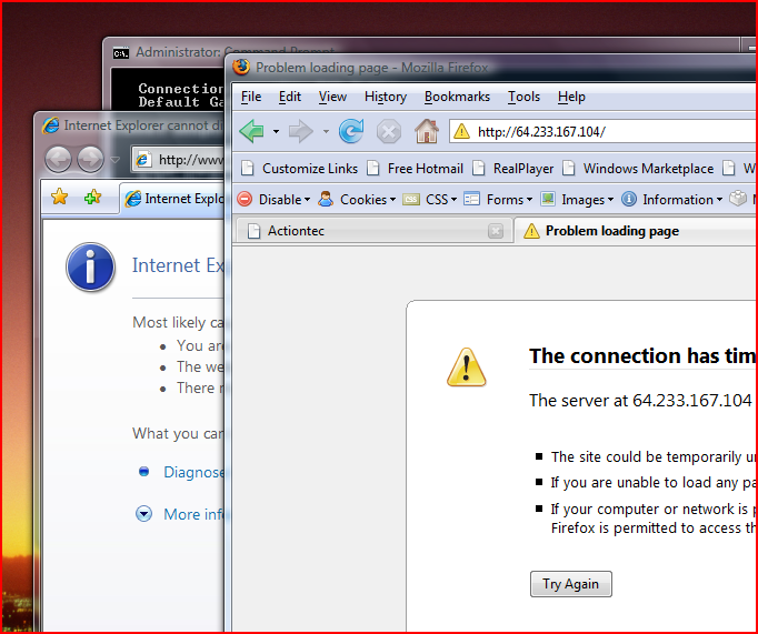
I'm attaching an annotated screenshot illustrating four problems. The screenshot is an SVG file but I've created it so that it should render properly in Firefox 2. If it doesn't, you may need inkscape to view it.
Problem #1 (top right):
Fonts in the title bar of applications look ugly. The reason is that it is white text on a brown background but with a black stroke. My guess is that this was done to provide contrast since the title bar is sometimes transparent. However, the way the text is outlined causes it to look dirty, thin, and makes it harder to focus on.
The solution is quite easy though. Instead of using a black stroke, use a brown stroke. The same color that the background would be if it wasn't translucent. If possible, make the stroke wide (say, 5 - 8 px) AND blurred (don't blur unless its wide). Since the font was chosen (presumably) to look good against a brown background then use the brown for the stroke too.
Problem #2 (two circles to the left of #1):
Similar problem, but this time for inactive title bars. Because the title bars are too transparent, then there is not enough contrast for the text. It makes it look messy. There is two possible solutions to this. The best solution would be to heavily blur whatever is behind the inactive title bar. This would allow you to get a sense of what is behind it, but would soften the edges allowing the fonts in the title bar to contrast against the transparency. The alternate, but probably less attractive solution is to outline the fonts (dark grey on light grey is bad btw) with the light grey color, making the outline quite thick and blurring it. This effectively reduces the transparency of the portion of the title bar where there's text.
Problem #3 (bottom left corner):
The fonts on the desktop just don't hold up against their drop shadow. The font is too thin which reduces contrast and makes it hard to focus. When the icon is selected, it gets a grey background around the text and the text becomes solid black, which is far more readable. I realize that the developers never know what color background the icons are going to be against and need to provide someway to give the text contrast... I suggest giving the font a little more weight.
Problem #4 (firefox - near bottom left):
This needs to be a separate bug. Ignore it here.
Problems 1 and 2 are directly related. I think problem #3 is too, but if not, I can file a separate bug on that one.

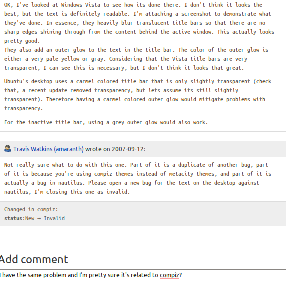
OK, I've looked at Windows Vista to see how its done there. I don't think it looks the best, but the text is definitely readable. I'm attaching a screenshot to demonstrate what they've done. In essence, they heavily blur translucent title bars so that there are no sharp edges shining through from the content behind the active window. This actually looks pretty good.
They also add an outer glow to the text in the title bar. The color of the outer glow is either a very pale yellow or gray. Considering that the Vista title bars are very transparent, I can see this is necessary, but I don't think it looks that great.
Ubuntu's desktop uses a carmel colored title bar that is only slightly transparent (check that, a recent update removed transparency, but lets assume its still slightly transparent). Therefore having a carmel colored outer glow would mitigate problems with transparency.
For the inactive title bar, using a grey outer glow would also work.