
Appearance of readonly GtkEntry elements is not different than normal entries
Bug #1219205 reported by
Andres G. Aragoneses
This bug affects 1 person
| Affects | Status | Importance | Assigned to | Milestone | |
|---|---|---|---|---|---|
| Ubuntu theme |
Fix Released
|
Undecided
|
Unassigned | ||
| ubuntu-themes (Ubuntu) |
Fix Released
|
Low
|
Unassigned | ||
Bug Description
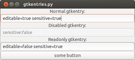
To improve usability, read-only GtkEntry widgets (whose "editable" property has been set to False) should have an appearance which is different from normal GtkEntry widgets.
I'm going to attach a python example with 3 different gtk entries. You will see how 2 of them are exactly the same.
Then I'm going to attach a solution to this problem (as a merge request), and a screenshot of the "before" and "after" the fix is included.
This change is inspired in this gtk+ bug being fixed upstream: https:/
Related branches
lp:~knocte/ubuntu-themes/bug1219205-fix-appearance-of-readonly-gtk3entries
- PS Jenkins bot (community): Approve (continuous-integration)
- Andrea Cimitan: Approve
-
Diff: 15 lines (+5/-0)1 file modifiedAmbiance/gtk-3.0/gtk-widgets.css (+5/-0)

| Changed in ubuntu-themes (Ubuntu): | |
| status: | New → Triaged |
| importance: | Undecided → Low |
| Changed in ubuntu-themes (Ubuntu): | |
| status: | Triaged → Fix Committed |
| Changed in ubuntu-themes: | |
| status: | Fix Committed → Fix Released |
To post a comment you must log in.
And this is the screenshot that shows the effects after my fix (merge request) has been included. ("after.png")