Personal details update message should be more striking
Bug #1207586 reported by
Leo Arias
This bug affects 1 person
| Affects | Status | Importance | Assigned to | Milestone | |
|---|---|---|---|---|---|
| Canonical SSO provider |
Confirmed
|
Low
|
Unassigned | ||
Bug Description
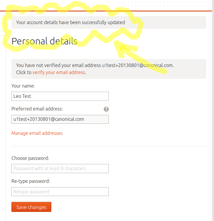
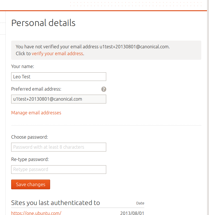
Following a support request, we noticed that the message when you go to login.ubuntu.com and change your details it's not as striking as it should. It uses the same colors as the rest of the page, so it's hard to notice it.
(Compare the two attached screenshots)
To reproduce, go to https:/
I think it should have something green. A green checkmark would be nice. Or maybe the box surrounding the message should be green.
I'll ask design for their opinion about this.
Related branches
lp:~ya-bo-ng/canonical-identity-provider/feedback-styles
- Jonas G. Drange (community): Approve
-
Diff: 30 lines (+17/-2)1 file modifiedsrc/identityprovider/media/ubuntuone/css/ubuntuone.css (+17/-2)

| information type: | Public → Private |
| information type: | Private → Public |
| Changed in canonical-identity-provider: | |
| assignee: | Registry Administrators (registry) → nobody |
To post a comment you must log in.
This should possibly be a green banner to match in else where like landscape. Also a red banner for an error in processing too.