Top of software item screen is unattractive

Bug #1026090 reported by Matthew Paul Thomas
32
This bug affects 6 people
Affects Status Importance Assigned to Milestone
software-center (Ubuntu)
Confirmed
Low
Emily Maher

Bug Description

Ubuntu Software Center 5.2.4, Ubuntu 12.04

The top of USC's software item screen is unattractive.
<https://launchpadlibrarian.net/110380605/layout.png>

To see this problem, go to <http://apt.ubuntu.com/p/snorms> for example.

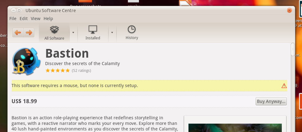
There are always at least five elements in this area:
a. Icon for the application/package.
b. Title (application name or package synopsis), usually four words or fewer.
c. Summary or tagline, usually ten words or fewer.
d. Price, often "Free"; or, if currently installed, an "Installed" icon and text and the date it was installed. <https://launchpadlibrarian.net/110391101/installed.png>
e. Button labelled "Install", "Install…", "Buy…", or "Remove", depending on the situation. During installation/removal, this changes to a progress bar with a small Stop button.

Occasionally there are additional elements:
f. An average rating, shown as stars, and the number of ratings.
g. A banner warning you that the item may be inappropriate: for example, "This software requires a CD drive, but none are currently connected."
h. Text for a package you've downloaded outside USC, "Install this item only if you trust its origin." Currently this replaces the price, because USC has no idea whether or how much you paid for it. <https://launchpadlibrarian.net/110980902/deb.png>

So, what are the problems?
<https://launchpadlibrarian.net/110980809/layout-annotated.png>

1. The contents of the price+button ribbon, and (when present) the warning ribbon, are flush with the left and right edges of their colored backgrounds. This is ugly.

We could fix this by adding some left and right padding inside, but then the text would no longer line up with the package description below it. Would that matter? Maybe, maybe not. We could fix that too, by adding padding to the package description as well. But then the overall description area would be further away from the edges of the window than the banner areas are. Would that matter? Maybe, maybe not.

2. The price/installed and warning ribbons are rather unattractive in themselves. In particular, they have no vertical borders, but dotted horizontal borders and a background color. These don't seem to go well together. The text in the price/installed ribbon is also bold and a bit clunky.

3. The "Install"/"Install…"/"Buy" button is far away from the price -- and the wider the window is, the further apart they are. Originally this was for semi-consistency with list views of multiple results, where we have a "More Info" button at the left end, and an "Install" button at the right end. <https://launchpadlibrarian.net/110391422/list-view.png> but we want to reduce our use of list views anyway. One possibility for fixing this would be to put the button on the left side, with the price/installed text immediately to its right.

These three problems would be best solved all at once by a graphic designer.

Revision history for this message
Matthew Paul Thomas (mpt) wrote :
description: updated
Revision history for this message
Gary Lasker (gary-lasker) wrote :

Hi mpt! What are the next steps, then? Thanks!

Changed in software-center (Ubuntu):
status: New → Confirmed
importance: Undecided → Low
description: updated
Revision history for this message
Matthew Paul Thomas (mpt) wrote :
Revision history for this message
Matthew Paul Thomas (mpt) wrote :
description: updated
Revision history for this message
Matthew Paul Thomas (mpt) wrote :
description: updated
Revision history for this message
Matthew Paul Thomas (mpt) wrote :
description: updated
Changed in software-center (Ubuntu):
assignee: nobody → Emily Maher (emily-maher)
Revision history for this message
Matthew Paul Thomas (mpt) wrote :
Changed in hundredpapercuts:
milestone: none → raring-round-4
importance: Undecided → Low
status: New → Confirmed
assignee: nobody → Papercuts Ninja (papercuts-ninja)
no longer affects: hundredpapercuts
Revision history for this message
Dario Ruellan (druellan) wrote :

Hi Matthew. I'm happy to see that my mockup seems useful. I'm willing to explore the problem a little further (adding some missing elements and alerts).

I'm also puzzled about the yellow/gray bar with dotted borders. I'm wondering if there is some approved design to separate areas on an UI (perhaps the theme default?).

Revision history for this message
Dario Ruellan (druellan) wrote :

I've explored the problem a little further on two new mockups.
On "Ubuntu_Software_Center_mockup2" I've played repositioning some elements in a three column layout. On "Ubuntu_Software_Center_mockup3" I've added some decorations and boxes, trying to mimic the Home page. That helped to create new areas to explore.

Hope this helps to bring some ideas and help improve the Software Center on the future.
I'm writting some notes on https://wiki.ubuntu.com/druellan/software-center-mockup-notes about particular challenges and odd things I've found working on the problem.

Revision history for this message
Dario Ruellan (druellan) wrote :
Revision history for this message
Dario Ruellan (druellan) wrote :
Revision history for this message
Matthew Paul Thomas (mpt) wrote :

Thanks Dario. It's an interesting idea to move some information into a secondary column. However, I'd like to retain the ability to use USC with a narrow window without horizontal scrolling, so three columns (secondary, primary, screenshots) is probably too much. Both M2 and M3 also continue problem #3, the "Install"/"Install…"/"Buy" button being far away from the price.

Revision history for this message
Dario Ruellan (druellan) wrote :

Hi Matthew. Thanks to taking the time and review the mockups.
I agree with you about the third column. Is not very useful and can cause problems on narrow resolutions, like a vertical tablet. Better to get rid of it.

I also agree about the position of the install button on M3: on a widscreen monitor it ends away from the price and the title, but I'm not sure about M2. Perhaps I approached the problem from the wrong concept, but for me, its not that the install button is away from the price, but away from everything that represents the product (but the screenshot). It is also badly positioned for discovery: most of the controls and links are on the left side.

On M2 the install button is right below the icon, and left of the main product info. I don't think that the average user can miss it or think that is not related to the product (and its price).

I don't want to be intrusive on your design process (I started without reading any documentation), but if you're OK, I can keep exploring the idea, eliminating the third column to see how the screenshot could be placed.

Thanks again.

To post a comment you must log in.
This report contains Public information  
Everyone can see this information.

Duplicates of this bug

Other bug subscribers

Remote bug watches

Bug watches keep track of this bug in other bug trackers.