Dash text is unreadable with some background pictures

Bug #824916 reported by Doug McMahon
124
This bug affects 26 people
Affects Status Importance Assigned to Milestone
Ayatana Design
New
High
Unassigned
Unity
Incomplete
Undecided
Unassigned
unity (Ubuntu)
Incomplete
High
Unassigned
Oneiric
Incomplete
High
Unassigned

Bug Description

unity 4.8.0-0ubuntu1, unity 4.8.2-0ubuntu4, Ubuntu Ocelot

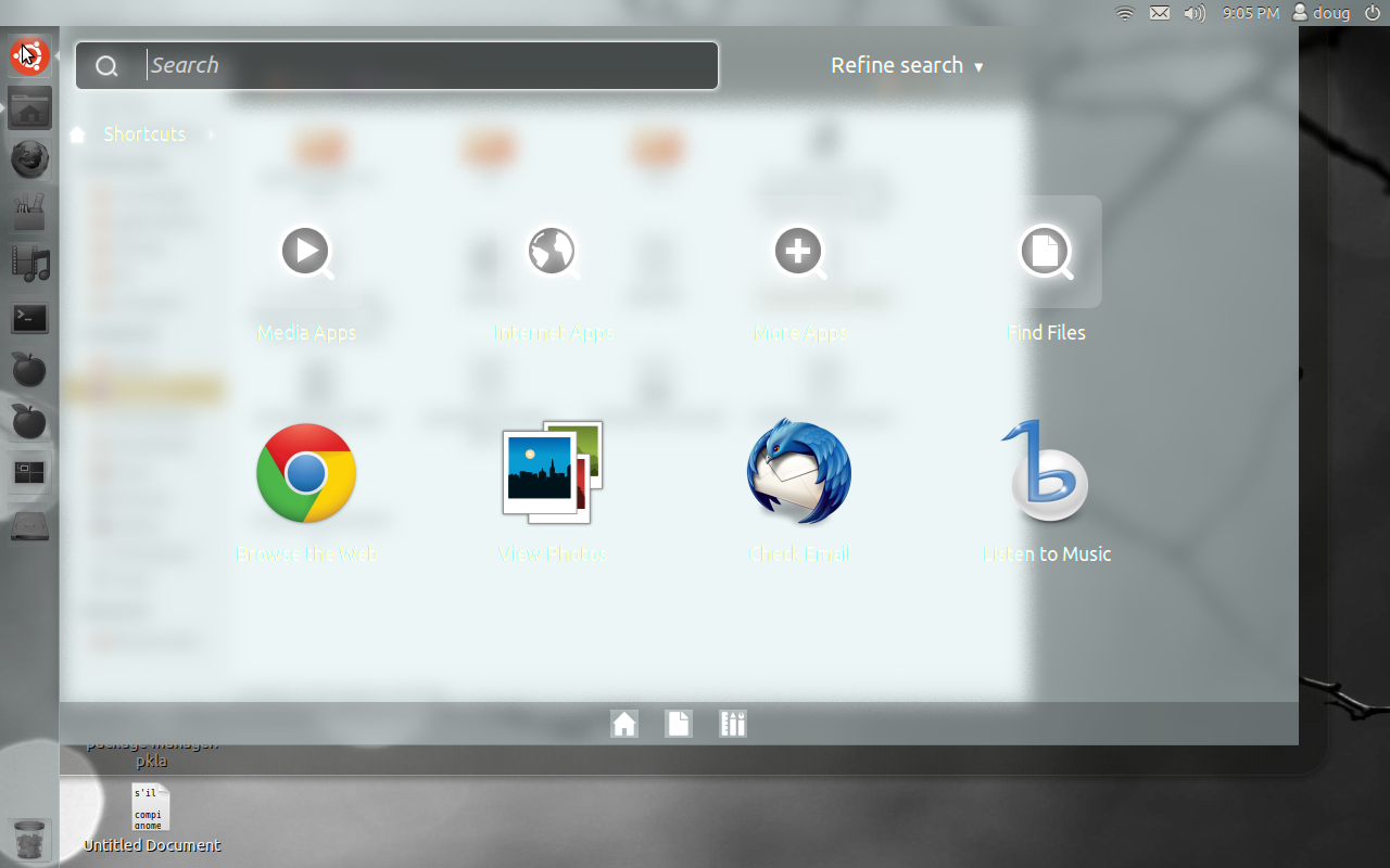
1. In the "Background" settings, choose "Wallpapers", then "Grey Day" (black and white skyscrapers) or "Touch the light" (branch with white blobs).
2. Open a maximized mainly-white window, such as this bug report.
3. Open the Dash.

What happens:
* https://launchpadlibrarian.net/77059668/Screenshot%20at%202011-08-11%2021%3A05%3A52.png
* https://launchpadlibrarian.net/78037869/Unreadable.png

The new default and currently non configurable dash transparency can become virtually unreadable depending on desktop background and or window(s) open
Additionally the idea of 'coloring' the dash based on the desktop doesn't seem to be well thought thru either
An option to either adjust the transparency or better yet use previous smoked glass effect seems to be needed if it's intended to continue using the current trans and color based on desktop

Other possible solutions suggested on ayatana@:
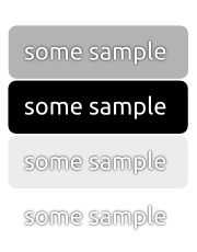
* Give the text an outline. [Conscious User]
* Use the opposite of the background in a chosen color space. [Conscious User]
* Switch to black text for any background that exceeds some brightness level on most of its surface. [Thorsten Wilms]
* Forget about the transparency. Set static back- and foreground colors. [Thorsten Wilms]
* Use the same centered and slightly-blurred drop shadow that Notify OSD uses. [Mirco Müller]
* A soft drop shadow around every Dash icon and text element. [Stefanos A.]

Revision history for this message
Doug McMahon (mc3man) wrote :
Changed in unity (Ubuntu):
status: New → Confirmed
Andrea Azzarone (azzar1)
Changed in unity:
status: New → Confirmed
description: updated
Revision history for this message
Jean-Baptiste Lallement (jibel) wrote :

Thanks for your report. It is a severe usability issue. As shown on your screenshot the dash is unusable.

Changed in unity (Ubuntu Oneiric):
importance: Undecided → High
status: Confirmed → Triaged
assignee: nobody → Canonical Desktop Experience Team (canonical-dx-team)
tags: added: regression-release
Changed in unity (Ubuntu Oneiric):
assignee: Canonical Desktop Experience Team (canonical-dx-team) → nobody
Revision history for this message
Doug McMahon (mc3man) wrote :

Obviously I did choose a background that accented the issue, however I'd hope some consideration is given to to whole concept itself.
It would be nice to see the lens' where the emphasis remained in the lens and the text and icons popped out.
I happen to think a smoked glass would do well , but that's just me and so what.
Anyway the current, even with a more suitable backdrop, just feels and looks very inelegant to say the least.

Revision history for this message
Sam_ (and-sam) wrote :

> An option to either adjust the transparency

Suggest to allow alt+mousewheel handle it like it does with windows. Settings are in opacity-plugin of CCSM and also could be set permanently with xprop values. This way a user is free in adjusting as preferred.

Revision history for this message
vulfgar (vulfgar) wrote :

The best is to let the user configure as much options as possible, or at least colour and transparancy. My eye-sight isn't the best and I rescent the fact that it's so difficult and complicated to change the appearance in unity.

Revision history for this message
adri76 (arcana76) wrote :

I think that this bug exists also if the desktop background is dark: if under the dash there is a light window, the dash is unusable.

Revision history for this message
Adolfo Jayme Barrientos (fitojb) wrote :

A solution to this bug could be adding a small blurred shadow behind the text (like the Aero’s effect on window titles) to increase contrast and visibility of text.

Revision history for this message
meborc (meborc) wrote :

One solution would also be to change the text color to dark-gray in cases when the background is too white. I don't know how easy it would be to implement though.

Anyways, dash is quite unusable right now unless I close all my nautilus windows first.

Revision history for this message
Matthew Paul Thomas (mpt) wrote :
description: updated
Revision history for this message
Doug McMahon (mc3man) wrote :

Would also like to note that the option to disable the blur exists . That results in a completely trans dash which is also unsuitable. Disabling the blur 'fixes' this bug & allows the use of another existing option - to alter the opacity of the panel
Bug #827012

Revision history for this message
Sean Fitzpatrick (sean-fitzpatrick) wrote :

I've been using the default configuration in a VirtualBox install; it hasn't become completely unreadable for me, but I'm getting colours so bright that it's painful on the eyes. Screenshot with bright orange attached; I've also had fluorescent yellow. As long as it looks like this I'm not going to be able/willing to use the dash.

Revision history for this message
Omer Akram (om26er) wrote : Re: [Bug 824916] Re: Dash is way too transparent, unsuitable for light & monochrome desktops

Sean which version of Unity? its fixed with latest in Oneiric I believe

Revision history for this message
David Barth (dbarth) wrote : Re: Dash is way too transparent, unsuitable for light & monochrome desktops

Seeking design guidance. There are fair points being raised about the opacity level and colour used in the absence of the blur. Considering the performance impact of blur on small system, should we consider reverting to older values color/opacity values when the blur is switched off?

Changed in unity:
status: Confirmed → Incomplete
Changed in unity (Ubuntu Oneiric):
status: Triaged → Incomplete
Revision history for this message
David Barth (dbarth) wrote :

Note: the 'incomplete' status reflects the fact that we are blocked on design's feedback.

Revision history for this message
Sean Fitzpatrick (sean-fitzpatrick) wrote :

Omer - you're right, it's fixed now. Or at least, it looks a lot better - basic transparency and not crazy colours.

Revision history for this message
Doug McMahon (mc3man) wrote : Re: [Bug 824916] Re: Dash is way too transparent, unsuitable for light & monochrome desktops

On 08/26/2011 12:49 PM, David Barth wrote:
> Seeking design guidance. There are fair points being raised about the
> opacity level and colour used in the absence of the blur. Considering
> the performance impact of blur on small system, should we consider
> reverting to older values color/opacity values when the blur is switched
> off?
>
> Clearly if a no blur option is offered it can't use a completely or near so transparent lens'. As far as the active& static, both are still subject to the background and or window(s) open when used. A useable no blur option would be a great alternative when the blur's are unsuitable.(personally I think the static blur may be the best default option other than it may cause some user confusion if set over an open window

>

Revision history for this message
Kenny Strawn (realkstrawn93) wrote : Re: Dash is way too transparent, unsuitable for light & monochrome desktops

I personally like the idea of a transparent Dash. I just want it to be more fine-tunable so that, depending on the background, the user can adjust transparency accordingly. I registered a blueprint about this as well: What I was thinking is that, just as for the Launcher and Panel, if the Ubuntu team can manage to create a slider in the CompizConfig Settings Manager that allows the user to customize the transparency of the Dash, that would be great.

The blueprint:

https://blueprints.launchpad.net/unity/+spec/desktop-p-ccsm-dash-alpha-slider

Revision history for this message
Kenny Strawn (realkstrawn93) wrote :

Another possible option I am thinking of: Make the text in the Dash black instead of white.

Revision history for this message
Marco Biscaro (marcobiscaro2112) wrote :

Or we can simply do the same as is done in movies' subtitles: white text with black border. This is readable in any circunstance (if the background is dark, the white text is readable; if the background is light, the black border give a nice contrast).

Revision history for this message
Doug McMahon (mc3man) wrote : Re: Active & Static blurs can be unsuitable for light & monochrome desktops, No blur needs some opacity

Feel free to adjust title as needed - the issue isn't the transparency of the blurs, it's how they presently work, particularly the Active.
A reasonable No blur option should be presented for those that don't wish to deal with the variances and probable bugs present with the Active & to a lesser extent the Static blur

summary: - Dash is way too transparent, unsuitable for light & monochrome desktops
+ Active & Static blurs can be unsuitable for light & monochrome desktops,
+ No blur needs some opacity
Revision history for this message
Sam_ (and-sam) wrote :

Text design seems to be discussed there. Bug #835095

Revision history for this message
Matthew Paul Thomas (mpt) wrote :

As shown in the screenshots, this has nothing to do with the blur: the problem exists even in areas that are full of one color and therefore have no visible blur.

summary: - Active & Static blurs can be unsuitable for light & monochrome desktops,
- No blur needs some opacity
+ Dash text is unreadable with some background pictures
Changed in ayatana-design:
importance: Undecided → High
Revision history for this message
Jono Bacon (jonobacon) wrote :

One comment and then a question. First, the comment: surely we can resolve this issue by painting a small drop shadow behind the text? It seems white text with a thin black drop shadow would help significantly in most cases.

Secondly, mpt, it sounds like this issue requires design input - is this assigned to anyone?

Revision history for this message
Doug McMahon (mc3man) wrote :

Seems this bug has lost some focus - when I mentioned Active & Static blurs it meant the options themselves and how poorly they are implemented, not the actual 'blur' itself.
While it's obviously easy to create a scenario where nothing can be read, I did so when filing, it's not just about whether the text can be readable or not.
Even when text is perfectly visible the look of the dash w/ either the active or static blurs can be awful, this has been poorly designed, implemented and tested
So another contrived but valid screen where I can read everything fine, the look however is decidedly low rent

As far as the no blur option, it's issue is quite simple - the lens can't be fully transparent, filed new on that alone
Bug 837401

Revision history for this message
Mirco Müller (macslow) wrote :

Why could we not use the same technique, currently utilized in notify-osd? It is using a centered drop-shadow so no matter how bright or dark the background is, there's always enough contrast to make the text readable. It's not too hard to add. See the attached sample.

Revision history for this message
Jono Bacon (jonobacon) wrote :

Agreed with Mirco - is this something the Design Team would be happy to approve?

description: updated
Brad Figg (brad-figg)
tags: added: rls-mgr-o-tracking
Revision history for this message
adri76 (arcana76) wrote :

The problem does not concern only light wallpaper: it persists also when under the dash there is a white background, like a document or any page with a text... even when our wallpaper is dark!

So I think that adding a plug-in in compiz to tune the darkness (not the opacity!) of the dash should be an excellent solution.

To post a comment you must log in.
This report contains Public information  
Everyone can see this information.

Other bug subscribers

Remote bug watches

Bug watches keep track of this bug in other bug trackers.