Notifications should show up closer to top right
| Affects | Status | Importance | Assigned to | Milestone | |
|---|---|---|---|---|---|
| Ayatana Design |
Opinion
|
Undecided
|
Christian Giordano | ||
| One Hundred Papercuts |
Opinion
|
Low
|
Unassigned | ||
| notify-osd (Ubuntu) |
Opinion
|
Wishlist
|
Mirco Müller | ||
Bug Description
Binary package hint: notify-osd
Currently the notify-osd notifications allot space for the volume control/brightness semi-notifications; this is rather jarring when the volume/brightness isn't being adjusted, unlike in Jaunty where application notifications default to above the volume/brightness.
-------------
Latest specs in the wiki for *Lucid* , https:/
Change in position: The top of any notification bubble should be positioned near the bottom right corner such that if the bubble grows to its maximum height, it is snug at the bottom right corner. Confirmation bubbles should use a slot immediately above that notification bubble slot.
------------
The Karmic design was a design decision , any comments relating to the position can be discussed in the ayatana Mailing list or you can follow the discussion >
http://<email address hidden>
-------------
Any discussions regarding the position need to be discussed in the ayatana mailing list. It is an open list anyone can join and participate.
This is a bug report and kindly do not post comments which do not add any useful information regarding the particular bug.
Also , To maintain a respectful atmosphere, please follow the code of conduct - http://

| Patrick (veinor) wrote : | #1 |
- BootDmesg.txt Edit (41.2 KiB, text/plain; charset="utf-8")
- CurrentDmesg.txt Edit (17.4 KiB, text/plain; charset="utf-8")
- Dependencies.txt Edit (3.2 KiB, text/plain; charset="utf-8")
- Lsmod.txt Edit (2.3 KiB, text/plain; charset="utf-8")
- Lspci.txt Edit (9.5 KiB, text/plain; charset="utf-8")
- Lsusb.txt Edit (361 bytes, text/plain; charset="utf-8")
- ProcCpuinfo.txt Edit (1.3 KiB, text/plain; charset="utf-8")
- ProcInterrupts.txt Edit (1.2 KiB, text/plain; charset="utf-8")
- ProcModules.txt Edit (2.3 KiB, text/plain; charset="utf-8")
- UdevDb.txt Edit (95.7 KiB, text/plain; charset="utf-8")
- UdevLog.txt Edit (194.7 KiB, text/plain; charset="utf-8")
- XorgLog.txt Edit (120.6 KiB, text/plain; charset="utf-8")
- XorgLogOld.txt Edit (1.4 KiB, text/plain; charset="utf-8")
- Xrandr.txt Edit (1.7 KiB, text/plain; charset="utf-8")
- glxinfo.txt Edit (16.1 KiB, text/plain; charset="utf-8")
- setxkbmap.txt Edit (44.1 KiB, text/plain; charset="utf-8")
- xdpyinfo.txt Edit (19.1 KiB, text/plain; charset="utf-8")
| Changed in notify-osd (Ubuntu): | |
| status: | New → Confirmed |
| Julien Lavergne (gilir) wrote : | #2 |
| Changed in notify-osd (Ubuntu): | |
| importance: | Undecided → Low |
| Vish (vish) wrote : | #3 |
Thank you for bringing this bug to our attention. However, a paper cut should be a small usability issue, in the default Ubuntu 9.10 install, that affects many people and is quick and easy to fix. So this bug can't be addressed as part of this project.
-This is a design decision.Not a papercut. One of the reasons , it was done, was due to complaints of the bubbles blocking the firefox search bar. This way the bubbles that are not triggered by the user dont cover that area.
For further information about papercuts criteria, please read https:/
| Changed in hundredpapercuts: | |
| status: | New → Invalid |
| Patrick (veinor) wrote : | #4 |
Fair enough, but I think that it looks rather annoying. It looks... wrong.
| Julien Lavergne (gilir) wrote : Re: [Bug 438536] Re: Notifications should show up closer to top right | #5 |
Le dimanche 04 octobre 2009 à 06:03 +0000, mac_v a écrit :
> -This is a design decision.Not a papercut. One of the reasons , it was done, was due to complaints of the bubbles blocking the firefox search bar. This way the bubbles that are not triggered by the user dont cover that area.
I am not agree. It doesn't block the search bar, because you can always
put your mouse on it and enter text below the notification.
Now it's just ugly, the notification appear near the middle of the
screen !
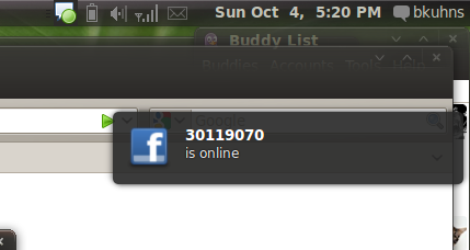
| Bret Kuhns (bkuhns) wrote : | #6 |
- notify.png Edit (33.8 KiB, image/png)
> -This is a design decision.Not a papercut. One of the reasons , it was done, was due to complaints of the bubbles blocking the firefox search bar. This way the bubbles that are not triggered by the user dont cover that area.
So the decision was made to change a system-wide notification system for the sake of not covering up a single area of a single application. But wait, please see my attached screenshot. Oh right, so not only are we tailoring an entire notification system to one application, but also to users who leave their windows maximised at all times. Now every time I get a new notification when typing a paper or writing some code, it shows up pratically in the MIDDLE of the screen.
I know you said that it's just *one* reason, but it sure seems like a horrible reason to use as an example. I apologise if this comes off as rude, but I just can't believe that this decision was made. The result looks nothing more than a mistake.
| Steve Dodier-Lazaro (sidi) wrote : | #7 |
As far as I know, the complete story is:
The desktop experience team decided to try the bubbles in the middle right
of the screen, to avoid the problems with some apps' toolbars being
overridden. So, at the same time they reviewed the bubble placement to get
rid of the notifications stacking problems. When it was decided to put the
top right corner by default, the new placement stayed... and i'm personally
for removing it too. :)
| Ian Hutchinson (ianhutchinson) wrote : | #8 |
I'm sure it can be cooked up so that users who find it a little strange can change it from the slightly-lower position to the place it was in Jaunty? Makes sense in terms of usability, but it's a little dodgy on the design front..
| Waldir Leoncio (wleoncio) wrote : | #9 |
Yeah, notifications look way too odd and out of place with that gap. Please consider making it the way it is on Jaunty. Pretty please. With cherry on top. I got more complaints here: https:/
| Changed in notify-osd: | |
| status: | New → Confirmed |
| Waldir Leoncio (wleoncio) wrote : | #10 |
P.S.: The bug I linked above is not a duplicate. It addresses a different problem!
| jhfhlkjlj (fdsuufijjejejejej-deactivatedaccount) wrote : | #11 |
- notifycurrent.png Edit (23.6 KiB, image/png)
You realize that with the notifications coming more down, a more cramped feeling comes up? The notification system loses the beauty of it being an ephemeral, out-of-the-way system. Even if visually the top is now visible at (almost) all times, the area of space that Notify-OSD uses is increased. It's more intrusive, now. Besides, one is more likely to have text in that portion of the screen.
Basically, as always with this program, the solution is to allow easy customization!
| jhfhlkjlj (fdsuufijjejejejej-deactivatedaccount) wrote : | #12 |
| Changed in notify-osd: | |
| importance: | Undecided → Wishlist |
| Changed in notify-osd (Ubuntu): | |
| importance: | Low → Wishlist |
| Changed in notify-osd: | |
| assignee: | nobody → Mirco Müller (macslow) |
| Changed in notify-osd (Ubuntu): | |
| assignee: | nobody → Mirco Müller (macslow) |
| Changed in notify-osd: | |
| milestone: | none → ubuntu-9.10 |
| Changed in notify-osd (Ubuntu): | |
| milestone: | none → ubuntu-9.10 |
| Nicolas (nicolas-espina) wrote : | #13 |
I don't understand well this... The behaviour of the notifications well be like jaunty or like now... I think that is a stupid idea to reserve space for specials notifications (sorry for the agresivity)... It's really intrusive in that way and looks really ugly. My propose is to use the bahaviour of the jaunty notifitcations...
Cheers!
| Vish (vish) wrote : | #14 |
There has been several objections to this change. But IMO , this doesnt seem wrong/ugly/
They seem to have done it due to concerns raised by other bug reporters in other bugs.
We might not like how it looks at first but it doesnt need the negativism this bug has generated. new changes might seem different initially.... just my 2 cents :)
| Mat Tomaszewski (mat.t.) wrote : | #15 |
A good place to discuss the alternative solutions would be the Ayatana mailing list (<email address hidden>). Mark Shuttleworth made a decision to go for the pre-allocated slot to solve few problems:
- inconsistency in terms of where each bubble appears (predictability)
- uncover the Firefox search bar
- enable the asynchronous bubbles to append without "pushing" the confirmation bubbles down.
Would be great to discuss these issues further, so once again I'd encourage everyone to write to the mailing list (Mark may not be subscribed to all bug reports, therefore he may not be aware of some of the conversations).
| Xhacker Liu (xhacker) wrote : | #16 |
I really dont like the new DAMN empty space. When mouse is hover on the notify, it will be lighter, blur. That is good enough, the space is totally overdo. When we have a empty desktop, no apps started, it shows a big space, then the notify, damn ugly! I know you considered user experience, I just want to say, the jaunty notify is better, really.
| Xhacker Liu (xhacker) wrote : | #17 |
| jhfhlkjlj (fdsuufijjejejejej-deactivatedaccount) wrote : | #18 |
Yeah... you uncover the FF search bar, but you block other parts, now, too!
As far as predictability, they all go exactly where I know them to go. One right after the other. It's not rocket science. If I have an IM bubble, and I adjust my volume, it'd take a very dull person to not figure out that the volume bubble would be next!
| Bret Kuhns (bkuhns) wrote : | #19 |
There's actually a lot to be said for Chauncellor's comment. The original behavior in Jaunty is simple and mindless. Now there's rules of what goes where and why. The original goal of the new notifications, from my understanding, was to be simple and out of the way. Now the more common notifications (at least in my experience) are the ones showing up closer to the center of the screen, intruding more frequently on my work area, and notifications don't pop up linearly and it's not obvious why.
The fact that my first reaction was to report this behavior as a bug (and obviously I'm not alone) is proof that this isn't the correct approach.
| Pedro Ribeiro (pmalvr) wrote : | #20 |
I also don't like the notifications new position. It always seems like there's something wrong with them . So I ask you to put it in the same place as they whore on Jaunty. Thanks
| Changed in notify-osd: | |
| milestone: | ubuntu-9.10 → none |
| Changed in notify-osd (Ubuntu): | |
| milestone: | ubuntu-9.10 → none |
| Xhacker Liu (xhacker) wrote : | #21 |
Although it's not a bug, but i think many people dont like the new position! So, please, put it closer to top right. And if there is a tool to change the position, it will be perfect.
So, dont put this 'bug' to wishlist! We really dont like the new position, its ugly!
| Julien Lavergne (gilir) wrote : | #22 |
- 99_revert_slot_allocation_to_dynamic.patch Edit (357 bytes, text/plain)
Digging a bit more, I saw that this behavior is the slot_allocation policy, set to FIXED for Karmic instead of DYNAMIC for Jaunty. This is not a bad choice but it required that all applications have been fixed and all notifications properly set. And it's not the case. At least for me rhythmbox not behave right and according to many comments of this bug report, it's not the only case.
For people who want the Jaunty behavior back, I attached a patch to revert the change, and a package is available in my PPA : https:/
| jhfhlkjlj (fdsuufijjejejejej-deactivatedaccount) wrote : | #23 |
Excellent, at least I have a fallback method. Thank you very much, Julien.
| Nicolas (nicolas-espina) wrote : | #24 |
This little change solves the problem? If this solves the problem maybe the users can switch this in gconf for example (just a idea)
| Bret Kuhns (bkuhns) wrote : | #25 |
Thanks so much Julien! I just applied your patch and it works beautifully. I agree with Nicolas that this should really be some sort of configurable option, whether visible in a GUI somewhere, or definable in gconf.
| jhfhlkjlj (fdsuufijjejejejej-deactivatedaccount) wrote : | #26 |
Has anyone commented in the mailing list? I would love to not have to use Julien's excellent fix, and so would everyone else I know that uses Ubuntu.
| Changed in notify-osd: | |
| milestone: | none → ubuntu-9.10 |
| status: | Confirmed → Triaged |
| ChrisTomalty (christomalty-deactivatedaccount) wrote : | #27 |
I completely agree! It looks ugly upon startup. Blocking the Firefox search bar, of course, is a much smaller problem than the aesthetics as the bubbles are by nature clickthrough and increasingly transparent as you approach them.
Regardless as to whether this is fixed there should be a customization dialogue under Prefs where you can set stuff like this, as well as corners and maybe shape, animation, a whole bunch of stuff.
But for the time being change it back!
| jhfhlkjlj (fdsuufijjejejejej-deactivatedaccount) wrote : | #28 |
Thank you for nominating this, Mr. Barth.
I messaged the mailing list quite some time ago. Has there been any further consideration towards this? Karmic is set to release in less than two weeks!
| hassan121 (k7rata121) wrote : | #29 |
hello everybody
i've read some of your posts but i want to say that perserving a space for the volume really is not a good idea !
IT'S ugly and annoying
plz find a solution to this problem "i think it is easy to make it like jaunty!" and bring the old notificationz configuration again
thank you
| JanG (jan-ge) wrote : | #30 |
For me and my 16:10 laptop screen they are still above the firefox search bar, which is no problem for me as you can simply hover them, but it looks really ugly.
If you want to have dedicated positions for the notifications why not change the positions for volume/brightness bar and normal notifications, as the normale ones are far more usual?
| Fran Diéguez (frandieguez) wrote : | #31 |
And why not differenciate notification events with colors or icons?
I think that with icons it will be more graphical and with a simple view of the notification you can "know" what is about.
| mcDavid (david-ursem) wrote : | #32 |
I think the best solution would be to put the notification in the highest
free position, so that if there are more notifications at the same time,
they show up underneath each other.
I think it would also be nice to have them slide up if a higher notification
disappears.
The best option by far would be to have a config tab in the
appearance-window, so everybody can choose his/her own favorite behavior.
2009/10/20 Francisco Diéguez <email address hidden>
> And why not differenciate notification events with colors or icons?
>
> I think that with icons it will be more graphical and with a simple view
> of the notification you can "know" what is about.
>
> --
> Notifications should show up closer to top right
> https:/
> You received this bug notification because you are a direct subscriber
> of a duplicate bug.
>
> Status in One Hundred Paper Cuts: Invalid
> Status in Notify OSD: Triaged
> Status in “notify-osd” package in Ubuntu: Confirmed
>
> Bug description:
> Binary package hint: notify-osd
>
> Currently the notify-osd notifications allot space for the volume
> control/brightness semi-notifications; this is rather jarring when the
> volume/brightness isn't being adjusted, unlike in Jaunty where application
> notifications default to above the volume/brightness.
>
> ProblemType: Bug
> Architecture: i386
> Date: Tue Sep 29 01:15:29 2009
> DistroRelease: Ubuntu 9.10
> GtkTheme: DarkRoom
> IconTheme: Humanity
> MachineType: ASUSTeK Computer INC. 1005HA
> Package: notify-osd 0.9.22-0ubuntu1
> ProcCmdLine: BOOT_IMAGE=
> root=UUID=
> ProcEnviron:
> LANG=en_US.UTF-8
> SHELL=/bin/bash
> ProcVersionSign
> RelatedPackageV
> xserver-xorg 1:7.4+3ubuntu5
> libgl1-mesa-glx 7.6.0~git200908
> libdrm2 2.4.13-1ubuntu1
> xserver-
> xserver-
> SourcePackage: notify-osd
> Tags: ubuntu-unr
> Uname: Linux 2.6.31-11-generic i686
> WindowManager: gnome-wm
> dmi.bios.date: 09/23/2009
> dmi.bios.vendor: American Megatrends Inc.
> dmi.bios.version: 0905
> dmi.board.
> dmi.board.name: 1005HA
> dmi.board.vendor: ASUSTeK Computer INC.
> dmi.board.version: x.xx
> dmi.chassis.
> dmi.chassis.type: 10
> dmi.chassis.vendor: ASUSTeK Computer INC.
> dmi.chassis.
> dmi.modalias:
> dmi:bvnAmerican
> dmi.product.name: 1005HA
> dmi.product.
> dmi.sys.vendor: ASUSTeK Computer INC.
>
| Kazade (kazade) wrote : | #33 |
I personally think that the notifications should be bottom-left, bottom-centre or bottom-right to avoid the problems with covering window buttons/firefox seach bar etc. However, then we are back to the "Notify-osd position should be configurable" debate, which would really solve the problem.
| jhfhlkjlj (fdsuufijjejejejej-deactivatedaccount) wrote : | #34 |
Mark Shuttleworth's comments from the mailing list:
"The position is final for 9.10 but can certainly be reconsidered for Lucid.
The factors that need to be considered are:
* fitting things into the corner is most aesthetically pleasing
* the "synchronous" notifications (like brightness and volume) are
fixed in size
* the async notifications (IM's etc, things that happen elsewhere, not
in response to a keypress) are variable sized and can grow vertically
* sliding things around when something else grows is really bad, it is
unpredictable and frustrating for a user trying to look at the thing
that suddenly moves, so:
- synchronous should not be below async (so that it does not have
to slide down)
- the bottom right corner doesn't work (because then async has to
grow "upwards")
* the top right corner has a lot of stuff there - window decorations,
tabs, tab controls (new tab, close tab etc) and in many apps, a search
input. So even though the look-through and click-through is *cool*, it's
still better not to put async right into the top right corner
For 9.10, two positions were considered and tried:
In both cases, we put sync above and async below, to avoid sliding
problems. We put them on the right hand side of the screen, as that's a
less-used area.
In the first case, we used the midpoint of the right side of the screen
and placed the notifications there, with sync above and async below. It
seems slightly odd to have them "hanging in space", but they conflict
with far less content there. This was the plan for 9.10. However, when
it landed, there were a lot of complaints saying that folks didn't like
it "out of a corner".
As a compromise, we moved to plan b, which was to put them in the top
right, with sync above. That means that the common case, with async
notifications, appears to leave a "gap". But it also avoids the worst
overlaps with things like window and tab controls, and usually also the
search bar.
That's where we settled for 9.10. For 10.04 I would like to revisit the
midpoint of the right hand side. I would not want to rehash old
territory, so please factor in the above in proposing new ideas. I'm of
the view that this decision involves at least one ugly compromise no
matter which way it goes, and am happy to make the call so far (i.e.
happy to be the one with the thick skin).
If there is an implementation which avoids the issues and is sane, I'd
love to include it.
Mark"
| jhfhlkjlj (fdsuufijjejejejej-deactivatedaccount) wrote : | #35 |
mcDavid, the "sliding" behavior was actually an idea that was shown in the mockup. See:
http://
I've been waiting for this feature most eagerly!
| parda (parda-dapar) wrote : | #36 |
I just don't believe that this can be the default setting. It's so annoying and weird. The notifications just appears on my tabs all the time! I see that they are a lot of people complaining about this implementation, when i can't see crowd complaining about the top right implementation!? So why did the implementation change, and why now it'slike impossible to make it back like it was?
| Vish (vish) wrote : | #37 |
parda:
Have you checked the other bugs in notify-osd? this bug is regarding the position not being on the top , so obviously there would be complaints only regarding that :)
There are bugs complaining that the top position was blocking the search area. ;)
| jhfhlkjlj (fdsuufijjejejejej-deactivatedaccount) wrote : | #38 |
They're trying to make a better desktop experience. Even if none of us like what they're doing, they're trying to make it better for us. Some of their reasons were pretty interesting, and I had never heard some of them. Thankfully, we have Julien's fix to hold us through until we get the ability to customize notify-OSD. That's my biggest complaint right now, and this would fix so many complaints with people.
| Grey Nicholson (greytheearthling) wrote : | #39 |
We could put asynchronous notifications in the top-right corner if synchronous notifications were centred horizontally (top, middle or bottom).
Gnome 3's approach is to make asynchronous notifications fixed in height, so they can show at the bottom of the screen: http://
| That Bum (jzachariou) wrote : | #40 |
I think the way to solve all this usability brouhaha would be to allow the notification to be dragged around and have it be anywhere the user wants it, and all subsequent notifications will appear in the same place the original one was before it faded out.
Just my two-hundredths of a dollar.
| neuromancer (neuromancer) wrote : | #41 |
As said by McDavid I think that the best solution will be to put notification (async and sync) in the highest free position available.
Do you remember?
http://
- highest free position
- slide up
- no different position for async and sync (no more confusion or wrong behaviour perception by user)
- integration with indicator-applet
| llpamies (llpamies) wrote : | #42 |
I really find the actual free space ugly and annoying.
Why not put an option in gconf to solve it for Karmic and discuss the default behavior later ?
| Nicolas (nicolas-espina) wrote : | #43 |
Yeah... We need at least a gconf option to solve it... There is a solution in another ppa but i dont want to break my system with strange packages
| jhfhlkjlj (fdsuufijjejejejej-deactivatedaccount) wrote : | #44 |
Well, Mr. Shuttleworth comments on this as well:
"A guiding principle in Ayatana is to *reduce* customisation, not
increase it.
Why?
First, we get much better collaboration and communication, and much
better testing, if everyone is looking at the same experience. We found
this with Ubuntu itself - we reduced the default application install set
to a single app for each major function: one browser, one mail client,
one word processor. That was controversial at the time - most
distributions were competing on HOW MANY apps they could install in one go.
One of the great failings of the community approach is that it attracts
folks who like to customise the environment to the point where it is
"perfect for them", at which point they stop caring about the
environment that the typical user sees. They run "the latest code from
CVS" so they don't care about bugs in the stable version. They swap out
components for things that are more interesting and then they have no
visibility AT ALL on the pieces a new user sees.
We will not make that mistake.
In Ayatana, we'll take an opinionated stance, and we'll apply some
common principles to the design process, and we'll live with the results.
I have no interest whatsoever in making it possible for anybody to have
any environment they want - we already have that. I'm interested in
driving forwards to build a default out of the box experience which is
as good as we can make it for the new, consumer user. Most people on
this list are NOT a new, consumer user, so I'm afraid you will have to
work hard to think from that perspective if you want your ideas to
resonate here.
Mark"
The mailing list is having slight conflicts on some of his claims, but he does make some good points (as well as some I disagree with). I still don't agree with him, though.
| Julien Lavergne (gilir) wrote : | #45 |
The problem is more simple than that, and very easy to reproduce :
- Install a fresh install of Ubuntu Karmic
- Boot and Log in
- Start music player
- See that the notification is misplaced on the screen, with an ugly space on the top (especially visible when there is nothing on the screen).
Just do the test with people who don't run "the latest code from CVS", they will say the same thing. It's not a geek stuff, it's a visual bug. I really can't see the improvement in the experience by having this notification lost on my screen.
Now, or notify-osd is fixed by changing the policy (because it's the more easier way to fix this bug), or others notifications are fixed to behave normally.
@Chancelor,do you have a link to the mailing list discussion ?
| jhfhlkjlj (fdsuufijjejejejej-deactivatedaccount) wrote : | #46 |
The archived discussion may be seen here:
http://<email address hidden>
| neuromancer (neuromancer) wrote : | #47 |
I think that also this opinion from Mark is very important:
https:/
It's not a so simple solution, and I agree with him that give too many options or customization to end user create confusion and no global user experience.
From design view, give more and more options, are simply a problem not resolved.
| Changed in notify-osd: | |
| milestone: | ubuntu-9.10 → none |
| John Paul Adrian Glaubitz (glaubitz) wrote : | #48 |
Thanks alot Julien for your patched version of notify-osd. It's really relief to have the old behavior back on my desktop ;-).
Adrian
| Waldir Leoncio (wleoncio) wrote : | #49 |
How can I apply this patch?
On Sat, Oct 24, 2009 at 3:08 PM, Adrian Glaubitz <
<email address hidden>> wrote:
> Thanks alot Julien for your patched version of notify-osd. It's really
> relief to have the old behavior back on my desktop ;-).
>
> Adrian
>
> --
> Notifications should show up closer to top right
> https:/
> You received this bug notification because you are a direct subscriber
> of a duplicate bug.
>
| John Paul Adrian Glaubitz (glaubitz) wrote : | #50 |
@Waldir:
You don't have to apply it. Just download the package of the patched version of "notify-osd" from here and install with GDebi:
<https:/
Adrian
| Waldir Leoncio (wleoncio) wrote : | #51 |
Awesome! Thank you, Adrian and Julien. notify-osd looks just right, now.
:)
On Sat, Oct 24, 2009 at 9:26 PM, Adrian Glaubitz <
<email address hidden>> wrote:
> @Waldir:
>
> You don't have to apply it. Just download the package of the patched
> version of "notify-osd" from here and install with GDebi:
>
> <https:/
> >
>
>
> Adrian
>
> --
> Notifications should show up closer to top right
> https:/
> You received this bug notification because you are a direct subscriber
> of a duplicate bug.
>
| Scott Armitage (scott-armitage) wrote : | #52 |
Thank you Julien for the patch; I'm in the same boat with the rest of you, the very first thing I thought was that the notifications were being misplaced on the screen and that there must be a bug in notify-osd.
| jatin sachdeva (jatin-sachdeva) wrote : | #53 |
I am planning to install the patch but one question about the patch - is it going to interfere with notify-osd updates in the future? OR Will the behavior get overwritten when a new update comes?
| hanzomon4 (hanzomon4) wrote : | #54 |
How does growl do it without leaving a gap?
| Scott Armitage (scott-armitage) wrote : | #55 |
Jatin, the current build in the Ubuntu repos is `notify-osd -
0.9.24-0ubuntu1', while Julien's build is `notify-osd -
0.9.24-
Any upstream-syncs will bump the version number to 0.9.25 or 0.9.24.1, at
which point they will take precedence over the PPA version. If a newer
release is made available by Ubuntu only, it will bump the Ubuntu version
from 0ubuntu1 to 0ubuntu2, however note that the ~gilir1 /still/ puts the
PPA version at lower priority.
So, short answer to your question, is that yes, you will get updates to
NotifyOSD; note, however, that you will lose the changes that were made in
the PPA version.
-Scott
On Sat, Oct 24, 2009 at 11:47 PM, jatin sachdeva
<email address hidden>wrote:
> I am planning to install the patch but one question about the patch - is
> it going to interfere with notify-osd updates in the future? OR Will the
> behavior get overwritten when a new update comes?
>
> --
> Notifications should show up closer to top right
> https:/
> You received this bug notification because you are a direct subscriber
> of the bug.
>
--
Scott Armitage, B.A.Sc., M.A.Sc. candidate
Space Flight Laboratory
University of Toronto Institute for Aerospace Studies
4925 Dufferin Street, Toronto, Ontario, Canada, M3H 5T6
| Julien Lavergne (gilir) wrote : | #56 |
Le dimanche 25 octobre 2009 à 11:44 +0000, Scott Armitage a écrit :
> So, short answer to your question, is that yes, you will get updates to
> NotifyOSD; note, however, that you will lose the changes that were made in
> the PPA version.
Yes, but I used also this PPA. So if notify-osd is updated, I'll see it
and upload a new version with the modification :)
| jatin sachdeva (jatin-sachdeva) wrote : | #57 |
great thanks for the inputs Scott and Julien!
| Nicolas (nicolas-espina) wrote : | #58 |
Really good job with the PPA :D
| Martin Ling (martin-launchpad) wrote : | #59 |
Here's a question, which I've yet to see a good answer for:
What are the synchronous notifications doing in that corner in the first place?
The rationale for putting asynchronous notifications (what the NotifyOSD spec calls "notification bubbles") in a corner is obvious, and clearly stated in the rationale in the spec: they contain information which is not directly related to what the user is doing right now, and therefore should be presented in the most unobtrusive way possible.
But the synchronous "confirmation bubbles" for e.g. volume and brightness do not fit this definition at all. When they appear, what the user is doing right now is changing the volume or brightness. Lots of systems display the confirmation for this right in the middle of the screen. Why not do the same? Or perhaps if that's a little too intrusive, in the middle at the bottom. I just don't see the justification for them competing for space in the corner at all, let alone pushing out other things.
| Luis Carlos Cobo (luiscarlos) wrote : | #60 |
I agree with Martin Ling. Lower corner, lower middle or middle of the screen would be sensitive choices for synchronous messages. Moving them to any of these locations would prevent them from messing up with async notifications.
| Scott Armitage (scott-armitage) wrote : | #61 |
I agree with Martin and Luis. If we are fundamentally differentiating
between these two types of alerts -- which I agree does make sense, just not
the way it is being done at present -- then it would certainly seem
reasonable for e.g. screen brightness, volume, etc. to be located in the
middle of the screen.
Not that I believe the copying of another system is the right way to move
forward, but in this instance, I think it is something that OS X got right
-- a nice, big, semi-transparent bubble in the middle of the screen.
--
Scott Armitage, B.A.Sc., M.A.Sc. candidate
Space Flight Laboratory
University of Toronto Institute for Aerospace Studies
4925 Dufferin Street, Toronto, Ontario, Canada, M3H 5T6
| nandhp (nandhp) wrote : | #62 |
This is how it is done in GNOME, and was done in Ubuntu before NotifyOSD, as shown in
http://
http://
http://
This seems very reasonable to me.
| jhfhlkjlj (fdsuufijjejejejej-deactivatedaccount) wrote : | #63 |
I liked the fact that all of the adjustments (brightness, sound, etc.) were also ephemeral and out of the way.
I find those ways kind of annoying, personally. MacOS pops up those huge boxes right in my face when I use an Apple machine, and I find it very much in the way.
| Vish (vish) wrote : | #64 |
https:/
There is the gconf-key for gravity you can set to influence the positioning of the bubbles. Use these commands to set the key:
(for East-gravity, right edge and vertically centered)
gconftool-2 -s /apps/notify-
for (NorthEast-gravity, top right)
gconftool-2 -s /apps/notify-
For those interested , the earlier discussion about the middle position:
http://<email address hidden>
| description: | updated |
| Troy James Sobotka (troy-sobotka) wrote : | #65 |
Seems that no matter where you put them, you will be hiding content. Keeping them in a single location does enhance predictability for a casual audience.
MacSlow's code works tremendously well at quickly hiding the bubbles via pass through.
As it stands now, it is a rather unfortunate decision that adversely affects the composition of the desktop. Form _is_ function.
| Robert (poofyyoda) wrote : | #66 |
Wow, WTF are the developers smoking?
Seriously this is the most retarded 'usability' design change ever made.
"Reduce Customisation" - what a joke. Ubuntu is quickly dissolving into a solely new user oriented disaster.
A good OS is one where both new users and expert users alike can feel comfortable at the simplicity and customisability that is offered. I predict a big fallout from this change alone
Thank God for the ppa package.
--Also, on a desktop system, I almost never receive any synchronous messages ( brightness, volume etc..), and I suspect most other users also experience this. The notifications by apps such as rhythmbox display MUCH more frequently than changing brightness controls, so by their logic the synchronous messages should be below the others, which will bring much less grief.
| Michael Martin-Smucker (mmartinsmucker) wrote : | #67 |
@poofyyoda: While I agree with your concern, your little freak-out there didn't really add much to the conversation, and the tone/language you used seriously detracted from a civil conversation. Hopefully you don't behave that way in face-to-face conversations; please try to refrain from doing so on the Internet. If you plan on adding your thoughts to bug reports in the future, please consider reading and signing the Ubuntu Code of Conduct.
Also the reasoning behind the synchronous-on-top decision has already been explained (comment 34). The issue is not as simple as it may seem, and developers are willing to consider different approaches. If you have a real suggestion, feel free to offer it, but please do a little reading before ranting loudly on Launchpad.
You did say something valuable that I'd like to highlight, though: "A good OS is one where both new users and expert users alike can feel comfortable at the simplicity and customisability that is offered." I think this is absolutely true, and I think that Ubuntu will be more successful if it doesn't intentionally hold back users who like customization.
| Waldir Leoncio (wleoncio) wrote : | #68 |
You're right about that. For example, one of the things my family most
enjoy about Ubuntu is that it allows them to tinker with the desktop,
specially the Gnome Panel. I've heard more than once they
say something like "cool, I can choose where I put the clock and the start
(sic) menu. I couldn't do that on Windows!". And they're not even close to
being computer geeks. IMHO, the new notify-osd is definitely not a step
back, as it was never something easily customizable. If anything, it's made
Ubuntu more modern (and we all know how much Gnome needs revamping -- let's
go, three point oh! :-) ). After reading some Ayatana's posts I'm quite sure
that this subject is going to be exhaustively discussed and the devs will
come out with the most sensible solution before Lucid is out. But even if
I'm wrong, we'll all have a way of tweaking it to fit our needs. Long live
FLOSS. :-)
On Mon, Oct 26, 2009 at 9:47 PM, Michael Martin-Smucker <
<email address hidden>> wrote:
> You did say something valuable that I'd like to highlight, though: "A
> good OS is one where both new users and expert users alike can feel
> comfortable at the simplicity and customisability that is offered." I
> think this is absolutely true, and I think that Ubuntu will be more
> successful if it doesn't intentionally hold back users who like
> customization.
| Marcos Diaz (marcos-diaz) wrote : | #69 |
If an usability fix seems a BUG, better do nothing.
| Isaiah Heyer (freshapplepy) wrote : | #70 |
I don't understand why there couldn't at least be a gconf key for this. It would be out the way for "new users" so I don't see any problem with that.
| jhfhlkjlj (fdsuufijjejejejej-deactivatedaccount) wrote : | #71 |
I have been thinking about desktop effects and how they're set up:
Metacity just has a simple None/Normal/Extra setting for those that just want to use the computer. But if someone wants more out of their desktop, they install compiz and the settings manager. I have my focus follow the mouse, and with Compiz I have unfocused windows on top fade out to show what's underneath. It's tremendously useful, and I have a hard time living without it.
Now, the average user? Probably doesn't care. It's easy enough to get what they want out of it. If they want flashy, they enable flashy and get on with their life. Any more would require a simple package install. The average user probably doesn't know it's there (provided they never heard of the famous cube).
It's out of the way by default, perfectly manageable by choice.
| John Wells (jfw) wrote : | #72 |
Just installed Karmic, and considered that this was a bug. I don't like it at all -- having notifications occasionally slide is much less jarring than dislocated notifications.
Most new users will just consider this to be sloppy work, it wouldn't occur to them that this was "by design".
Been using Ubuntu solely on all home machines since Dapper, and in general love the improvements upon each release.
But this gets a thumbs down.
I agree with the solution to put sychronous notifications middle-and-centred, and asynchronous notifications in the top-right.
Something also needs to be done about clearing the queue quicker when it gets full -- have variable timing of the notifications. Say, min = 2 seconds, normal = 5 seconds. When the queue has more than two items, speed up the display for goodness' sake.
J
| Anonym25712 (anonym25712) wrote : | #73 |
> I don't understand why there couldn't at least be a gconf key for this.
> It would be out the way for "new users" so I don't see any problem with that.
I can't agree more.
For me, Linux has always been about customization. I understand that default settings are made for new users, but there should always be a way to customize them, be it through gconf-editor or something else.
I've been using Ubuntu since Hoary, and I really don't like the "do it the way I decided" direction it's taking.
| Scott Armitage (scott-armitage) wrote : | #74 |
A lot of people say they don't understand the decision to not allow
customization of this; the main point Mark has tried to drive home on this
point (regardless of whether you or I agree with it or not) is that
customizability significantly complicates testing, increases the risk of
bugs in the tests themselves, and generally makes it harder to make sure the
system works /for everyone/.
Every new option -- even if it is just a gconf key -- adds a new code path
that must be tested, and furthermore, splits the testing base between users.
You get much more out of your testing if everyone is looking at the same
unified configuration then if you have a bazillion different custom
configurations out there.
Hopefully you should now understand -- even if you don't agree with -- why
they are not including these as options.
Regards,
-S
--
Scott Armitage, B.A.Sc., M.A.Sc. candidate
Space Flight Laboratory
University of Toronto Institute for Aerospace Studies
4925 Dufferin Street, Toronto, Ontario, Canada, M3H 5T6
| quatsch3000 (quatsch3000) wrote : | #75 |
I would like to make a suggestion and consider the points that were addressed by Marc. Main point for me is that notifications should appear in a corner. And imo the notifications look quite misplaced currently. Also I would rather not be able to see the window decoration for a second than the window's content. For these two reasons I would prefer another solution to the synch/asynch-
So my suggestion is (similar to Greg Nicholson's and others) to keep the differentiation but place the synchronous notifications somewhere else (e.g. centred on the screen, maybe even for a little shortened period) while keeping the asynchronous notifications in the corner. (Yes, I know, that might seem MAC-like to some but just because someone already thought of it, does not automatically mean it's wrong.) Or, to get back to the points, Marc made:
"The factors that need to be considered are:
* fitting things into the corner is most aesthetically pleasing"
true. +1
" * the "synchronous" notifications [...] are fixed in size"
Okilidokili, they can appear centred and fade out after a second or so.
" * the async notifications [...] are variable sized and can grow vertically"
Shouldn't be a problem any more because the synchronous notifications are out of the way
" * sliding things around when something else grows is really bad, it is unpredictable and frustrating for a user trying to look at the thing
that suddenly moves, so:
- synchronous should not be below async (so that it does not have to slide down)
- the bottom right corner doesn't work (because then async has to grow "upwards")"
Ok, so no movement of the notifications. Let's stick with the sequential appear-disappear solution. Also as I said above: "Shouldn't be a problem any more because the synchronous notifications are out of the way."
" * the top right corner has a lot of stuff there - window decorations, tabs, tab controls (new tab, close tab etc) and in many apps, a search input. So even though the look-through and click-through is *cool*, it's still better not to put async right into the top right corner"
That's where I disagree for three reasons: 1.) "fitting things into the corner is most aesthetically pleasing", 2.) If I had to decide between seeing the decoration and the window's content, I would always go for the window's content. And 3.) If I really had to press a button (new tab or so) in that exact second, I would have to move my cursor there anyway, thus making the notification transparent.
| mcDavid (david-ursem) wrote : | #76 |
Everybody keeps saying that sliding notifications is wrong, but looking at
the sample somebody else posted:
http://
I don't think its annoying or anything at all. I think it looks very nice. I
think this would be the best way to solve this problem.
Groeten, David
2009/10/31 quatsch3000 <email address hidden>
> I would like to make a suggestion and consider the points that were
> addressed by Marc. Main point for me is that notifications should appear
> in a corner. And imo the notifications look quite misplaced currently.
> Also I would rather not be able to see the window decoration for a
> second than the window's content. For these two reasons I would prefer
> another solution to the synch/asynch-
> sync and async notifies itself is not as bad as I thought in the
> beginning, but still, placing the notifications so low as a consequence
> just seems plain wrong.
>
> So my suggestion is (similar to Greg Nicholson's and others) to keep the
> differentiation but place the synchronous notifications somewhere else
> (e.g. centred on the screen, maybe even for a little shortened period)
> while keeping the asynchronous notifications in the corner. (Yes, I
> know, that might seem MAC-like to some but just because someone already
> thought of it, does not automatically mean it's wrong.) Or, to get back
> to the points, Marc made:
>
> "The factors that need to be considered are:
> * fitting things into the corner is most aesthetically pleasing"
> true. +1
>
> " * the "synchronous" notifications [...] are fixed in size"
> Okilidokili, they can appear centred and fade out after a second or so.
>
> " * the async notifications [...] are variable sized and can grow
> vertically"
> Shouldn't be a problem any more because the synchronous notifications are
> out of the way
>
> " * sliding things around when something else grows is really bad, it is
> unpredictable and frustrating for a user trying to look at the thing
> that suddenly moves, so:
> - synchronous should not be below async (so that it does not have to
> slide down)
> - the bottom right corner doesn't work (because then async has to grow
> "upwards")"
> Ok, so no movement of the notifications. Let's stick with the sequential
> appear-disappear solution. Also as I said above: "Shouldn't be a problem any
> more because the synchronous notifications are out of the way."
>
> " * the top right corner has a lot of stuff there - window decorations,
> tabs, tab controls (new tab, close tab etc) and in many apps, a search
> input. So even though the look-through and click-through is *cool*, it's
> still better not to put async right into the top right corner"
> That's where I disagree for three reasons: 1.) "fitting things into the
> corner is most aesthetically pleasing", 2.) If I had to decide between
> seeing the decoration and the window's content, I would always go for the
> window's content. And 3.) If I really had to press a button (new tab or so)
> in that exact second, I would have to move my cursor there anyway, thus
> making the notification transparent.
>
> --
> Notifications should show up closer to top right
> ...
| ex-oficio (wilkinson-luke) wrote : | #77 |
the changes to notifications as compared to jaunty are a seriously retrograde step. i have just installed juliens fantastic package to fix this bug and it really is so much better. the correct behaviour should be that all passive notifications appear in the corner with existing notifications moving downwards to make room in a downward-growing stack. there was no need whatsoever to alter the jaunty behaviour.
i think it was as far back as the intrepid release that volume and brightness notifications appeared in the bottom-middle and it looked very nice. i have to say that i didnt feel the move to the top right was a negative development. the notifications themselves are very nice-looking, and the design of them is one thing that has improved with the karmic release.
i have already seen the response from the ubuntu thought police about this which was essentially "i will hear your protestations just so long as they dont disagree with the "decided" policy" and frankly its the screensaver-
i am always telling people how good ubuntu is (and of course i still think its the best), but this is the first time i have upgraded and been really disappointed with the tinkering that has taken place.
good day.
| sfantu (sfantus1) wrote : | #78 |
Thanks julien much better with the script
| Creak (romain-failliot) wrote : | #79 |
I agree with ex-oficio. The notification should just be a stack. Actually, I thought it was a bug because I was using the beta release.
Maybe some notifications, like volume or brightness, could have more important priority, so that if they are thrown after a simple notification (like one of Rhythmbox), they would appear at the top of the stack while the other notification simply appears at the bottom.
This offset is definitely not normal!
| cristian.vrabie (cristian-vrabie) wrote : | #80 |
Having read this head to tail I see that the discussion is becoming repetitive and not bringing nothing new, I think we should push it into a more constructive direction. I will summarize the most important points that have been said and add my 2 cents.
#1. The "old" notify-osd version had no clear rules. It displayed the messages as they come.
#2. Some people complained that it's obstructing some important components like the minimize/close buttons and Firefox search bar.
#3. The "new" version choses to have predictable positions for the synchronous/
#4. The "new" version looks bad to some/many (old) users.
#5. The developers says that it's more important that notify-os makes sense to new users, rather than allowing old users to customize the desktop.
#6. Users reply that a mature os should do both (make sense to new users and be pleasing to old users).
#7. Users ask for at least a way to customize the behavior back to the original behavior.
#8. The developers say that adding more customization is bad.
Ok. My point of view:
#A. I understand the need for #3 and #5 but I don't think that the current solution is the best solution for #4 and #6. However i cannot say that I have a better, new one.
#B. I would add that we must understand that the majority of new users are not all new, but probably had some contact with another OS. In neither OS that I know a similar solution is used so it probably isn't that good for them either. At least the old version looked like the usual Windows notification but in reverse (coming down instead of going up). This combined with #4 makes the old version better than the current one.
#C. If indeed the Gnome3 approach is the one presented above, we should also consider that the transition to that is smooth, not a complete redefinition.
#D. We need to take into account scalability. The new design makes some assumptions that are not all in all correct, like: "all sync messages have a fixed size". Will this solution still fit as new notifications are added or the granularity of the current one will be increased. We don't know on what devices will Ubuntu run next and what messages/
#E. We (the users) need to understand that what the developers main purpose is that "Ubuntu succeeds". Windows and Mac OS have proved that less configurability works, when many distributions that were driven by the community have failed. It is in my opinion a good decision to keep configurability low. However #5 is a very good point. This is open source. Why add reasons for a fork. Plus, where to place the notifications is not a life changing decision. My solutions would be:
- #E.1. Allow configurabilly from a configuration file. The new users wouldn't be confused by many options and the old/advanced users would still have the option to configure it to their pleasing.
- #E.2. Do a vote or better, a research with both old and new users.
Hope this helps bringing the community and the developers to a consent.
| sfantu (sfantus1) wrote : | #81 |
Cristian the configuration option was already provided by julien. we all so called old users thanks him for that.
if i`m old at 6 month in Ubuntu then....
There should be made a sticky thread in Ubuntu forums telling "old" users where to find this patch and the problem should be resolved .
If the developers want to enforce their design then they can try but i don`t think that is the way to go in open source as this will lead to forks and versions and "WAR" :) customizations isn`t bad not even for new users they can alway not try to customize if it looks confusing if they are techy users (the majority i think of ubuntu`s users) they will love to tinker with the settings.
| ace386 (ace) wrote : | #83 |
at #5: I know this is not representative but: There were two of my friends I brought to Ubuntu last weekend. One of them asked me, if some settings were wrong with that and if I could correct it. (I did not ubgrade to karmic by then, so I tjought it were the settings, too). I just asked the second, he doesn't like it, either.
Seriously, does anyone here know somebody who finds this aesthetically nice? Do you developers like it more from the aesthetic point or from the we-thought-
| cristian.vrabie (cristian-vrabie) wrote : | #84 |
@sfantu: Thanks for the answer. Yes, I am aware of the patch provided by Julien and I thank him for that. I am currently using the patch. However, as I am to understand from comment #55 ( https:/
@ace386: We all here had that kind of experiences either with our friends or ourselves. However, from the developers point of view, a handful of users posting in this thread are nowhere near a majority, nor is the majority of Ubuntu users qualified to say what is better for "brand new" users (as we're all, more or less, customization freaks). This is why I'm for the vote/poll/research that will settle this for good.
| Scott Armitage (scott-armitage) wrote : | #85 |
> @sfantu: Thanks for the answer. Yes, I am aware of the patch provided by
> Julien and I thank him for that. I am currently using the patch.
> However, as I am to understand from comment #55 (
> https:/
> osd/+bug/
> changes added in this patch will be lost. I think that it is all of our
> goals to have the "better" version as official.
>
Well, the changes will be lost in the sense that a newer version of the
package would appear in the repositories, and your update manager would
update you to that version. As Julien said, he would then just update his
own PPA package; however, you are correct in that having to jump through
this hoop is not ideal.
@ace386: We all here had that kind of experiences either with our
> friends or ourselves. However, from the developers point of view, a
> handful of users posting in this thread are nowhere near a majority, nor
> is the majority of Ubuntu users qualified to say what is better for
> "brand new" users (as we're all, more or less, customization freaks).
> This is why I'm for the vote/poll/research that will settle this for
> good.
The devs have come up with a design that meets their requirements. I am not
100% convinced that their list of requirements is complete, and so I have
been working on one of my own that I plan to post to the Ayatana mailing
list soon. I intend to follow up that list with a trade study objectively
comparing several different solutions, one of which is the current Ubuntu
default behaviour, and one of which is the old Jaunty behaviour reinstated
by Julien's package. This should eliminate some of the solutions for not
meeting requirements, and should show objectively where the others stand
with respect to each other.
/After/ all of that comes the subjective comparison -- each of the solutions
that passes the trade study should be evaluated based on subjective metrics,
such as aesthetics, code complexity, etc. I will provide a link here once I
get all of this posted to the mailing list.
--
Scott Armitage, B.A.Sc., M.A.Sc. candidate
Space Flight Laboratory
University of Toronto Institute for Aerospace Studies
4925 Dufferin Street, Toronto, Ontario, Canada, M3H 5T6
| cristian.vrabie (cristian-vrabie) wrote : | #86 |
@scott-armitage This sounds great. Before you post to Ayatana mailing list, post a draft here. Maybe we can help with ideas.
| mcDavid (david-ursem) wrote : | #87 |
*#5. The developers says that it's more important that notify-os makes sense
to new users, rather than allowing old users to customize the desktop.
*
The first reaction of a college-mate of me (who has always runned KDE) when
I showed him the "new ubuntu" was "*Hey, the notifications are misplaced, is
that a bug in the beta-release?"*. And to be honest, that was my first
reaction too. I only learned there is a difference between "synchronous" and
"asynchronous" notifications when I read about it while trying to file a bug
report about it.
I think we have to look at the notifications in an other way to solve this
issue. We can go in two directions:
#1: No difference is being made between "asynchronous" and "synchronous"
notifications, and they are handled exactly the same way. If the system does
make a difference, it will only be confusing to users.
#2: If we dó make a difference, this difference should immediately be clear
to users. For example by giving them a different layout and/or a compeltely
different location (as some users suggested, put the synchronous ones in the
middle of the screen).
Groeten, David
2009/11/2 cristian.vrabie <email address hidden>
> Having read this head to tail I see that the discussion is becoming
> repetitive and not bringing nothing new, I think we should push it into
> a more constructive direction. I will summarize the most important
> points that have been said and add my 2 cents.
>
> #1. The "old" notify-osd version had no clear rules. It displayed the
> messages as they come.
> #2. Some people complained that it's obstructing some important components
> like the minimize/close buttons and Firefox search bar.
> #3. The "new" version choses to have predictable positions for the
> synchronous/
> not obstruct the above mentioned components.
> #4. The "new" version looks bad to some/many (old) users.
> #5. The developers says that it's more important that notify-os makes sense
> to new users, rather than allowing old users to customize the desktop.
> #6. Users reply that a mature os should do both (make sense to new users
> and be pleasing to old users).
> #7. Users ask for at least a way to customize the behavior back to the
> original behavior.
> #8. The developers say that adding more customization is bad.
>
> Ok. My point of view:
> #A. I understand the need for #3 and #5 but I don't think that the current
> solution is the best solution for #4 and #6. However i cannot say that I
> have a better, new one.
> #B. I would add that we must understand that the majority of new users are
> not all new, but probably had some contact with another OS. In neither OS
> that I know a similar solution is used so it probably isn't that good for
> them either. At least the old version looked like the usual Windows
> notification but in reverse (coming down instead of going up). This
> combined with #4 makes the old version better than the current one.
> #C. If indeed the Gnome3 approach is the one presented above, we should
> also consider that the transition to that is smooth, not a complete
> redefinition.
> #D. We need to take into accou...
| Robert (poofyyoda) wrote : | #88 |
The funny thing is that the developers think they know new users better than other users do. Perhaps unknown to them, many of us have friends and are aware of what users look for. It's pretty clear that the developers do not.
Whatever happened to the community approach?
| Scott Armitage (scott-armitage) wrote : | #89 |
>
> @scott-armitage This sounds great. Before you post to Ayatana mailing
> list, post a draft here. Maybe we can help with ideas.
Sure thing.
-S
--
Scott Armitage, B.A.Sc., M.A.Sc. candidate
Space Flight Laboratory
University of Toronto Institute for Aerospace Studies
4925 Dufferin Street, Toronto, Ontario, Canada, M3H 5T6
| ex-oficio (wilkinson-luke) wrote : | #90 |
- Screenshot.png Edit (28.2 KiB, image/png)
i agreed with mcdavid's post (#87) 100% .
i.e.
A) notifications that are direct responses to user action (volume, brightness change etc) ought to be back in the bottom centre (a-la intrepid for those that remember. i think it was intrepid).
B) passive "FYI" notifications (in my case exaile and gcdemu mostly) should stack up in an orderly fasion in the corner, and probably for a user-configurable amount of time.
i know the thought police dont like settings, but for me the notifications hang around too long, whereas for people with diminished eyesight they might need more time to discern the message. that's a no-brainer really, although i now dread the possible response of "if they have bad eyesight the setting to make the notification remain longer should be automatically set by the "bad-eyesight profile"... ugh".
| Cadu (carloses-young) wrote : | #91 |
What if we try the top-center position?
This area of the screen displays the middle section of top gnome-panel, wich is usually empty.
So, a popup in that area would overlay a empty section of gnome-panel and just a little bit of the current window title, if any (witch could be left-oriented to minimize the issue).
Sliding down animation would create a even more pleasant look.
One of the design rules of notify-osd says that only 2 popups could appear on the screen at once. So, they could be aligned horizontally at tha area, instead of vertically.
That also would solve the growing popup problem.
Lastly, personally I think that some setup interface for that matter would be a good idea. This way, a user could easily adjust the behavior of the system if he/she are not please with the default.
Thank you for the attention, and sorry for the English mistakes.
| Cadu (carloses-young) wrote : | #92 |
Also, another tought I had is to leave Gconf keys for setting postiion/
This way I think that everyone is going to be pleased. Newcomers would enjoy the results of Ayatana guidelines, and advanced users can aways use gconf-editor to change the default behavior. In the future, community could even bring a 3rd part application for managing the gconf keys, so if you are interested, you could install it and personalize the thing.
The bottomline is: we should pursuit the idea of a unified experience but, for the ones that are aware of what they are doing, there could be aways an alternative.
Thank you for reading,
Best regards.
| hospadar (hospada1) wrote : | #93 |
- adds the ability to configure slot allocation Edit (5.3 KiB, text/plain)
I've recently coded a patch which allows changing between fixed (async notifications show a fixed distance below the top) and dynamic (the first notification always shows up on top) slot allocation by means of a gconf key ("/apps/
My patch also changes the default (when there is no key) to dynamic allocation.
Here's my `bzr diff` (from in the source folder).
| Kjetil Rydland (kjetilrydl) wrote : | #94 |
I understand Shuttleworth's argument, but I disagree. I don-t have hotkeys for volume on my desktop, and I never change brightness. In other words, I never see volume or brightness notifications, and every single notification I see seems out of place. I seriously doubt I'm the only one. For this reason (and many more listed here), there should be some form of configuration possibilities for notify-osd, even if it complicates testing.
| Troy James Sobotka (troy-sobotka) wrote : | #95 |
Another side effect of the aesthetically curious decision with regards to stacks of notifications.
Previously, an application elegantly provided stacks of notifications via MacSlow's most impressive scrolling implementation and they dissolved in time according to their arrival.
Now, the notifications all cluster in the exact same region.
For example, in GWibber, you had a visual hierarchy of events based on time. Now we have a cluster of notifications that seem forced into a slim time frame.
As I can see it, with the new implementation we lose:
1) Proximity. The general location of most messaging applications happens in the upper right corner. Notifications straying from this lose their visual relationship. [1]
2) Hierarchy. The visual hierarchy present in the original model represented a visual relationship to time. Removing this behaviour requires one to be focused on the event to understand the relationship to time. [2]
3) Aesthetic-Usability Effect. While arguable, it does seem that there is at least some evidence the new placement has adversely affects the aesthetics of the desktop with regards to a westernized learned response. "Aesthetic designs are more effective at fostering positive attitudes than unaesthetic designs, and make people more tolerant of design problems." [3]
4) Scannability of Content. Notifications primarily consist of readable content. For example, within Gwibber, some content is relevant to the audience, some is not. Forcing overlapping information eliminates scannability. [4]
In closing, while do gain a degree of consistency with the new implementation. Clearly the reasoning for the positioning is not entirely understandable or easily discoverable [For example, see comment https:/
The second argument that we create a logical division of events based on location, one could also argue based on the feedback in this report, is also either not apparent or entirely lost on the end audience member.
Unfortunately we have no explicitly stated audience for this design, so arriving at an effective solution is nigh on impossible. If we make an audience a power user that frequently is needing to hit window decoration buttons (again assuming top right orientation) and entering search bars in Firefox, then the current path has merit. If the audience is a slightly more casual individual, the decision might seem out of place aesthetically and subject to a different set of design concepts.
Alternatively, we could simply close this bug based on the fact that the fellow footing the bill has made a concrete design decision. :)
[1] PG 160 of Universal Principles of Design [ISBN 1-59253-007-9]
[2] PG 104 of Universal Principles of Design [ISBN 1-59253-007-9]
[3] PG 18 of Universal Principles of Design [ISBN 1-59253-007-9]
[4] http://
| Marko Zabcic (gm-marko) wrote : | #96 |
Thanks Julien! The "bug" was really annoying.
| John Paul Adrian Glaubitz (glaubitz) wrote : | #97 |
I recently played around with Growl [1] on my Mac and I have to say it's way more behaving the one would expect it than notify-osd. I can thoroughly configure it and it provides all kinds of nice themes. The best thing would be a port or clone of Growl to Linux IMHO.
Adrian
| jhfhlkjlj (fdsuufijjejejejej-deactivatedaccount) wrote : | #98 |
Adrian: Nothing's stopping you. Growl is BSD, so go ahead and port it to Linux, I'm sure lots of people will be glad you did. But Notify-OSD's purpose is not to be just like Growl, it's supposed to be an out-of-the-way, simple notification system, no bells and whistles. While I strongly urge Mr. Shuttleworth to allow basic customization of Notify-OSD, theming and the likes, but the ability to trick out every little thing is exactly what brings less stability and more bugs. Look at Compiz. It generally works quite well, but there are acres and acres of problems and little bugs that keep occurring with the WM. Fullscreen flash was broken from it for a while last year, there's been a long-running problem with full-screen applications that was just partially solved a month ago, and there's even the irritating bug concerning tooltips that don't go away when you switch desktops with the workspace switcher. That last one has been around since Jaunty, and there's only a dirty hack to get rid of it at the moment. There are lots of little things that have been around that just aren't being fixed because there's not enough manpower.
Why should Canonical have to spend that many more resources on making sure that the custom themes, click-ability or invisibility work all perfect when they could spend the time working on the core system? If someone really wants to go nuts with customization, by all means, fork it. That's what's great about free software. But Canonical isn't terribly large and they can't keep up with everything.
There's a debatable line on what should be customizable and what shouldn't; I STRONGLY feel like we should get options for screen position and behavior (the async/sync nonsense). Whether they go beyond this or not, it's their choice, but I sincerely feel that they shouldn't do this. This is why I still use GNOME, despite the constant idiocy and sophistry that they employ in their "features". They allow customization as much as they can with a guarantee of stability. KDE is wonderful with allowing this customization, but KDE4 has had a track record of being extremely buggy and unstable (I know it's gotten much better now, but it took quite a while to pick themselves back up: Even Linus ditched it for GNOME for a while!).
(Also, for the record, my praise for GNOME halts at Gnome shell. That lunacy will be the catalyst that will drive me to XFCE).
| Waldir Leoncio (wleoncio) wrote : | #99 |
Now the only thing still annoying me is the fact that the notifications
won't accumulate on the screen. It's really weird to have an action happen
on your computer right now and notify-osd only alerting you about it 10, 20
seconds later.
| Scott Armitage (scott-armitage) wrote : | #100 |
On Tue, Nov 17, 2009 at 3:08 AM, Waldir Leoncio <email address hidden>wrote:
> Now the only thing still annoying me is the fact that the notifications
> won't accumulate on the screen. It's really weird to have an action happen
> on your computer right now and notify-osd only alerting you about it 10, 20
> seconds later.
>
I don't think it is /too/ bad.. however you get into weird circumstances
where you have an event happen, you notice it through some other means, you
respond to the event (e.g. reply to an IM), and /then/ the notification pops
up.
I don't think there is an elegant solution to this without accumulating
messages. On a totally related note, why doesn't NotifyOSD do this again? I
know it is for a very specific reason, I just can't recall what that reason
is.. probably related to information overload.
--
Scott Armitage, B.A.Sc., M.A.Sc. candidate
Space Flight Laboratory
University of Toronto Institute for Aerospace Studies
4925 Dufferin Street, Toronto, Ontario, Canada, M3H 5T6
| Ongion (benpy2k) wrote : | #101 |
I don't know about anyone else, but I've resorted to just using notification-daemon again. I can't stand notify-osd. Even though using notification-daemon solves my problem, there is no reason why I should have to use it anyway. I liked the look of the new notifications. But I use Pidgin a lot, and notify-osd only shows one notification from a program at a time. If I could dismiss notifications, it wouldn't be a problem. However, I can't.
The developers want the notifications to be passive and ephemeral, but they have to realize that some notifications are not meant to be passive. We are also being repeatedly told that notifications are going to support varied times, but it's been a year since notify-osd was first introduced, and this feature still hasn't been implemented. Does anyone have an answer for that?
| Mirco Müller (macslow) wrote : | #102 |
The reason for limiting the amount of on-screen notifications at anyone time, is to protect the user from notification-spam.
Ongion, notifications you consider to not meant to be passive-only, should really be proper dialogs (see https:/
The different on-screen time of notifications, rendered by notify-osd, is a bug that'll be fixed for Lucid (see https:/
| Waldir Leoncio (wleoncio) wrote : | #103 |
So maybe you could limit it to five simultaneous messages, or something.
Just yesterday I went through this annoying situation, when I was chatting
with a friend on Pidgin. We were sending messages to each other on a really
quick pace, and notify-osd wasn't picking up. Then he left and almost a
minute after we were done chatting I was still getting bubbles with sent
messages.
On Wed, Nov 18, 2009 at 3:23 PM, Mirco Müller
<email address hidden>wrote:
> The reason for limiting the amount of on-screen notifications at anyone
> time, is to protect the user from notification-spam.
>
> Ongion, notifications you consider to not meant to be passive-only,
> should really be proper dialogs (see
> https:/
>
> The different on-screen time of notifications, rendered by notify-osd,
> is a bug that'll be fixed for Lucid (see
> https:/
> notifications).
>
> --
> Notifications should show up closer to top right
> https:/
> You received this bug notification because you are a direct subscriber
> of a duplicate bug.
>
| Forlong (forlong) wrote : | #104 |
Mirco Müller schrieb:
> The reason for limiting the amount of on-screen notifications at anyone
> time, is to protect the user from notification-spam.
>
> Ongion, notifications you consider to not meant to be passive-only,
> should really be proper dialogs (see
> https:/
Is any user bothered by notification spam? I mean how often do you get a
notification anyway?
And those are pretty bad examples, btw.
A pop-up I have to click to make it go away, telling me I have low disk
space - _that's_ what I consider spamming.
And why do we need to have volume and brightness in the notification
area anyway?
What was exactly wrong with the behaviour up until intrepid?
| Mirco Müller (macslow) wrote : | #105 |
Waldir, you should not get any notifications if you've the chat-application focused.
Nick, discussing user-interaction rationale on bugs is not very helpful. This is very off-topic looking at the initial bug-description anyway. This should happen on the ayatana mailing-list. The reasoning for why notifications behave the way they do you can find https:/
| SilverWave (silverwave) wrote : | #106 |
OK as a workaround I can confirm that manually setting gconf-key "/apps/
I still don't like it, it is intrusive and does not work in an intuitive manor, but at least I am not pulling my hair out over it.
This is _not_ a paper cut, this is more akin to someone pulling your finger nails out.
Also why does the notification not close when I click it!
Who's bright idea was it to make it(on mouseover) see through and click through?!
What kind of usability study could possibly have thought this is a good idea?
Look it notifies you of its message right? - Good!
But...
Then you go to dismiss it and it does not close! How frustrating.
But its actually worse because it does not even let you click the damn thing!
No instead you click whatever is behind it! Why would I _ever_ want this behavior?
> - added support for integer gconf-key "/apps/
> - supported values are 1 (NorthEast, top-right) and 2 (East,vertically centered at right of screen)
| Scott Armitage (scott-armitage) wrote : | #107 |
>
> What kind of usability study could possibly have thought this is a good
> idea?
>
> Look it notifies you of its message right? - Good!
> But...
> Then you go to dismiss it and it does not close! How frustrating.
> But its actually worse because it does not even let you click the damn
> thing!
> No instead you click whatever is behind it! Why would I _ever_ want this
> behavior?
>
Because you aren't supposed to dismiss it. The notifications are supposed to
be sufficiently out of the way that they do not interrupt your workflow. You
just leave them there. If you /need/ to access something behind them, e.g. a
toolbar button or something, then they allow you to see and interact with
the rest of your UI that is underneath them, again without interrupting you.
--
Scott Armitage, B.A.Sc., M.A.Sc. candidate
Space Flight Laboratory
University of Toronto Institute for Aerospace Studies
4925 Dufferin Street, Toronto, Ontario, Canada, M3H 5T6
| Creak (romain-failliot) wrote : | #108 |
Actually I kinda like the fact that the notification is just a notification and you can click trough it.
Maybe a close button could be a good idea though.
| Scott Armitage (scott-armitage) wrote : | #109 |
>
> Actually I kinda like the fact that the notification is just a notification
> and you can click trough it.
> Maybe a close button could be a good idea though.
>
What happens when the regular part of your interface that you are trying to
interact with is located below the close button? You would be forced to then
close the notification prior to being able to interact with your interface.
What's worse, is what if there are several notifications in the queue? Each
time you close one, the next one pops up -- you are prevented from
interacting with your desktop until the notification queue has been
depleted.
--
Scott Armitage, B.A.Sc., M.A.Sc. candidate
Space Flight Laboratory
University of Toronto Institute for Aerospace Studies
4925 Dufferin Street, Toronto, Ontario, Canada, M3H 5T6
| sfantu (sfantus1) wrote : | #110 |
I would like to see mumbles project working on karmic and also to be in active development because it gives more customization
but the default should be as it is (in JAUNTY not at all as in KARMIC) ... and if we have alternatives for those that like tinkering then that would be great.
| mcDavid (david-ursem) wrote : | #111 |
>What happens when the regular part of your interface that you are trying to
>interact with is located below the close button?
You could either locate the close-button somewhere else (like on the gnome
panel just above) or dismiss all queing notifications when a close-button is
clicked.
I also think the notifications are not faded enough right now. It's still
quite hard to see what you're clicking on through the notification bubble.
Groeten, David
2009/11/19 Scott Armitage <email address hidden>
> >
> > Actually I kinda like the fact that the notification is just a
> notification
> > and you can click trough it.
> > Maybe a close button could be a good idea though.
> >
>
> What happens when the regular part of your interface that you are trying to
> interact with is located below the close button? You would be forced to
> then
> close the notification prior to being able to interact with your interface.
> What's worse, is what if there are several notifications in the queue? Each
> time you close one, the next one pops up -- you are prevented from
> interacting with your desktop until the notification queue has been
> depleted.
>
> --
> Scott Armitage, B.A.Sc., M.A.Sc. candidate
> Space Flight Laboratory
> University of Toronto Institute for Aerospace Studies
> 4925 Dufferin Street, Toronto, Ontario, Canada, M3H 5T6
>
> --
> Notifications should show up closer to top right
> https:/
> You received this bug notification because you are a direct subscriber
> of a duplicate bug.
>
> Status in One Hundred Paper Cuts: Invalid
> Status in Notify OSD: Triaged
> Status in “notify-osd” package in Ubuntu: Confirmed
>
> Bug description:
> Binary package hint: notify-osd
>
> Currently the notify-osd notifications allot space for the volume
> control/brightness semi-notifications; this is rather jarring when the
> volume/brightness isn't being adjusted, unlike in Jaunty where application
> notifications default to above the volume/brightness.
>
> -------------
> This is a design decision , any comments relating to the position can be
> discussed in the ayatana Mailing list or you can follow the discussion >
> http://<email address hidden>
>
> Any discussion regarding the position need to be discussed in the mailing
> list.
> --------------
>
> Mark Shuttleworth's comments from the mailing list:
>
> "The position is final for 9.10 but can certainly be reconsidered for
> Lucid.
>
> The factors that need to be considered are:
>
> * fitting things into the corner is most aesthetically pleasing
>
> * the "synchronous" notifications (like brightness and volume) are fixed
> in size
>
> * the async notifications (IM's etc, things that happen elsewhere, not in
> response to a keypress) are variable sized and can grow vertically
>
> * sliding things around when something else grows is really bad, it is
> unpredictable and frustrating for a user trying to look at the thing
> that suddenly moves, so:
> - synchronous should not be below async (so that it does not have to
> slide down)
> - the bottom right corner doesn't work (because then async has to grow
> "upwards")
>...
| Creak (romain-failliot) wrote : | #112 |
> What happens when the regular part of your interface that you are trying
> to interact with is located below the close button?
Mmm...You're right...
Maybe the notification could unblur when shift or control is hold?
Like this, by default the notification would be completely click-proof but when the user wants it, you can click on it and so close it.
| jhfhlkjlj (fdsuufijjejejejej-deactivatedaccount) wrote : | #113 |
If you remove notify-osd, then you get notifications similar to many of the scenarios described with the legacy notification system
| SilverWave (silverwave) wrote : | #114 |
@Scott Armitage #107
>Because you aren't supposed to dismiss it.
>The notifications are supposed to be sufficiently out of the way that they do not interrupt your workflow.
OK they are not and they do. (Less so when set to display right center)
>You just leave them there.
I should have the choice to dismiss them.
Also part of the problem is they are displayed too long on screen. (Timer setting)?
>If you /need/ to access something behind them, e.g.
>a toolbar button or something, then they allow you to see and interact with
>the rest of your UI that is underneath them, again without interrupting you.
If I want to " interact with the rest of your UI that is underneath them" thats a pretty big hint that I want the notification to go away, not turn transparent.
Honestly who can possibly work with a load of notify bubbles hanging around. I need them to deliver the message and get out of the way.
Also this click through madness, I have never seen this implemented anywhere else and it is not expected behavior.
| jhfhlkjlj (fdsuufijjejejejej-deactivatedaccount) wrote : | #115 |
SilverWave: Remove Notify-OSD. You will get the EXACT behavior that you want. I don't understand why you are sticking with Notify-OSD when there is clearly a system for you that has been in use for some time.
| Michael Martin-Smucker (mmartinsmucker) wrote : | #116 |
This report is quickly turning into a catchall bug for "everything anyone wants to complain about relating to notify-osd." With more than 20 duplicates, there are a lot of people subscribed to this bug who get emails every time someone posts something. For their sake, please try to keep comments here related to the issue at hand (the position of notifications in Karmic). Really, even that topic has been hashed out pretty thoroughly by now, so comments at this point should be minimal.
For people wishing to discuss the color of notifications, the time-out of notifications, the ability to close notifications, and the click-through behavior of notifications, please take Mirco Müller's advice and move those conversations to the Ayatana mailing list. Even you have a good idea directly related to the position of notifications, that idea will make more of an impact if discussed on the mailing list than it will if you post it here in a comment.
| SilverWave (silverwave) wrote : | #117 |
Chauncellor #115
>SilverWave: Remove Notify-OSD.
Well I would prefer to run a standard desktop and just have this fixed but if I do as you have suggested I get this:
Additional changes required:
To Be Removed
gnome-power-manager
ubuntu-desktop
update-notifier
That does not look good.
| jhfhlkjlj (fdsuufijjejejejej-deactivatedaccount) wrote : | #118 |
>>$sudo apt-get remove notify-osd
>>The following packages will be REMOVED:
>> notify-osd ubuntu-desktop
| Chris Roddy (cmr) wrote : | #119 |
i am not buying that this was a design decision; no one with a sense of design or the capacity to see things through eyes would sign off on this. please just cop to the fact that there's some bug preventing the notifications from being drawn in the right place.
| description: | updated |
| Julian Andres Klode (juliank) wrote : | #120 |
SilverWave, install notification-daemon and remove notify-osd:
sudo aptitude install notification-daemon notify-osd-
If this wants to remove packages (excluding those starting with lib), abort the process and run "sudo aptitude unmarkauto <packages>" for them. Then retry it.
| ShackJack (shackjack) wrote : | #121 |
Just wanted wanted to chime in on a couple of the reasons for the OSD position decision noted in # 34...
* sliding things around when something else grows is really bad, it is unpredictable and frustrating for a user trying to look at the thing that suddenly moves, so:
- synchronous should not be below async (so that it does not have to slide down)
- the bottom right corner doesn't work (because then async has to grow "upwards")
> I think the "badness" of this from the user perspective is being exaggerated here; it's not hard to read at all - wasn't before when it worked "right". The movement is very fluid and slow and the circumstances where you 'd have more than one notification popping up at once is on the rare side. I think it's *much* worse having an inconsistency of the positioning of the notifications on the screen...
* the top right corner has a lot of stuff there - window decorations, tabs, tab controls (new tab, close tab etc) and in many apps, a search
input. So even though the look-through and click-through is *cool*, it's still better not to put async right into the top right corner
> This reason smacks more of a rationalization of the OSD position decision...
Also just wanted to addthat it would be nice to add some simple config options (as I know other's have mentioned) - Perhaps an extra tab under "Appearance"?... Background/text color and position on screen (top/bottom left/right)... Of course the sliding direction of the OSD and other positioning thing would have to be tweaked slightly...
| t3rmin (matt-thetrents) wrote : | #122 |
The default positioning in 9.10 screams "broken" to me. I was almost certain some app was wrong about my screen resolution and was mis-placing the bubbles. I never would have dreamed it was a design decision.
That said, "less customization" *is* definitely the way to go for the masses. Less is more these days. Look at the wild popularity of netbooks, Apple products, etc. -- extremely minimalistic and all the more functional for the most common usage patterns. And usage patterns are narrow and narrowing (web). People just want things to work out of the box. We (the masses) want stateless, androgynous black boxes with as much style, soul, and instant usability as possible. We don't want to know how it works, and we don't care to change it. But only if the default behaviors are spot-on in the first place.
That doesn't mean you can't have an "advanced" mode for the tinkerers. I used to be a tinkerer too, and that's great. But now I've got work to do...
| Ralf Nieuwenhuijsen (ralf-nieuwenhuijsen) wrote : | #123 |
I should be suprised by these things, but i'm not anymore.
They seem to think that we report bugs like this from a sort of theoretical point of view.
Not just because it annoys us.
Here's a solution:
- pop up a message the first time somebody has a notification, explaining why it's so ugly.
Perhaps it will annoy it us less, if we knew what the flawed reasoning was.
122 comments, 20 duplicates.
Yeah, great call.
| JanG (jan-ge) wrote : | #124 |
Problem still exists in Lucid.
For most widescreens (16:10 and 16:9), which are becoming more and more popular, this does still cover the firefox searchbar which was apparently the reason for lowering the notifications.
| Lee Hyde (anubeon) wrote : | #125 |
Aesthetically speaking the fixed slot-allocation schema is, shall we say, less than perfect, as I'm sure has already been stated ad infinitum. How about moving asynchronous notifications (i.e. new mail and instant message notifications) to the bottom-right corner whilst maintaining synchronous notifications (i.e. volume and brightness adjustments) in the top-right corner. That way asynchronous notifications will not interfere with window controls or other application elements which is still an issue for some (myself included) under the current system.
I really do think that moving the asynchronous notifications (which triggered by applications and require no user input) to the bottom-right corner is the best solution here. It would remove that unsightly gap whilst bringing the notification system in-line with those of other operating systems (e.g. Windows). It's worth remembering that a significant number of Ubuntu users are converts from other operating systems or dual-boot into them, and speaking one such convert I can tell you now that the bottom-right is the first place I look for asynchronous notifications (even after three months of solid Ubuntu).
Lee.
| Tom Pino (metalsmith-rangeweb) wrote : | #126 |
I have no idea why this is listed as a "wish list" item.
I would list it as critical for being able to use the computer for more than giggles and gossip.
This may be great for twits (users of twitter) and folks just looking for entertainment.
As for being able to anything else on here it is just about impossible if I make the mistake of starting rhythmbox. Every time the tune changes I get this huge bubble on top of browser tabs, controls for boinc, text I am trying to read. Just great as long as I do not play music. Thanks a bunch for this improvement.
Mouse over the rhythmbox applet in the notification area and no nice, properly placed bubble comes up to give time and tittle.
But I do have this honkingly big thing that is of no use to cover my work and interupt what I am doing.
This is not a wish list item. This is an invitation to use a different desktop environment.
| jhfhlkjlj (fdsuufijjejejejej-deactivatedaccount) wrote : | #127 |
I actually would agree with the above comment. I thought some of the reasoning behind this was that it was covering up Firefox stuff. With this new placement, though, it's covering up more space than it was before. I even have a custom-css'ed UI that minimizes the space used by the top and this position still manages to cover up the important stuff. It's doubly nasty when I use a netbook (in which it STILL covers up important Firefox stuff!).
I really like a lot of the changes that Ayatana have been doing. Cleaning things up left and right (I even support the putting the buttons on the left). This move, however, was a terrible one.
I don't know if it is at all possible to change Mr. Shuttleworth's mind on this, since this report and an entire mailing list discussion has failed to catch his interest in the matter enough to even hint at putting it back.
| ValentinV (valentinverde) wrote : | #128 |
Julien or someone else could you please create a .deb file that will bring back the jaunty notifications for lucid ... the current one are hurting my eyes and the .deb file for karmic isn`t working on lucid :|
| Julien Lavergne (gilir) wrote : | #129 |
@ValentinV
It will be available in the same PPA (https:/
| Mike.lifeguard (mikelifeguard) wrote : | #130 |
Why are we avoiding covering search bars when we're now covering *content*? This actually blocks out what people are *reading* or interacting with and is still called a usability enhancement? At least in the corner, it covers as little of what people might be reading or interacting with as possible.
| whaught (whaught) wrote : | #131 |
The two tier notification system looks particularly bad on smaller netbook screens. Please consider a less intrusive option for smaller screens such as putting all notifications at the top.
| Finog (finog) wrote : | #132 |
Just disabled Pidgin's notifications because they:
(a) stayed around forever
(b) their positioning occluded parts of my tiny netbook screen that I was using
I must say I don't understand your rationale. The choice of notification space blocks content with which I am working.
This is definitely decreasing the quality of my user experience - thanks notification overlords.
| Jeremy Kolb (kjeremy) wrote : | #133 |
I'm not even using a netbook. My display is 1080I
On Fri, May 14, 2010 at 11:39 AM, Finog <email address hidden> wrote:
> Just disabled Pidgin's notifications because they:
> (a) stayed around forever
> (b) their positioning occluded parts of my tiny netbook screen that I was
> using
> I must say I don't understand your rationale. The choice of notification
> space blocks content with which I am working.
>
> This is definitely decreasing the quality of my user experience - thanks
> notification overlords.
>
> --
> Notifications should show up closer to top right
> https:/
> You received this bug notification because you are a direct subscriber
> of a duplicate bug.
>
> Status in One Hundred Paper Cuts: Invalid
> Status in Notify OSD: Triaged
> Status in “notify-osd” package in Ubuntu: Confirmed
>
> Bug description:
> Binary package hint: notify-osd
>
> Currently the notify-osd notifications allot space for the volume
> control/brightness semi-notifications; this is rather jarring when the
> volume/brightness isn't being adjusted, unlike in Jaunty where application
> notifications default to above the volume/brightness.
> -------------
> Latest specs in the wiki for *Lucid* ,
> https:/
>
> Change in position: The top of any notification bubble should be positioned
> near the bottom right corner such that if the bubble grows to its maximum
> height, it is snug at the bottom right corner. Confirmation bubbles should
> use a slot immediately above that notification bubble slot.
> ------------
> The Karmic design was a design decision , any comments relating to the
> position can be discussed in the ayatana Mailing list or you can follow the
> discussion >
> http://<email address hidden>
>
> -------------
> Any discussions regarding the position need to be discussed in the ayatana
> mailing list. It is an open list anyone can join and participate.
>
> This is a bug report and kindly do not post comments which do not add any
> useful information regarding the particular bug.
>
> Also , To maintain a respectful atmosphere, please follow the code of
> conduct - http://
>
> To unsubscribe from this bug, go to:
> https:/
>
| Barry Warsaw (barry) wrote : | #134 |
AFAICT, only gravity 1 (NE) and 2 (E) actually do anything. All other gravity values just squash the notifications to the NE (upper right).
The central misunderstanding behind the decision to fix the osd bubble and not provide configurability is that you know how a user is using their desktop. E.g. since users have the choice of mail client, you can't know whether the osd obscures important real-estate during message composition. In my case, that's exactly what happens. So when osd is displayed, I'm effectively interrupted and prevented from continuing to write the email I was working on. That's a horrible productivity killer.
I fully support making opinionated decisions to give a good user experience in the default case. There must be some accommodations for customization though, or you'll really need to prevent the use of alternative editors, mail clients, web browsers, or even positioning of IM clients, etc. Either you have to lock down the entire desktop, or you have to provide people with a way to customize intrusive notifications. The alternative is to seriously negatively impact productivity for some slice of users.
| Barry Warsaw (barry) wrote : | #135 |
BTW, there is a model of an application that I think does notification-like positioning really well. Mail Act-On is a third party add on for Mail.app on OS X. Its results window is positionable through a preference pane option. When you click on the "Show results window" button in the preference pane, you can then just drag the results window to wherever you want to put it. Then you click on the button (which now reads "Hide results window"), the notification window's position is remembered so that it always comes up in the user positioned location. Very simple, clear, and with exactly the right amount of configurability that you want.
| Bret Kuhns (bkuhns) wrote : | #136 |
Barry, I completely agree with your points, but I feel as though I should direct you to the Ayatana mailing list to discuss this issue. It's been mentioned above that a discussion over this "design decision" should be brought up on the mailing list. You seem to be quite active in it Ayatana list, so I'm not sure why you're wasting your very good points on this bug report that the benevolent dictator doesn't follow. This issue couldn't be address and *fixed* soon enough, but I don't believe this is the correct outlet.
| Jan Schürmann (visionfactory.net) wrote : | #137 |
in Lucid with elementary installed everything was fine. the notification shows just under the panel and if volume is changed the notification goes under the volume notification.
i don't like the bubbles with that space to the panel, it verytime looks like a bug to me.
is it so complicated to change that behaviour? perhaps it IS possible with gconf-editor parameters?
| Paul Sladen (sladen) wrote : | #138 |
Jan: I believe the origin of the gap was to ensure that any window manager icons were still easily visible. Now that the default theme has the bubble semi-transparent and the default window-manager icons moved to the left-hand side this is probably less of an issue. It is of course intention, but you do raise a point that other make not think it to be so!
| Fire (redsoul) wrote : | #139 |
| Changed in hundredpapercuts: | |
| status: | Invalid → New |
| ValentinV (valentinverde) wrote : | #140 |
Where can we download that configuration app?
| Fire (redsoul) wrote : | #141 |
| Changed in hundredpapercuts: | |
| status: | New → Confirmed |
| jhfhlkjlj (fdsuufijjejejejej-deactivatedaccount) wrote : | #142 |
- mockup.png Edit (127.2 KiB, image/png)
I have a thought.
With unity coming up there will be quite a lot of space saved with the nifty global menu and the housing of the window buttons on the top panel.
Essentially, the titlebar disappearing on maximize causes the search bar in firefox (and many other apps, actually) to be right smack under the top panel, only taking up a few centimeters under it.
I think this shift can be taken advantage of in terms of notify-osd as well. See, the brightness/volume notification bubbles are pretty big (to fill up the space for the current model, I'm guessing). These notifications can get reduced in size to accommodate the fact that the important stuff is now flush with the panel. This way the other bubbles can get moved up a bit and free up a little room: Similarly, the system bubbles are even less intrusive (since the person is causing the adjustment these notifications require far less attention-
Take a look at the attached for an example. I did not alter the sizes of the actual screenshots, just the notify-osd bubble. The fonts are just used differently in Natty than in Maverick so it appears altered.
I hope Mr. Muller is still monitoring this report for I would be curious to know his opinion on the matter.
| Changed in hundredpapercuts: | |
| importance: | Undecided → Wishlist |
| importance: | Wishlist → Low |
| Changed in hundredpapercuts: | |
| status: | Confirmed → Triaged |
| assignee: | nobody → Papercuts Ninja (papercuts-ninja) |
| Changed in hundredpapercuts: | |
| status: | Triaged → In Progress |
| Changed in hundredpapercuts: | |
| milestone: | none → precise-5-indicators |
| jhfhlkjlj (fdsuufijjejejejej-deactivatedaccount) wrote : | #143 |
Please avoid random changing of bug statuses and explain why they are being changed.
| Pavlo Verba (pavlo.s.verba) wrote : | #144 |
Yes, please resolve this until Precise. This thing have been with us for almost three years now!
| Changed in ayatana-design: | |
| status: | New → Opinion |
| assignee: | nobody → Christian Giordano (nuthinking) |
| Changed in notify-osd (Ubuntu): | |
| status: | Confirmed → Opinion |
| Changed in notify-osd: | |
| status: | Triaged → Opinion |
| Chris Wilson (notgary-deactivatedaccount) wrote : | #145 |
Marking as Opinion and removing assignment since this needs design.
| Changed in hundredpapercuts: | |
| status: | In Progress → Opinion |
| assignee: | Papercuts Ninja (papercuts-ninja) → nobody |
| no longer affects: | notify-osd |
Confirmed on up-to-date karmic. There is a empty space between the window for general notifications and the panel. This space is for the volume or brightness notifications, but if those are not activated, it should not display this empty space.
It's a regression, in Jaunty the notification is correctly placed, if there is volume/brightness notification or not.